A control chart can be an effective way of analyzing whether a process is being executed effectively over time. Drawing emphasis to points in time where a process is either over-performing or under-performing relative to a constant measure or relative the the rest of the dataset.
Someone might use a control chart to look at emergency service response times over a period, or in superstore terms sales over time to identify instances where there was significant under-performance in a particular quarter.
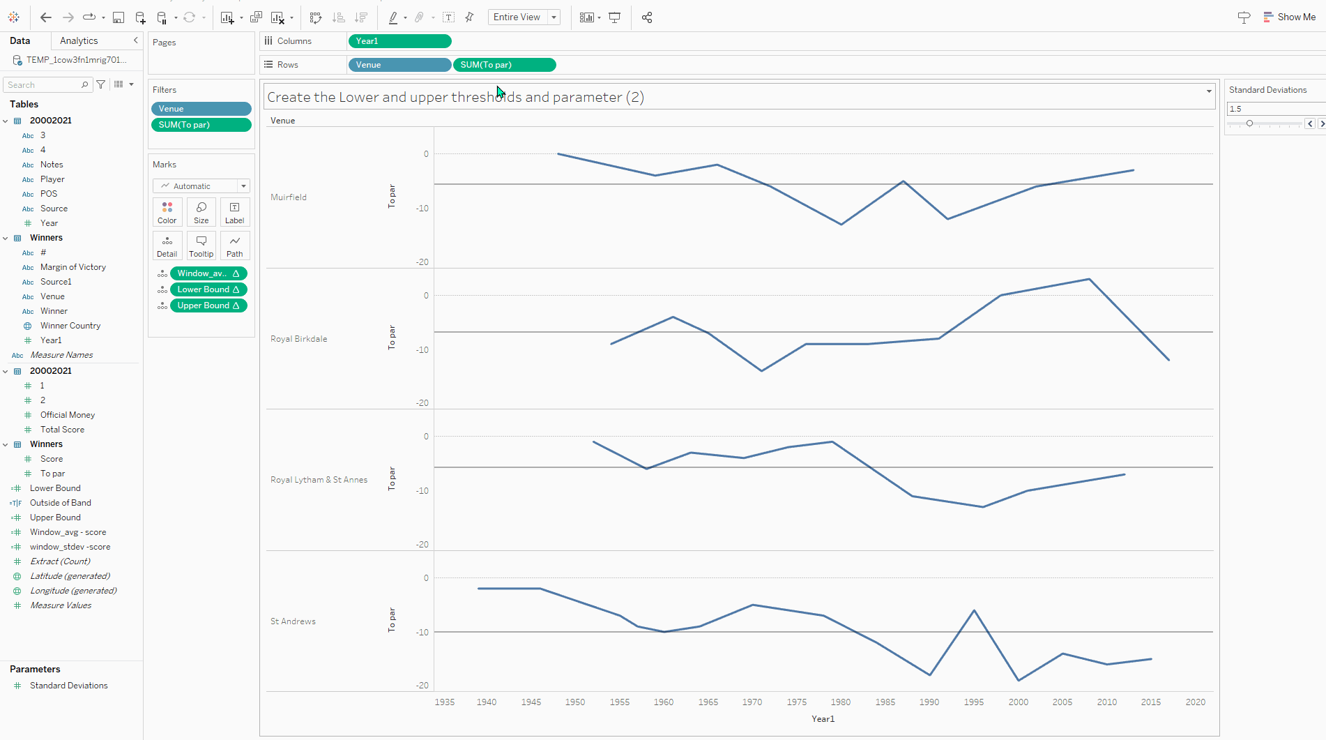
For this example of building a control chart I am going to use a SportsViz Sunday Dataset on golf scores from The Open Championship attained through Wikipedia. We are going to plot the winning scores over time at the 4 venues with the most scores recorded in the dataset.
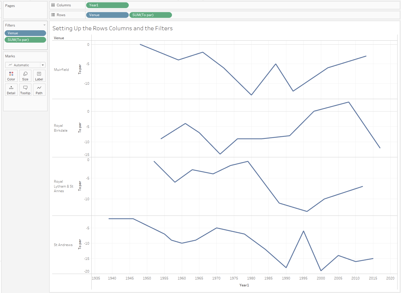
The initial set-up is fairly simple - we want a continuous date on the columns shelf and a measure on the rows shelf. We then have the option to break this measure down with a dimension which I have done in this case with venue. For ease of viewing I have used a TopN venue filter taking the top 4 by count of our measure. Some years of the tournament had a row for the winner but no scoring data and therefore they were nulls on this chart - I have filtered them out for the sake of simplicity.
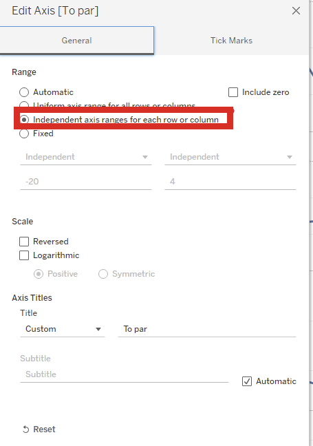
The final thing of note is I have edited the axis to allow for different scales per pane:
The quick path to a control chart is to drag an average line from the analytics pane onto the view and dropped onto the by pane for sum(measure), then drag a distribution band onto the view, again by pane for sum(measure):
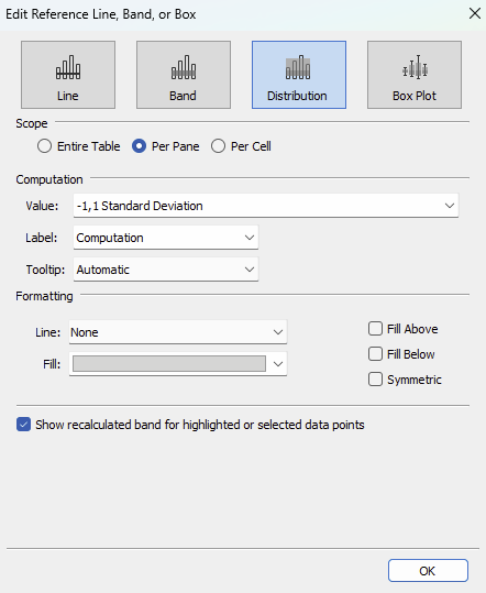
Chose your method of computation in this case we are using +/- 1 standard deviation and we have a basic control chart.
However for additional formatting and functionality of changing the size of the band we might want to compute with table calculations.
We can replicate the average line with the following calculation:
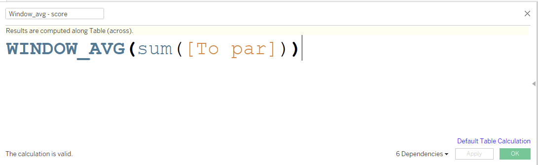
We can then drag this onto the details pane and use the edit table calculation pane to make sure it is computing correctly:
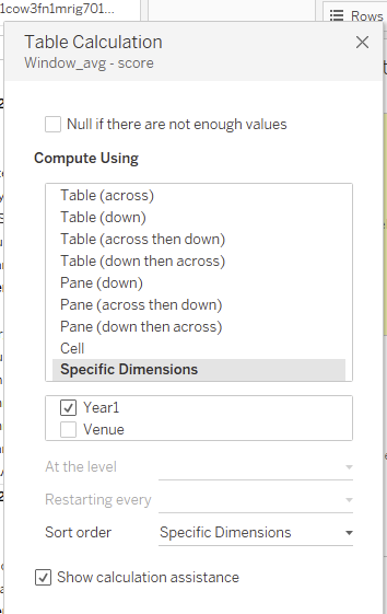
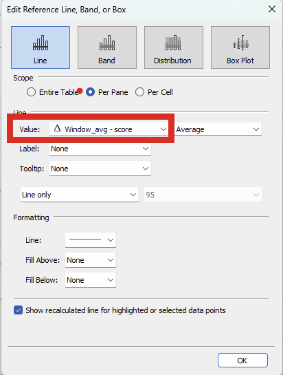
Calculate the average measure of the view across years and resetting each venue. The calculation assistance helps here showing it taking into account the marks in each pane in the calculation before resetting for a new venue. We can then use a reference line and for its value, point it at this table calculation.
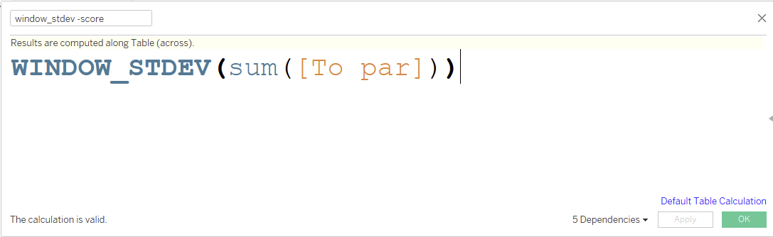
To calculate the size of the band we are going to use standard deviation calculated again with a table calculation, also configured to calculate across years resetting each venue:
The bands themselves are actually calculated by adding or subtracting the standard deviation from the mean. We also want to give users the ability to customize the size of the band. Thus, we make a parameter to serve as a multiplier for the subsequent calculation:
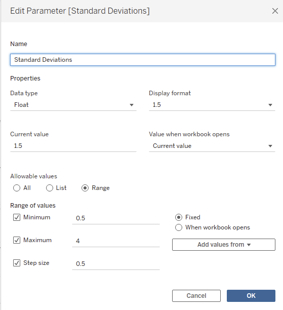
I allow a specific range of options in my parameter but this stage is case-specific and you should use whatever is industry appropriate.
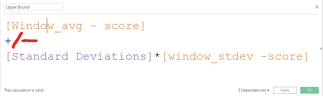
The resulting calculation for the band values is:
We can then add these values to the details pane and add a reference band from our lower band value to our upper bound value (again double check the table calculation is calculating as it should).
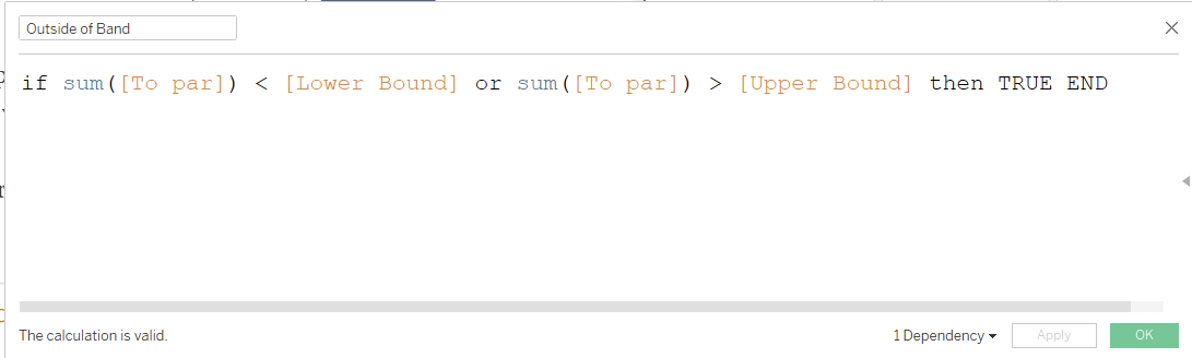
From there we can leverage the fact we have the values as a calculated value to create a boolean field to color points that fall out of the band:
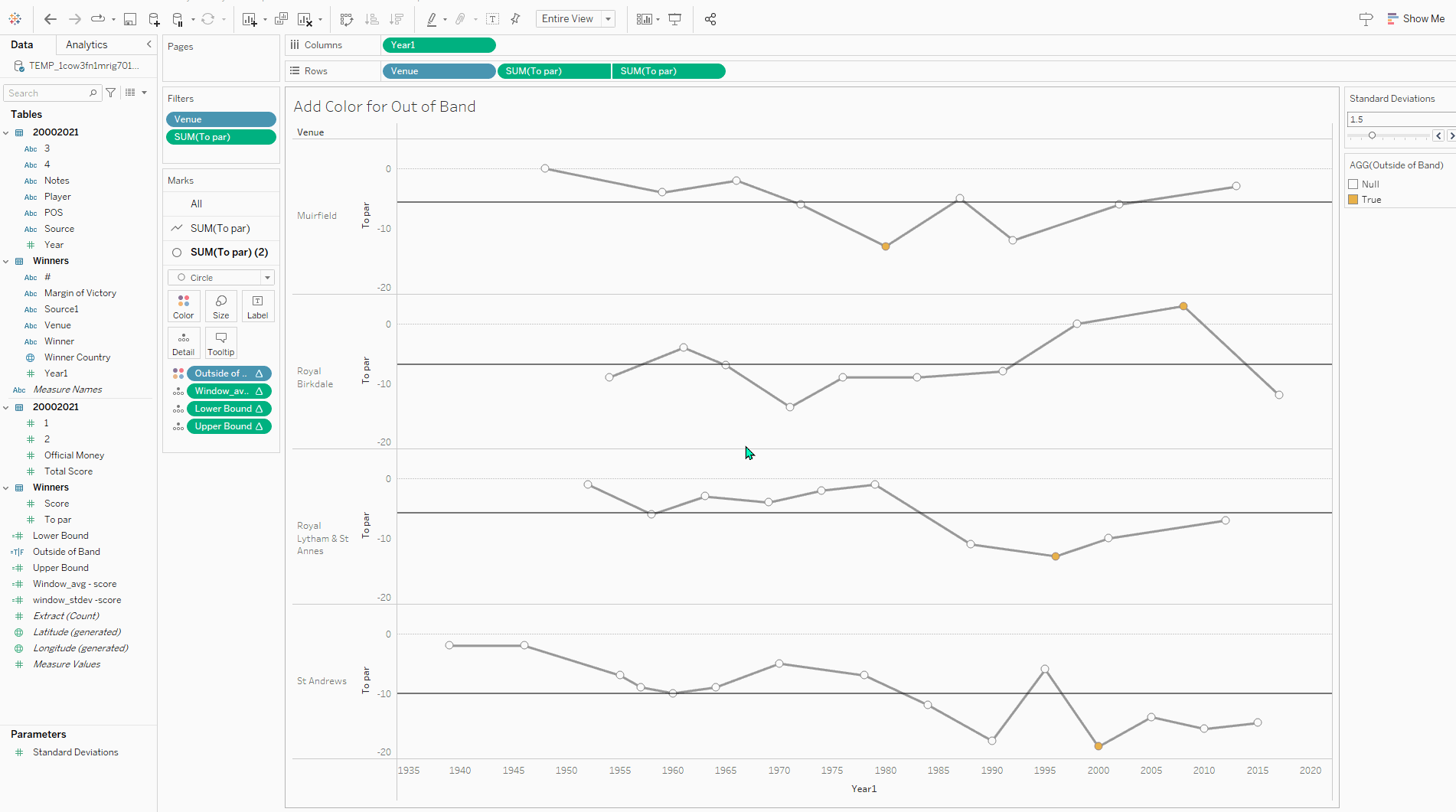
When coloring the line the result is a line that fades in and out of colors. Thus I prefer to make a dual axis:
A control drag in the left direction will ensure that we can change the bottom shelf mark type to circles and the circles sit on top of the line rather than vice versa. A right click on the pill to set as dual axis and then a right click on the axis to synchronize then hide the second axis sets the chart up. I like to drop the boolean on the color for the circles and grey out the points in the band to really emphasize the scores that fall out of the zone, in this case performances at the extreme end (either good or bad) for the venue in question.
The final result: