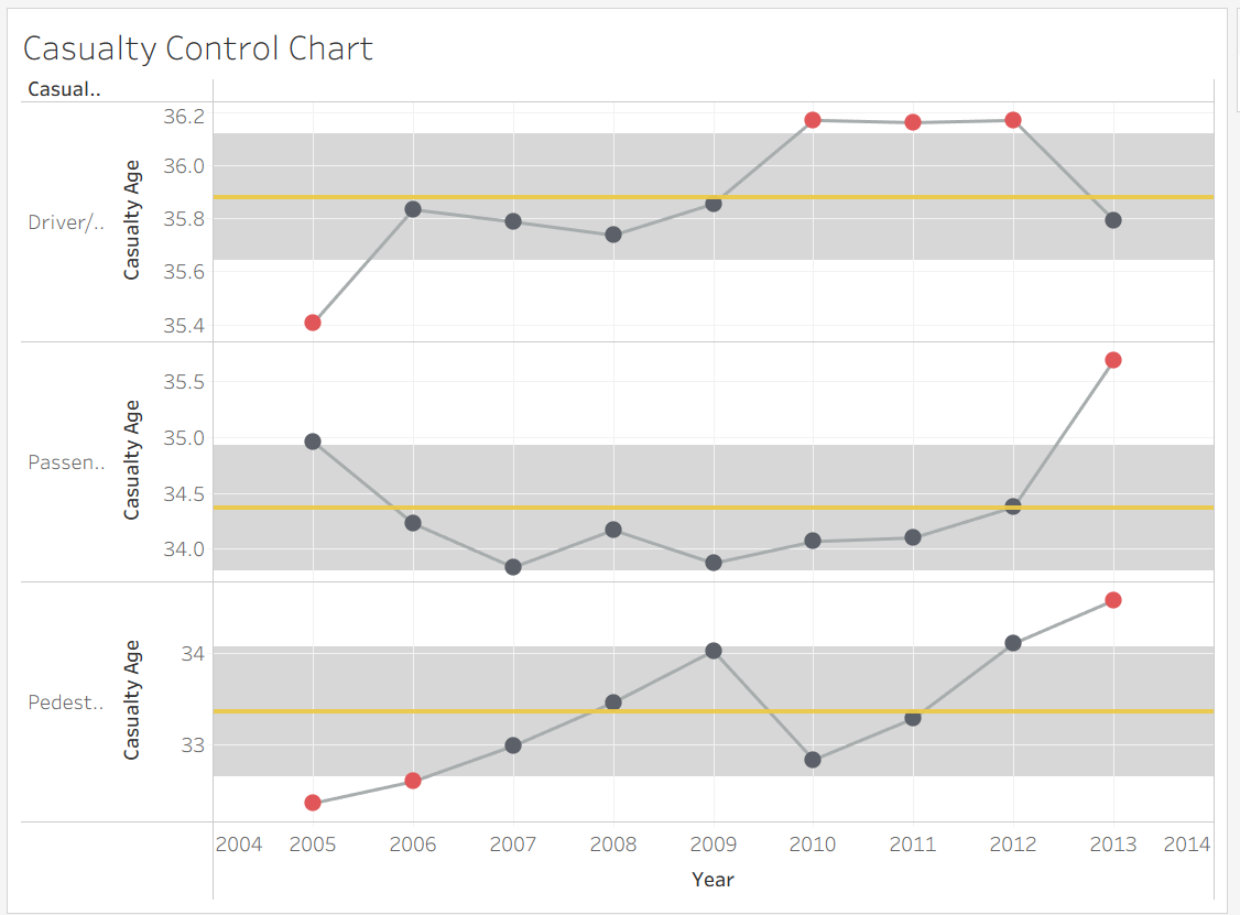
Today I'm going to walk through how to create a control chart in Tableau. Control charts are mainly used to track data over time, show if processes are stable, and identify any normal variations from real areas of concern. Because they're such a key tool for monitoring and understanding variations, learning how to create these charts can be a valuable skill.
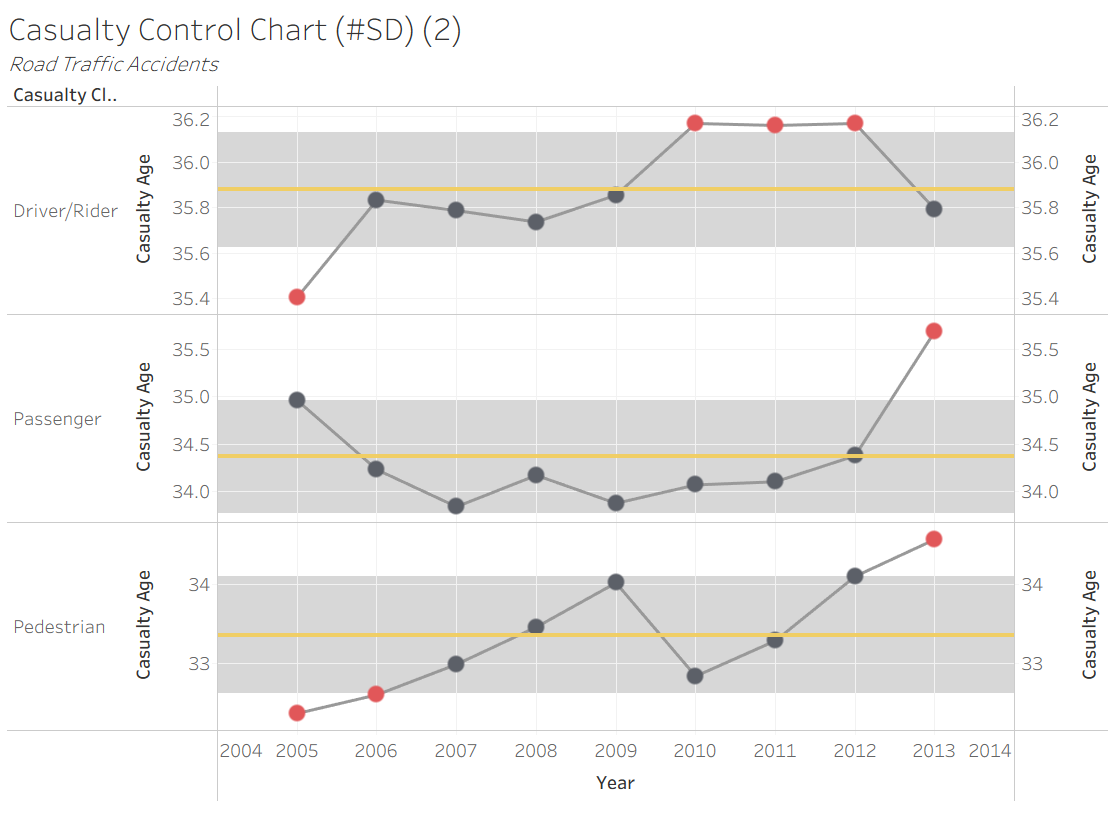
Creating the Chart
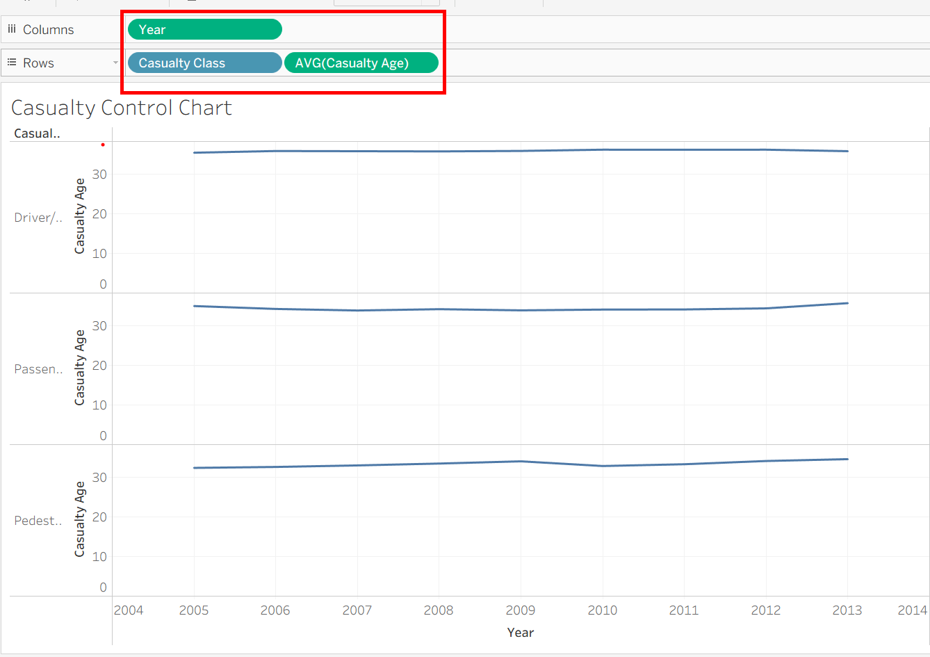
Make your base chart. I used traffic accident data to create this chart, but follow along with whatever data you're using. Drag in dimension 'Year' into columns, dimension 'Casualty Class' into rows (will create one chart per category in this dimension), then the measure 'AVG(Casualty Age)' into rows.
Create Two Layers to Your Chart
Drag in the same measure (AVG(Casualty Age)) next to the original in rows, then right click and choose 'Dual Axis'.
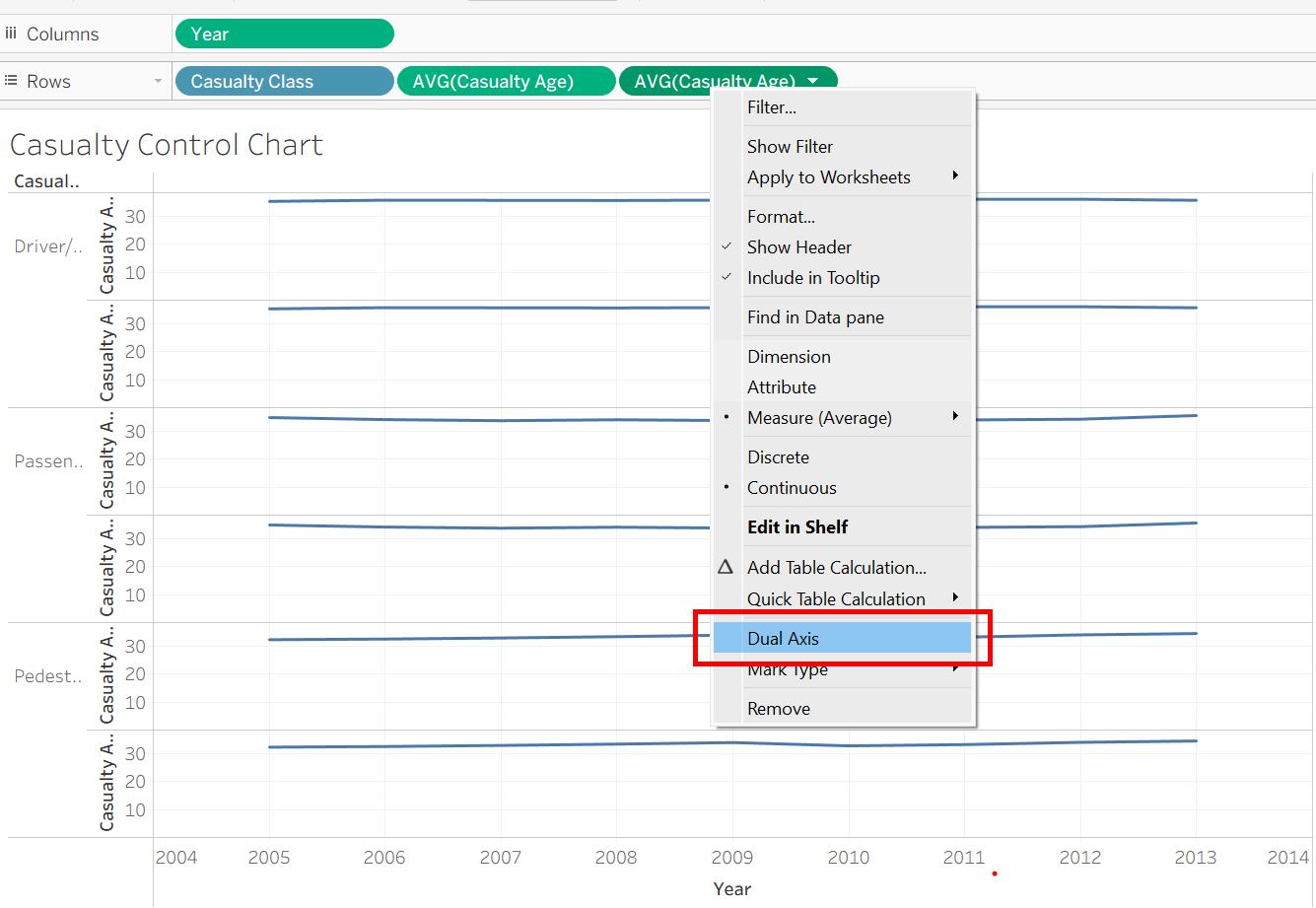
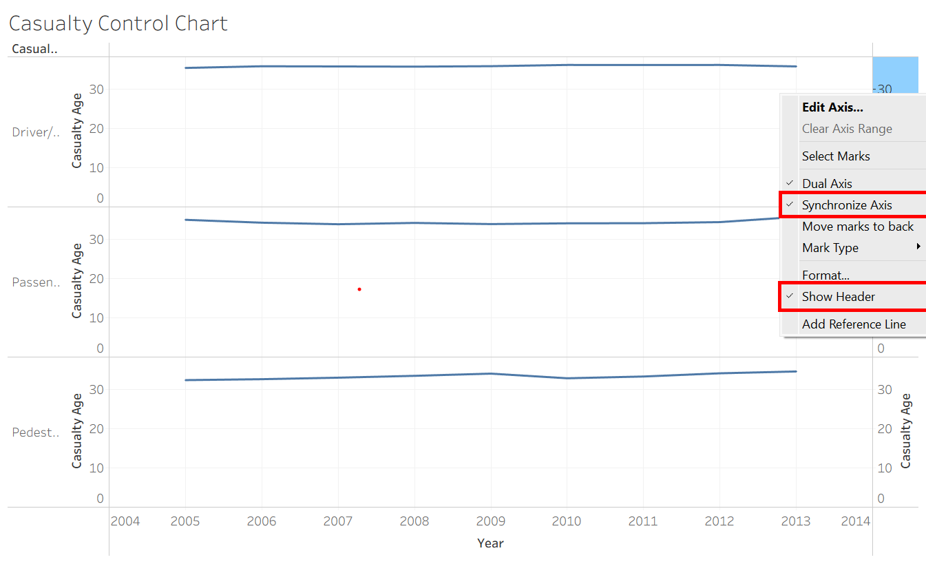
Next, right click on the new header, choosing 'Synchronize Axis' in the menu. In the same menu, click on 'Show Headers' to hide the second headers and make the chart cleaner.
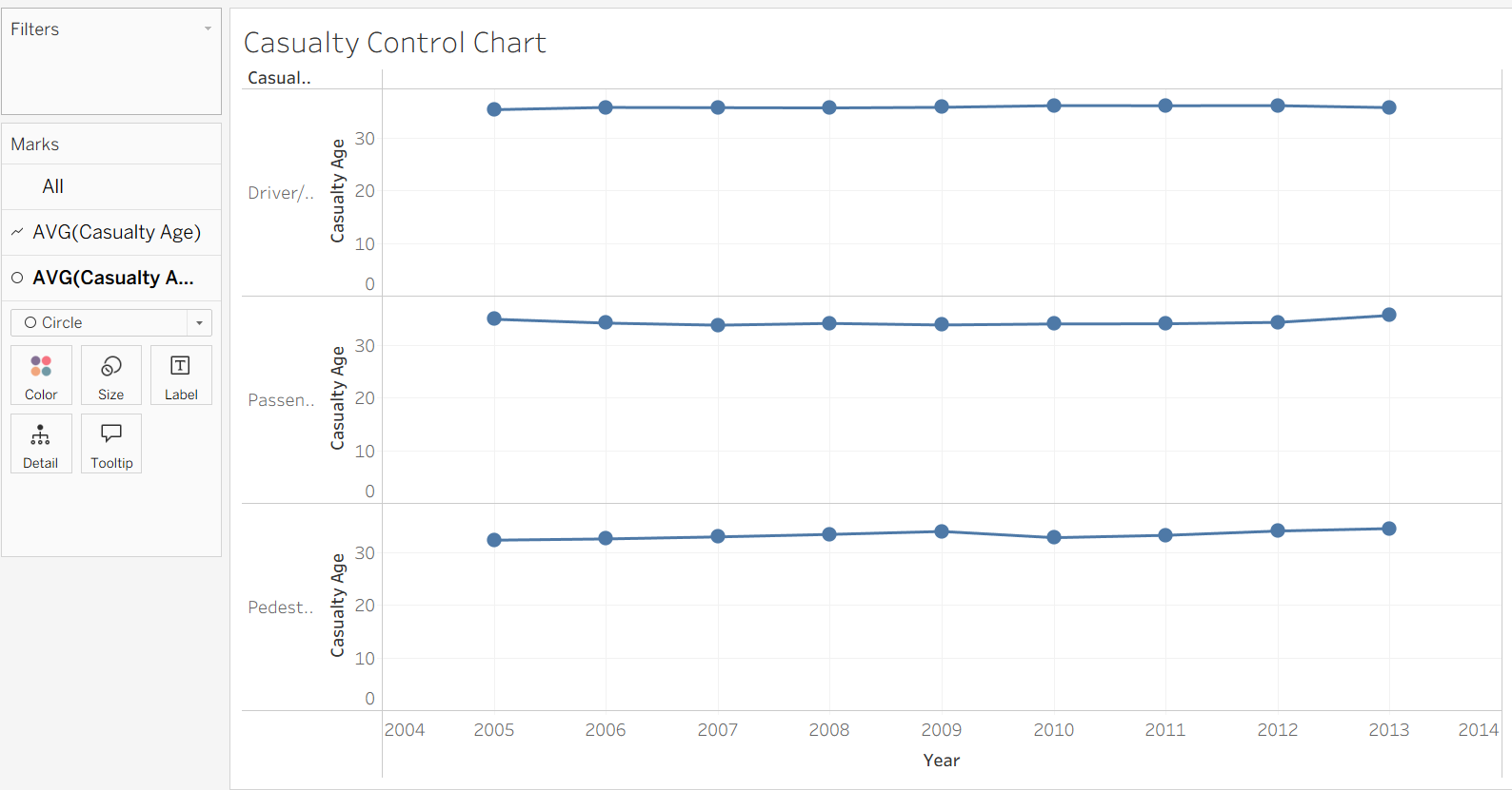
Then, change the chart type for the second AVG(Casualty Age) to Circle.
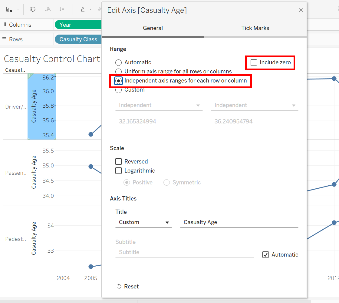
Then, to make differences in the data clearer, right click on the axis and uncheck 'Include zero', and turn on independent axis ranges.
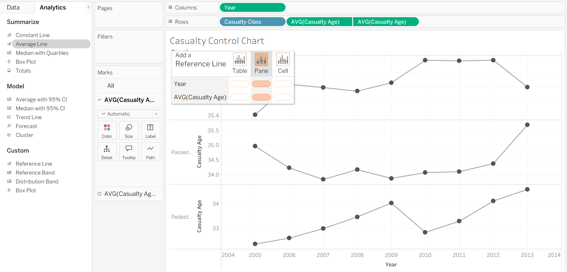
Average Line from Analytics Pane
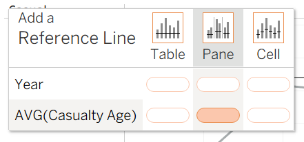
Now we're going to put an average line in for each line chart. Go into the analytics pane, and drag an Average Line in, making sure it's for each 'Pane', specifically on the measure AVG(Casualty Age). This is so we get a line for each one of our Casualty Classes.
Create Distribution Band
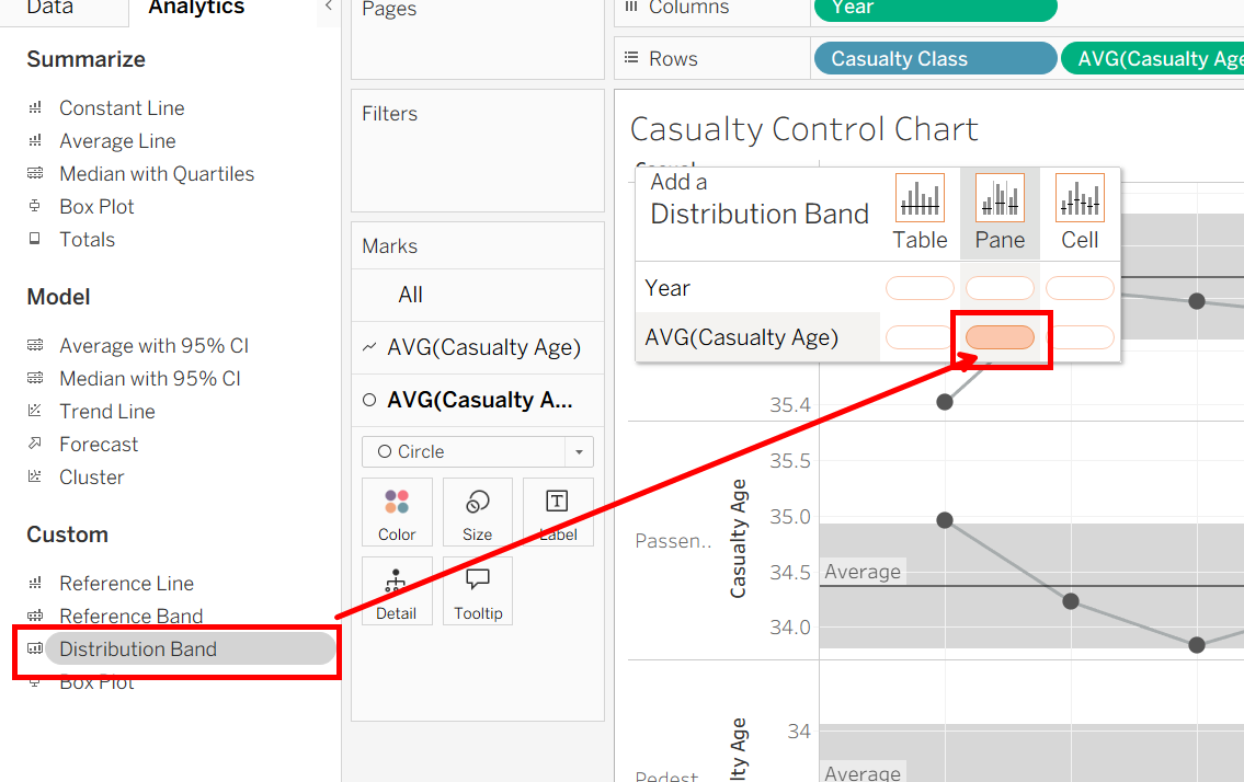
Next up is making a distribution band for the analytics pane again, drag in distribution band, again making sure it's for each 'Pane'.
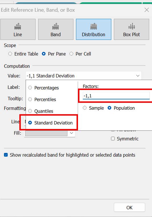
In the distribution band settings, choose Standard Deviation and choose however many SD's you need (for this example I chose 1). -1,1 means the band will extend from the Average - 1 SD to the Average + 1 SD.
Now we need to make a conditional formatting where points that appear outside of the band are red, and points inside are grey.
Create Conditional Formatting
First we need to create upper and lower bounds to indicate when a point is outside the band.
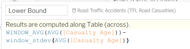
Create a calculated field, then enter the following for the lower bound.
Create another calculated field, then enter the following for the upper bound.
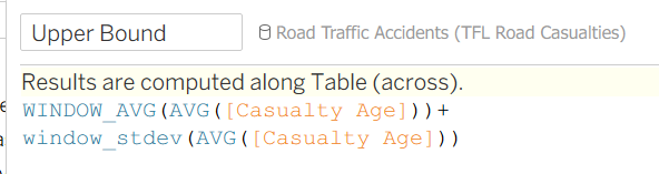
Keep in mind, both of these calculations are for only 1 SD. Also, ensure the results are computed across the table. These fields are calculating the average and standard deviation of the measure (Casualty Age) in the specific window, meaning it calculates it for each casualty class (AKA each dimension category) we have on the chart. That way it gives separate bounds for each category of our dimension.
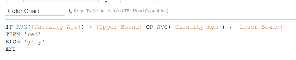
Now that we have our bounds, we can make another calculated field to change the color based on if the mark is in or out of the bounds.
Making a new calculated field, enter the following for the Color Chart. It's an if statement that says, if our measure is above the upper bound or below the lower bound, then color it red, otherwise color it gray.
Finishing Up
For our last steps, drag in your color chart field into the colors mark for our Circle measure, not the Line measure. That should change the colors of each dot outside of the bounds to red.
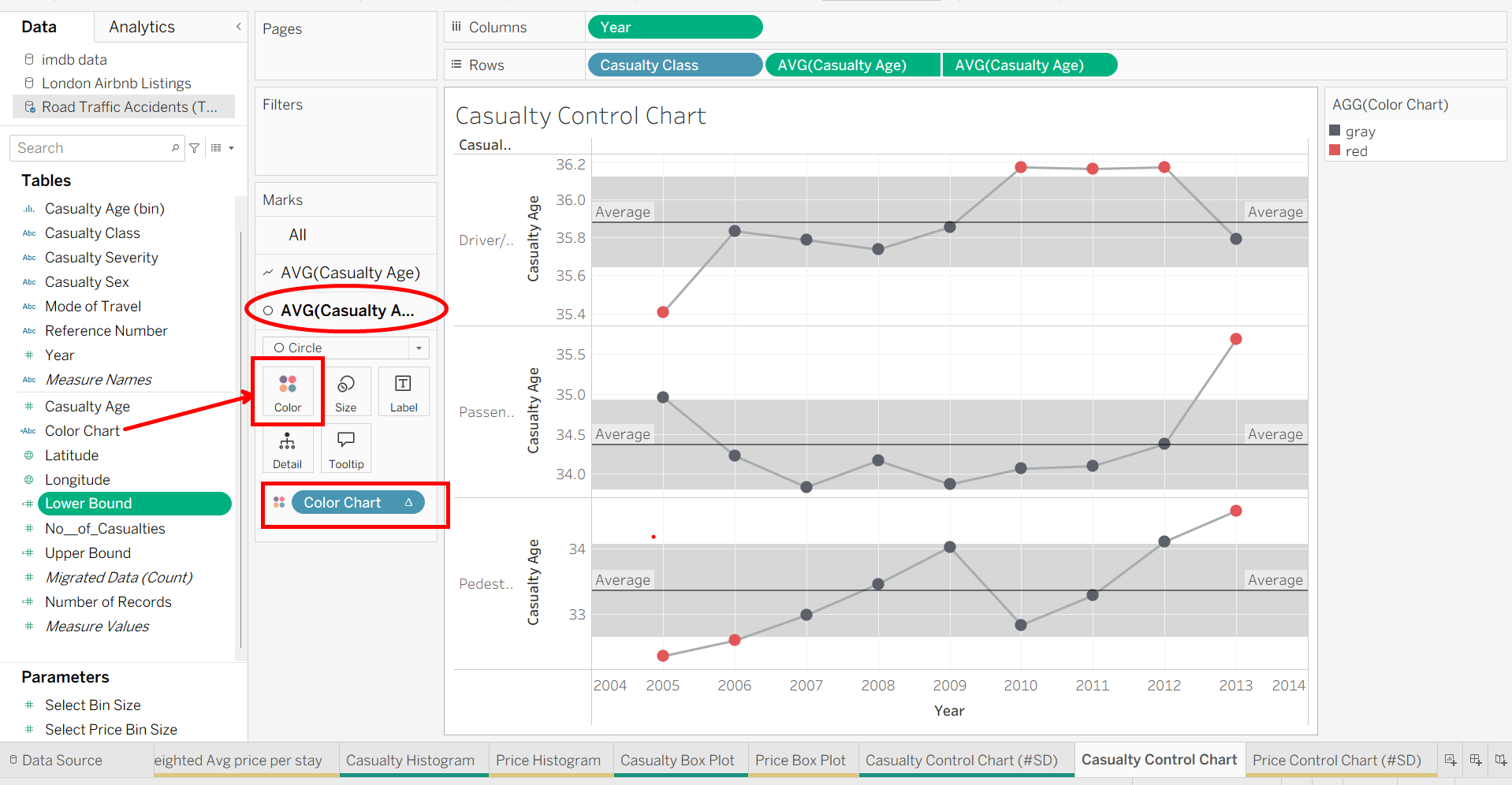
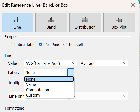
To clean up, let's get rid of the 'Average' label and change the Average Line color to yellow. Click on an average line, then click 'Edit'.
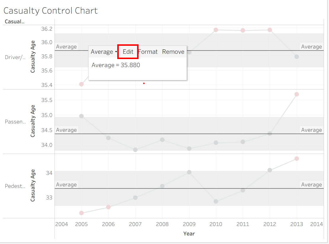
Then in the 'Line' section, click the dropdown for Label and choose 'None'. that will get rid of the 'Average' label next to each line.
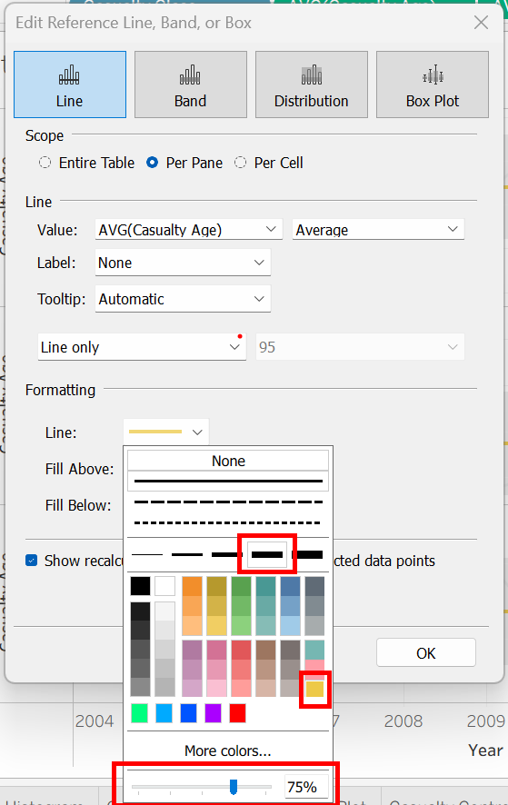
Next, under 'Formatting', click the dropdown for Line and choose the following for thickness, color, and opacity (you can of course customize these to your liking as well).
And that's our completed control chart! Control charts are super useful for statistical tracking and makes it easy to highlight any areas of concern within our data. Thanks for following along!