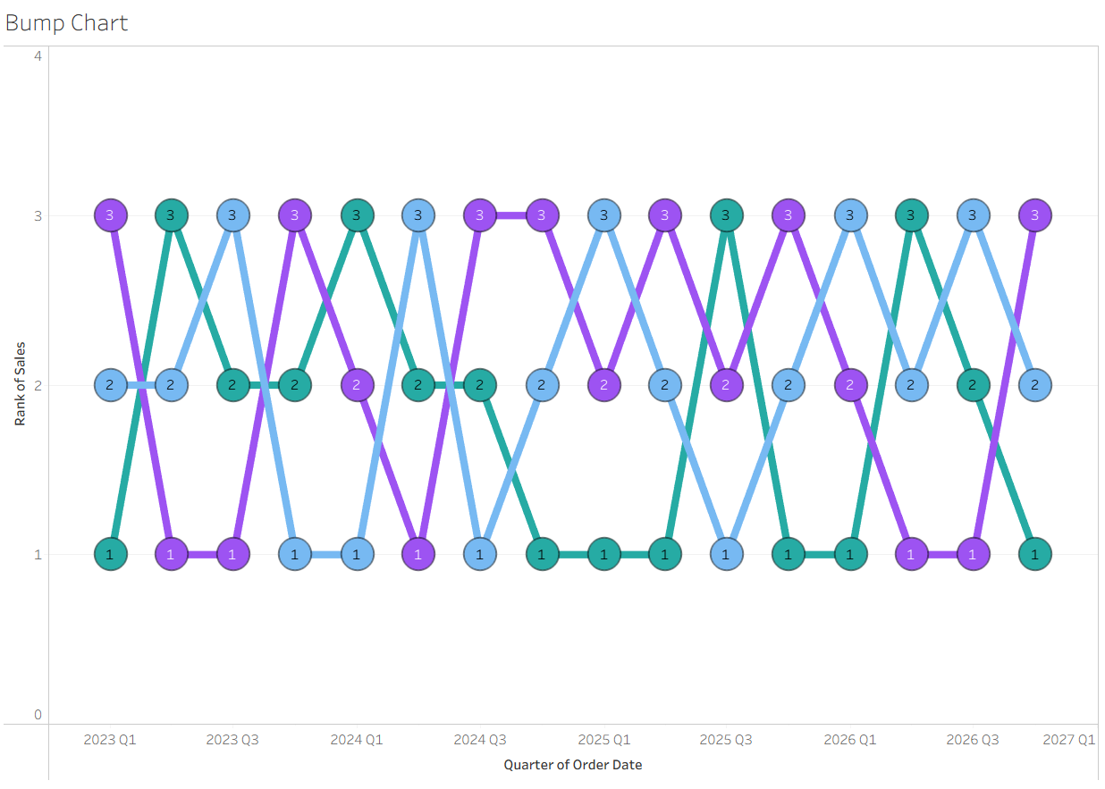
Bump charts are a type of line graph that is designed to show the changing rankings or positions of multiple values across a period of time. It focuses on changes in rank instead of exact numerical values to highlight trends, winners, and losers. Let's get started!
Create Base Line Chart
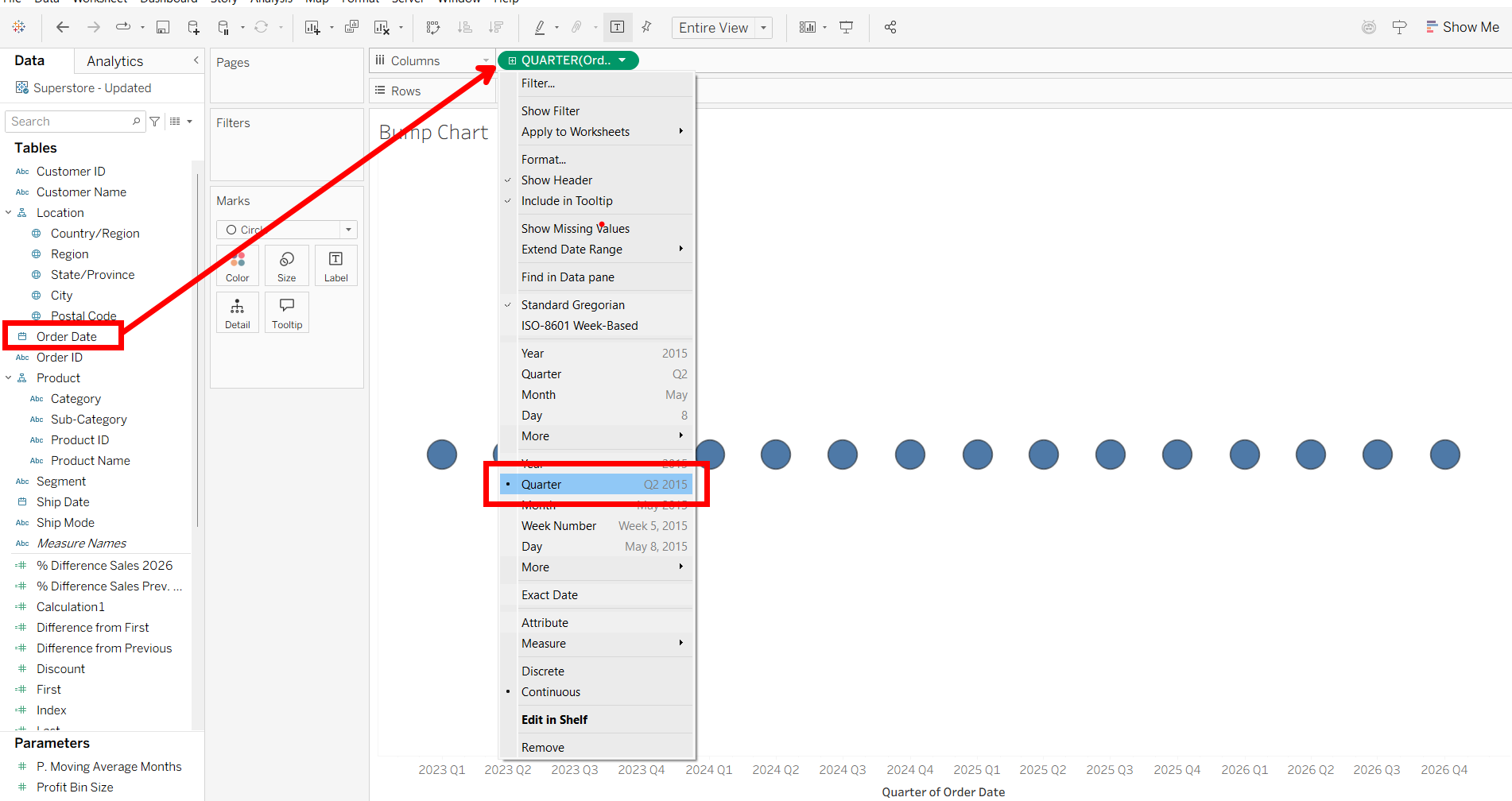
First, drag your time dimension (Order Date) into columns, changing it to a continuous dimension. I chose quarter to fit the graph appropriately without overcrowding. Usually, a bump chart will have some time dimension on the x-axis.
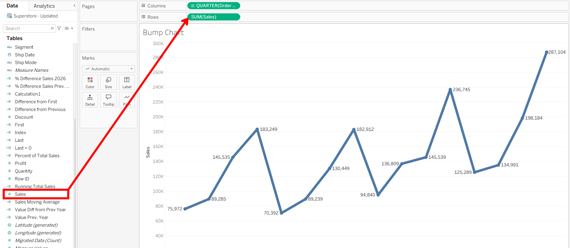
Next, drag the measure you want your chart to rank by to rows. For this case, I wanted ranks by sales, so I used SUM(Sales).
Create Dual Axis
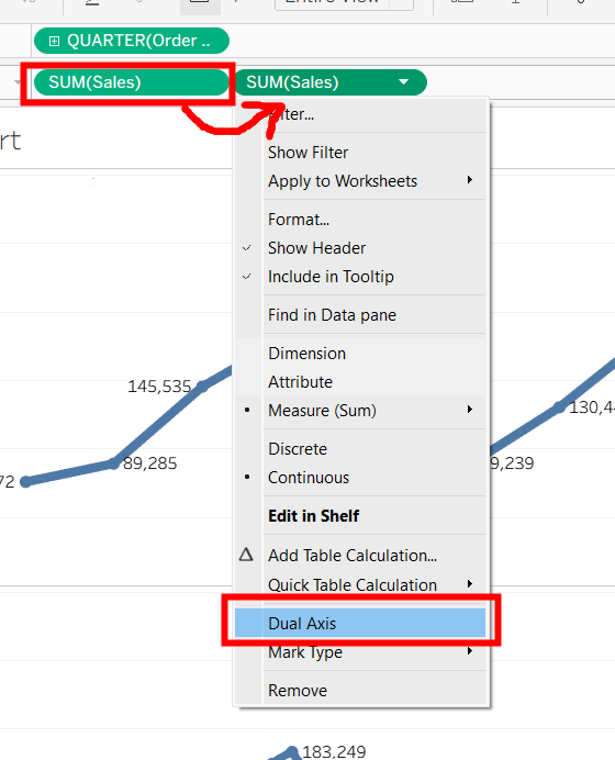
Next we have to create a dual axis with sales to display circles on top of the line chart. While holding CTRL, left-click on your measure and drag it next to the original pill. You should end up with a duplicate measure. Then, right click on the new pill, choosing Dual Axis in the menu.
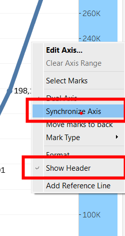
Then, right click on the right axis and select these options to synchronize the axis and remove the right axis.
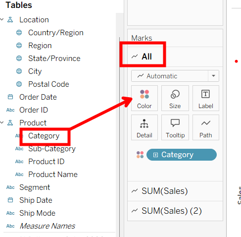
Lastly, drag whatever category or grouping you'd like to rank for your measure into the "All" marks card on Color. For this example, I'll be ranking Product Category by our SUM(Sales) measure.
Create Table Calculations for Rankings
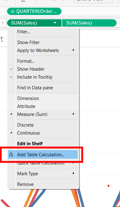
Now, we have to edit the measures to create rankings depending on the measure value. For both measures, right click on them and choose to add a table calculation.
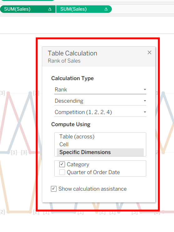
In the table calculation settings, we want the descending rank, competitive, then choose by a specific dimension. Tick the dimension you want your ranks to be based off of. I chose the Product Category, so this is saying for categories, compute their respective rankings based off the sum of sales for that category, moving across the Quarter of Order Date. It's calculating a new ranking for each quarter.
Again, repeat for both measures.
Finishing Up
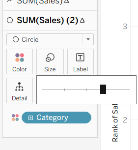
We're almost done with the chart! Now, change the last marks card from line to circle and adjust the size as needed.
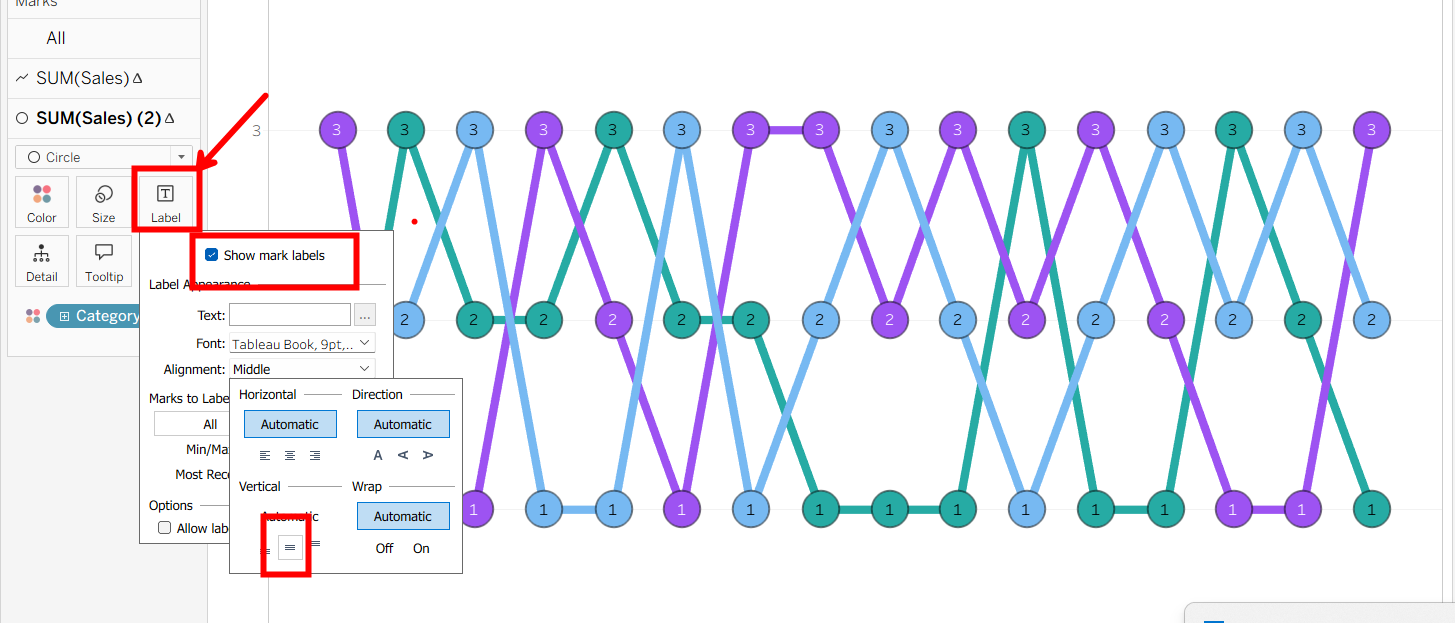
To put the rank labels on each mark, click on the label icon, and adjust these settings.
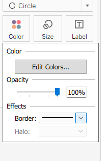
Lastly, you can edit the colors to your preference and add a border to make each circle more apparent.
And that's the completed bump chart! Bump charts are a great way for businesses to visualize who is rising, who is falling, and any trends or difference over time. It can highlight any shifts in competitive movement and is a very useful and easily digestible visual to use.