


Day 2 of Dashboard Week made use of our knowledge of two different softwares instead of just one. We used SQL to prepare the data, and a different tool to what we used yesterday for dashboarding – for me, this meant using Power BI.
Data Preparation:
We started by downloading the Rebrickable CSV tables and uploading them individually into our own Snowflake schemas. Getting everything configured took longer than expected, but with help from fellow DSers, I was eventually up and running.
Luckily, there was a readily available schema on the Rebrickable website, which helped me identify the joining keys and better understand how the different tables related to one another.
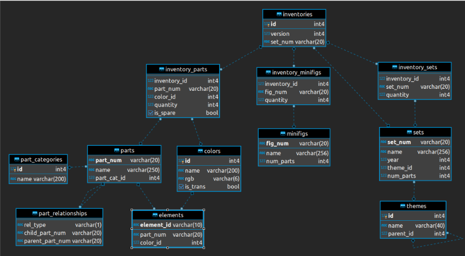
Based on the structure of the data, I decided to reduce the model down to a maximum of three tables as the main inventories table naturally split into three areas: sets and themes, minifigures, and parts and colours.
We were given the option to focus our analysis on either Botanical/Floral sets or the Animal/Creature kingdom, and I decided to take the botanical route.
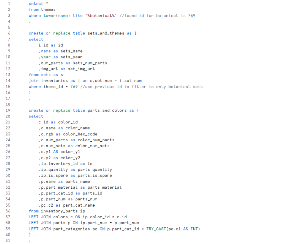
- Starting with sets and themes, I filtered the themes table to botanical-related themes, identified the relevant theme ID, and used this to filter the sets table down to only botanical sets. I then joined this with the inventories table to retain the inventory ID, which I expected would help later when creating relationships with other tables.
- I decided to leave minifigures out, as I didn’t think they were necessary for the type of analysis I wanted to carry out.
- Moving onto parts and colours, there wasn’t much thought behind the fields I kept — I mostly selected columns that appeared useful, which in hindsight meant I carried through more fields than needed and made dashboarding more difficult later on. Saying this, I did leave out the part_relationships and elements tables , as I didn’t feel they added much value. For the remaining tables, I used left joins from the inventory parts table as I wanted the granularity to represent a specific part, in a specific colour, within a specific set.
My SQL code was as follows:
Dashboard:
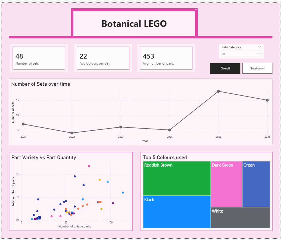
After connecting Power BI to the tables I had created in Snowflake, most of my remaining time was split between exploring the data, and troubleshooting issues in Power BI, both of which I found quite challenging. As a result, I ended up producing a fairly simple dashboard with some elements of interactivity.
Ideally, I would have liked to spend more time thinking through, understanding, and analysing the data in a greater depth, as I think this would have helped me develop a more well-thought-out analytical approach and ultimately create a more insightful dashboard - definitely something I’d like to revisit and build on properly in the future.