


A connected dot plot is a simple an very easy way to visualize differences between e.g. years, locations, categories etc.
Today I want to show in a quick and easy way how to do this in 3 steps.
In this case I will visualize the differences in sales per region in each sub category.
1. Drag sub-category on Rows and sales on columns
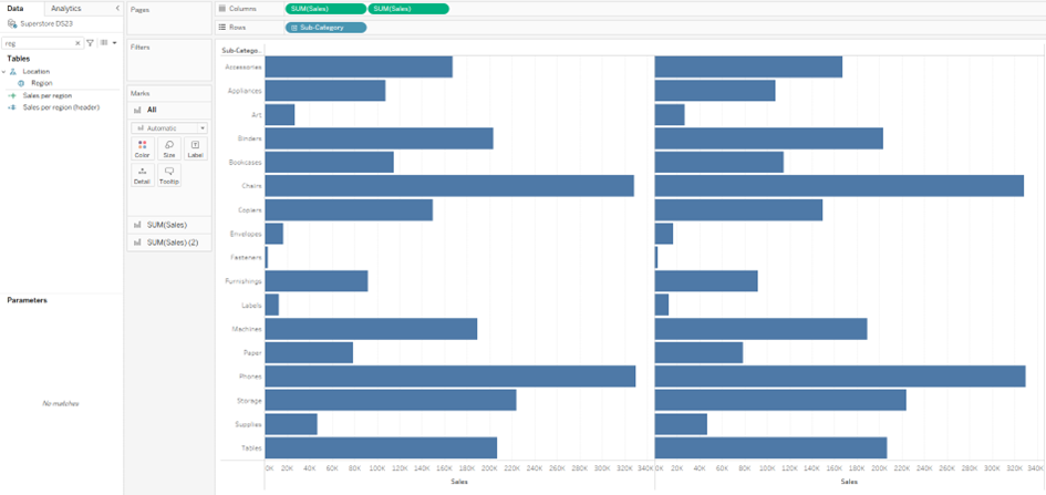
You get the sales for each sub-category in a bar-chart, hold ‘crtl’ on sales and drag it next to sales to get a second bar chart
2. Now drag the regions in both marks cards
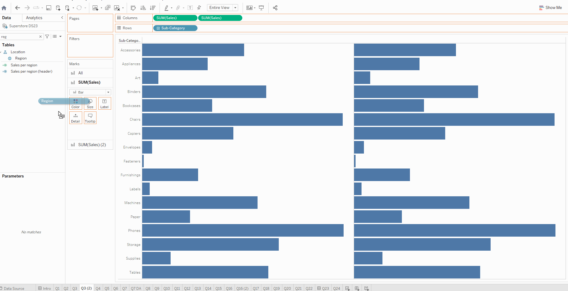
When the regions are in the mark cards, select line in the first mark card and drag regions on path. In the second mark card select circle and drag regions on color.
3. Now klick on one of the sum(sales) in the columns and select dual axis to get one single chart.
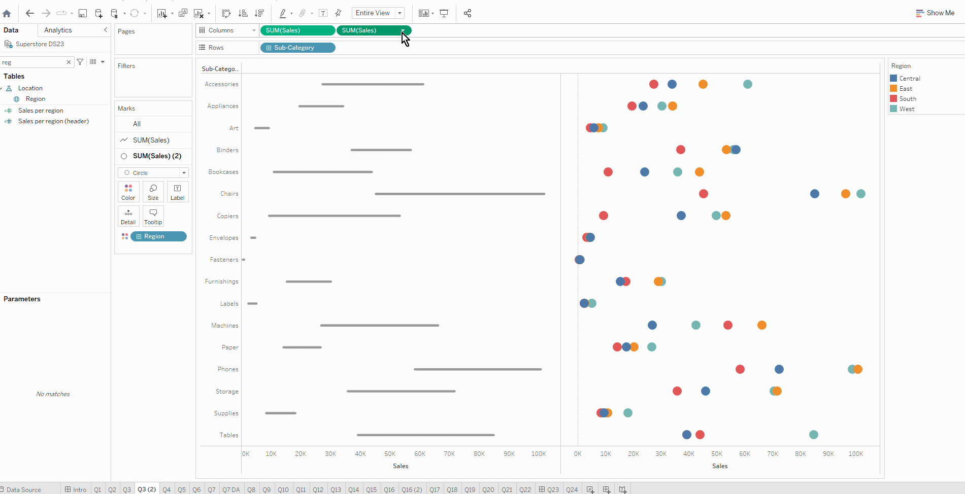
Make sure to synchronize the axis and hide one the headers to clean up a bit.