You may find yourself wanting to put two charts together on the same set of axes in order to compare two different fields. In the world indicators dataset that comes with Tableau, there are two separate fields for life expectancy - one for women and one for men. In order to show a line for each gender's change in life expectancy over time on the same set of axes, you'll need to make a dual axis chart. Here's a step-by-step guide on how to do that.
Drag your fields to the rows and columns shelves
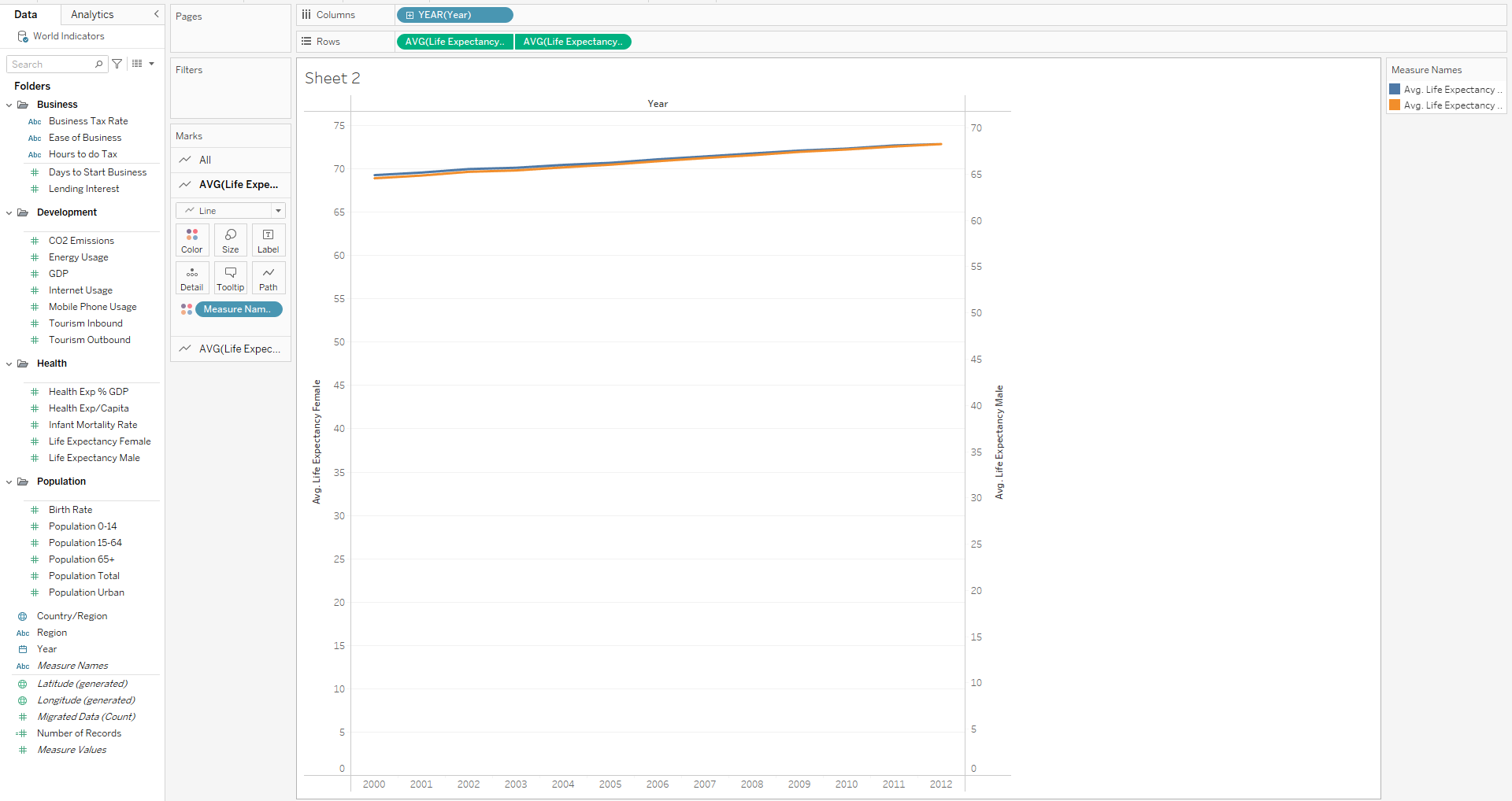
In my example, I'm showing change over time so I'll drag my Year field to the columns shelf. Next I'll drag Life Expectancy Female and Life Expectancy Male to the rows shelf and choose the appropriate aggregation (I'll use average). Next, right click on the rightmost pill in the rows shelf and select Dual Axis. Here's what you should see:

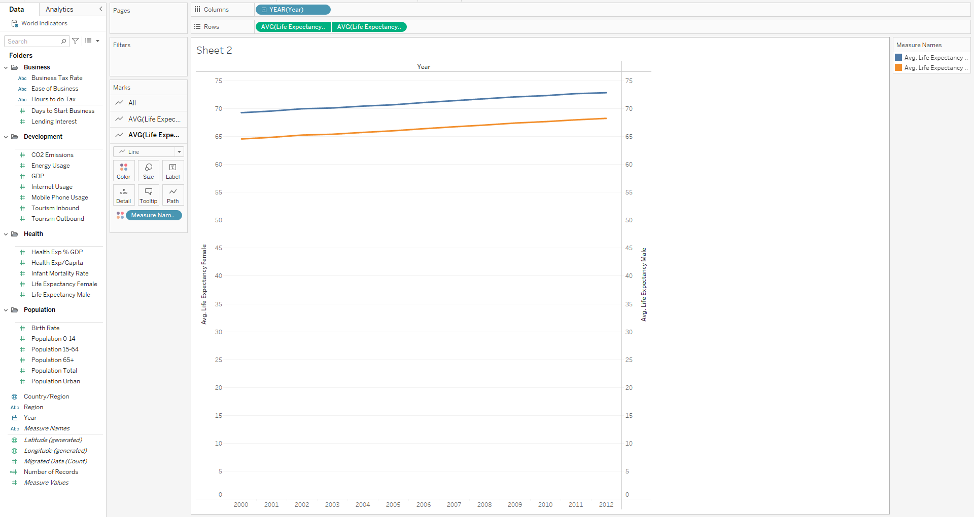
You'll notice that the two lines overlap despite having different values and that the axes on the right and left side are out of sync. This is because Tableau adjusts the axes independently of each other to push the lines closer together. To fix this, right click on either the Life Expectancy Male axis or the Life Expectancy Female axis and click Synchronize Axis. Here's how it should look:

You can see that the axes on either side match and the consistently higher life expectancy for women is clearly visible. If you wanted to improve this chart, you could remove some of the chart junk, like the extra axis and the grid lines. Dual axis charts are not only useful for line charts. You can also use them for bar charts or any other kind of chart. Try playing around with them to create some unique and powerful visualizations.
