There's a strong preference for donut charts over pie charts in Tableau. Donut charts are easier to interpret and look better. You may even choose to use the empty space inside them with a label for the chart. Here's a step-by-step guide on how to make them.
Start with a pie chart
Before making a donut chart, you'll first have to make a pie chart. Start by changing your marks to Pie on the marks card.
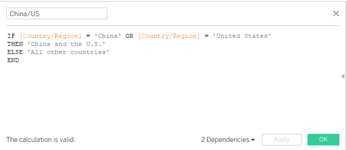
Next, you'll have to decide which field to use to determine the chart's colors. I'll be using the world indicators dataset that comes with Tableau for this demonstration. The charts I create will represent the proportion of global CO2 emissions by China and the U.S. (in red) and the rest of the world (in gray). Donut and pie charts are most easily interpreted with few segments (ideally just two) so I created a calculated field dividing the world into China and the U.S. and all other countries.

This calculated field will color the chart's segments so drag it to the color shelf.
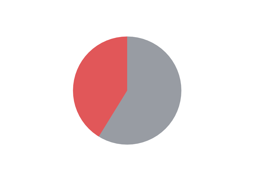
Finally, you have to use a field to determine how big each segment of the pie will be. To do this, drag CO2 Emissions to the angle shelf on the marks card. If you can't see the angle shelf, check to make sure you've changed your marks to Pie instead of the default Automatic. The angle shelf is only visible once you've completed this step. Here's the completed pie chart:

Turn it into a donut chart
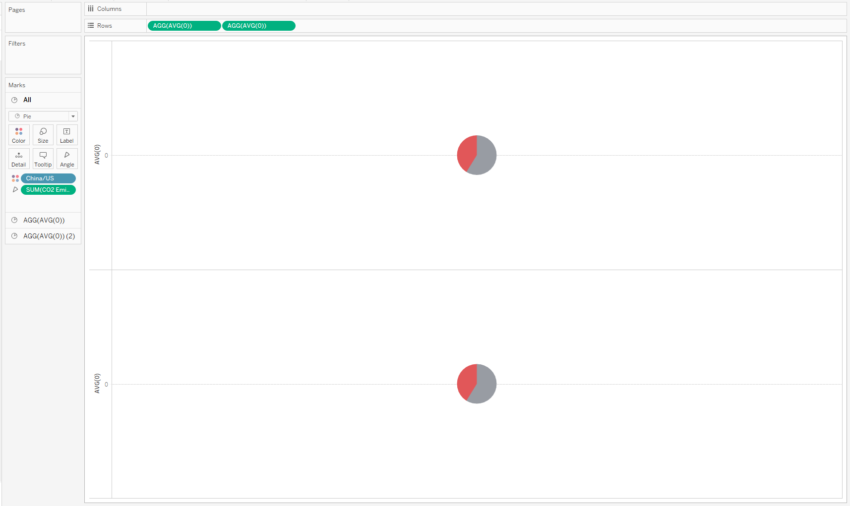
A donut chart is actually two pie charts on top of each other so we have to create a dual axis chart. An ordinary pie chart has no axes so we'll first have to create one in order to have an axis to duplicate. Double click on the rows shelf. This will allow you to create a calculated field there. Type in AVG(0) and hit enter. Now you have an axis to work with. Holding down the control key, drag the AVG(0) pill and drop it on the rows shelf next to the original pill. Holding down control creates a copy without moving the original so now you should have two pills next to each other on the rows shelf. Here's what you should see at this point:

The next thing to do is right click on the second pill in the rows shelf and select Dual Axis. You'll see the two pie charts appear to collapse into one. In reality, they're now layered one on top of the other. Right click on the axis on the left (where it says AVG(0) next to the marks card) and select Synchronize Axis.
At this point, you're almost done. Now you just have to edit one of the pie charts to be a blank circle matching the color of the background (in this case white) and make it smaller than the other pie chart so that it will cover its center and create the appearance of a donut.
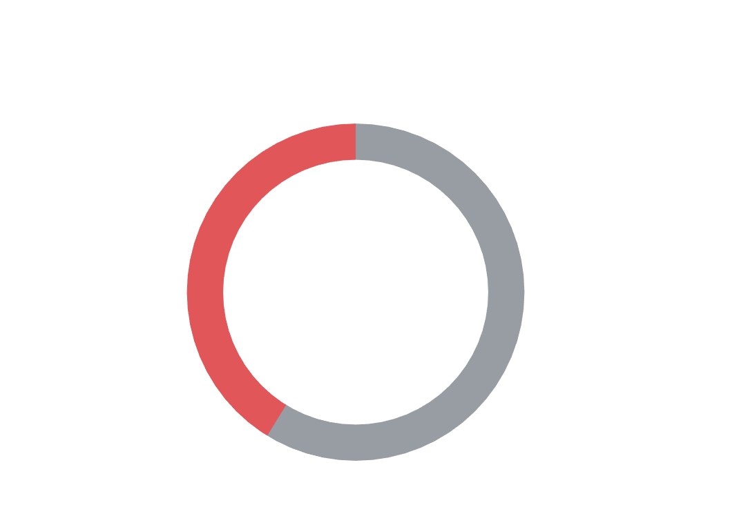
You can start by selecting one of the marks cards on the left. In my example, these are labeled AGG(AVG(0)) and AGG(AVG(0))(2). Once you've done that, drag the fields off the color and angle shelves. This will turn the pie chart into a blank circle. Then click the size shelf and drag the slider down to make that chart smaller than the other one that still has the colors. You'll see the colors emerge on the outer edge of the chart as the inner circle recedes. Finally, click color and change the color of the blank chart to match the background color. Now your donut chart is finished! Here's the final version of the chart:

You can clean it up by removing zero lines and grid lines and hiding the headers for the axes. You can also add labels to make it more easily readable. I hope that helped!
