Tableau allows us to create reference lines, bands, distributions and box plots on our continuous axes in order to help highlight certain areas of our data. These features can be especially useful when we combine them with calculated fields and actions in order to make them interactive.
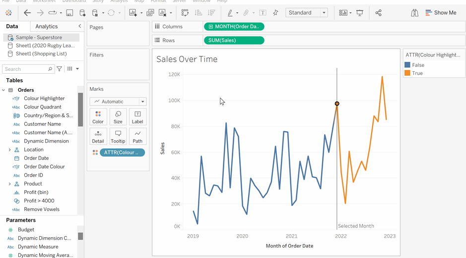
The screen shot below shows a simple line chart displaying sales over a four year period with order date truncated into months on the x-axis and sales on the y-axis. The reference line allows you to select a specific month on the chart which the reference line will move to. The sales line will also become orange for all values after this order date, and blue for all sales before. This can be really useful when we want the user to engage with a chart and have the chart highlight key areas as the user explores the data.
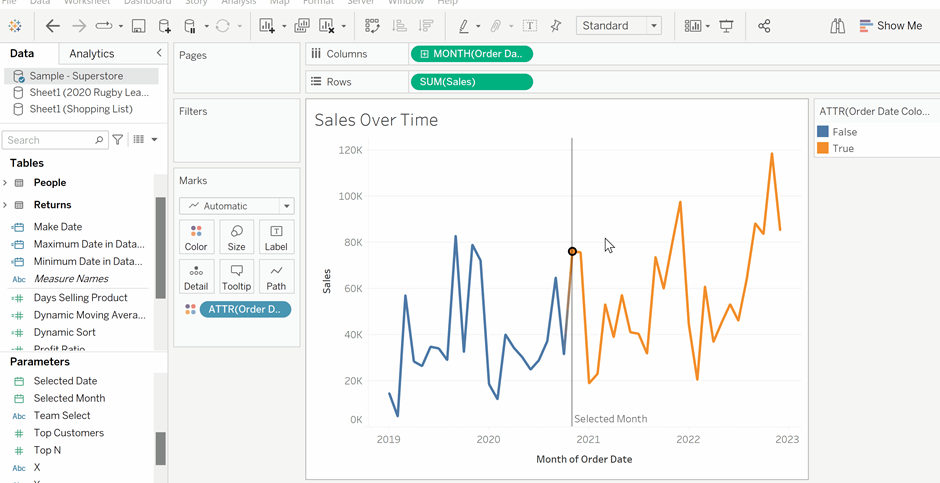
In order to do this, we first need to create a parameter that allows us to select a date on our chart. Create a parameter from the datapane and make sure that within the Edit Parameter window, the data type is selected as Date and that all allowable values are chosen.
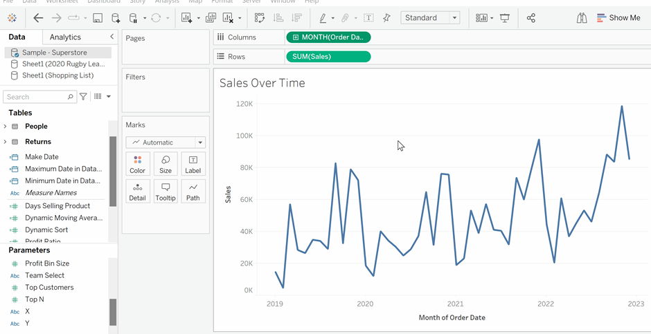
Now, create a reference line by going into the analytics tab and dragging Reference Line onto the chart. Ensure that you release the Reference Line over the Table and Order Date section to have your line concern the Order Date axis. When the Edit Reference Line, Band, or Box window appears select the newly created Selected Month parameter and click ok. You should now have a dynamic Reference Line that moves to the month that the user selects.
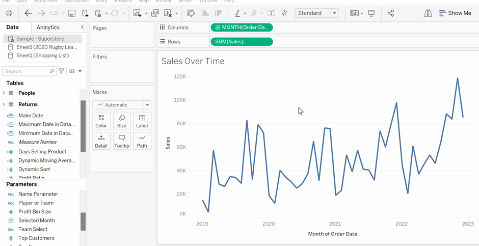
Finally, in order to add colour, create a new calculated field. In this calculated field, write a Boolean function where if the Order Date is greater than or equal to the Selected Month, the statement is true. Drag the newly created calculation onto the colour in the marks card and the chart line should become orange after the date you select. However, the chart line will be discontinuous around the reference line. To make the line continuous change the colour highlighter to Attribute within the Marks card.
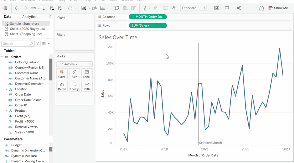
Finally, lets customise the reference line’s colours. To do this click the colours option in the Marks card and select whichever colour palette you wish. Both the true and false colours can be assigned by selecting them from the Select Data Items pane on the left, and then selecting the chosen colour from the palette pane on the right. Click ok and your dynamic reference line is created and customised.
