It’s the end of week 2 in DS 37 and our cohort has been asked to improve on one of our application vizzes. I decided to take a look at the viz I had created for the first stage of the application process as I thought it should have plenty of areas to look at. The vis provided an analysis of music sales over the past 50 years, breaking the sales down into their musical formats and providing insight into how the music industry will look in the future.
I began the project by first familiarising myself with the viz, looking out for areas which could be improved based on what I’ve learnt this week in our Tableau Time sessions. Something that immediately stood out to me was the clutter, with numerous charts used to show the same insight. It’s become clear to me this week that the aim of a viz is to allow a user to gain the maximum amount of insight possible, with the minimum amount of difficulty. I therefore elected to remove all unnecessary charts. In doing so, I realised that I’d become attached to certain charts due to the amount of time it had taken me to make them. Simplification was the aim here though, so I made no exceptions for favorites
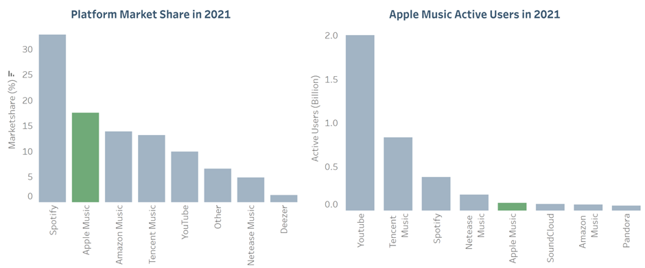
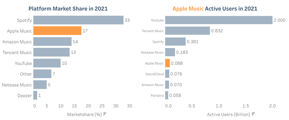
Secondly, I spotted a pair of vertical bar charts and remembered the advice I’d received during my first interview when I was told to switch the axes. I also decided to add bar labels and to use a brighter colour for the highlighting, showing this colour within the dynamic title. The improvements are displayed below and its clear to see that it is both quicker and easier to draw insight from the two new bar charts.
Before:

After:

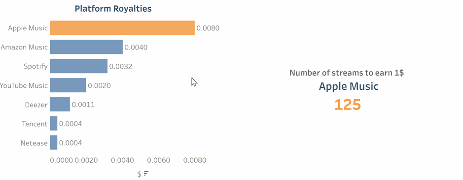
A comment I had heard from virtually everyone who had seen my viz was that they would’ve liked to see some supplementary data regarding platform royalties. I, therefore, found the royalty rates for each platform analysed in my vis and added a bar chart ranking the platforms by descending royalty rates. I also used a calculated field to create a BAN stating the number of streams required to earn 1$ using each platform. This section provided a good ending to the vis and helped make the analysis feel complete.

See the full viz before and after here.
In Reflection
Although I was happy with the improvements that I'd made to my vis, if I was to do a similar project again, I would approach it differently. I would spend more time planning the improved vis and would make sure to have a detailed drawing of the dashboard before proceeding to Tableau. Better structural changes to the dashboard could've been made but without that initial planning it was difficult to do so. I'd also look to reduce the amount of text in the dashbaord. This would require large structural changes and would again be much easier to implement with thorough planning.
