


Dashboard Week Day 3 & 4
For my final training project, I analysed the Gender Pay Gap across London and the UK using government data. As a Business Intelligence Analyst, my goal was to uncover meaningful insights, highlighting industries making progress towards equality while also calling out those still falling behind.
The project was completed in two days, with data preparation in Alteryx and dashboard building in Tableau. It was an intense but rewarding challenge that pushed me to apply everything I’d learned during training.
Approach
Day 1
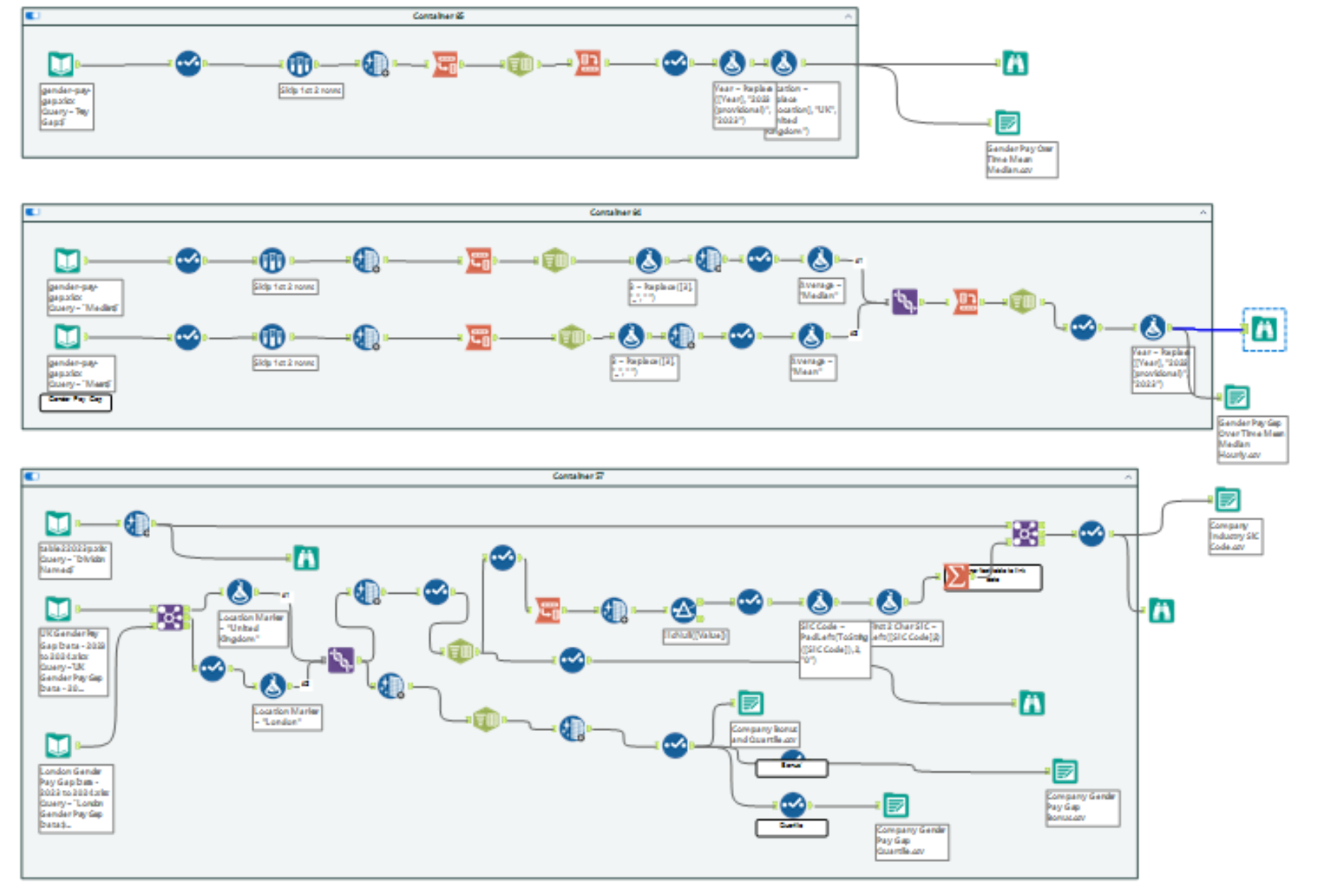
I focused on planning my dashboard and data cleaning and prepping in Alteryx, although I did not assume it would take the whole day. I began cleaning the data, but soon pivoted to creating sketches of my desired dashboard. This meant I didn't use vital time cleaning data that I wouldn't need, which was the right move.
One of the biggest challenges was assigning companies to divisions when they had multiple SIC Codes. To solve this, I built a separate table where each row linked a company to its division, enabling a clean relationship in Tableau.
Day 2
I finished data prep, and I moved everything into Tableau. I used two separate data sources instead of one combined source, as merging them caused issues. From there, I built out the charts I had sketched.
A significant issue was that I didn't include quartile filters in my sketch, so I didn't structure my data in my workflow accordingly. Therefore, I had two options: to go back into my workflow. Still, I was unsure if this would impact the charts I had already created. Therefore, I made a parameter for the quartile and two calculated fields (male and female values). It wasn't my original plan, but it worked well.
Not every chart made it into the final dashboard. For example:
- I dropped the company size vs. pay gap scatterplot since company size was a categorical range rather than a continuous measure. Instead, I built a bar chart comparing company sizes and the median pay gap.
- I also experimented with a scatterplot of male vs. female bonuses. This showed a strong positive correlation and a small cluster of companies where women outperformed men. Unfortunately, space limitations meant it didn’t make the cut.
Key Insights
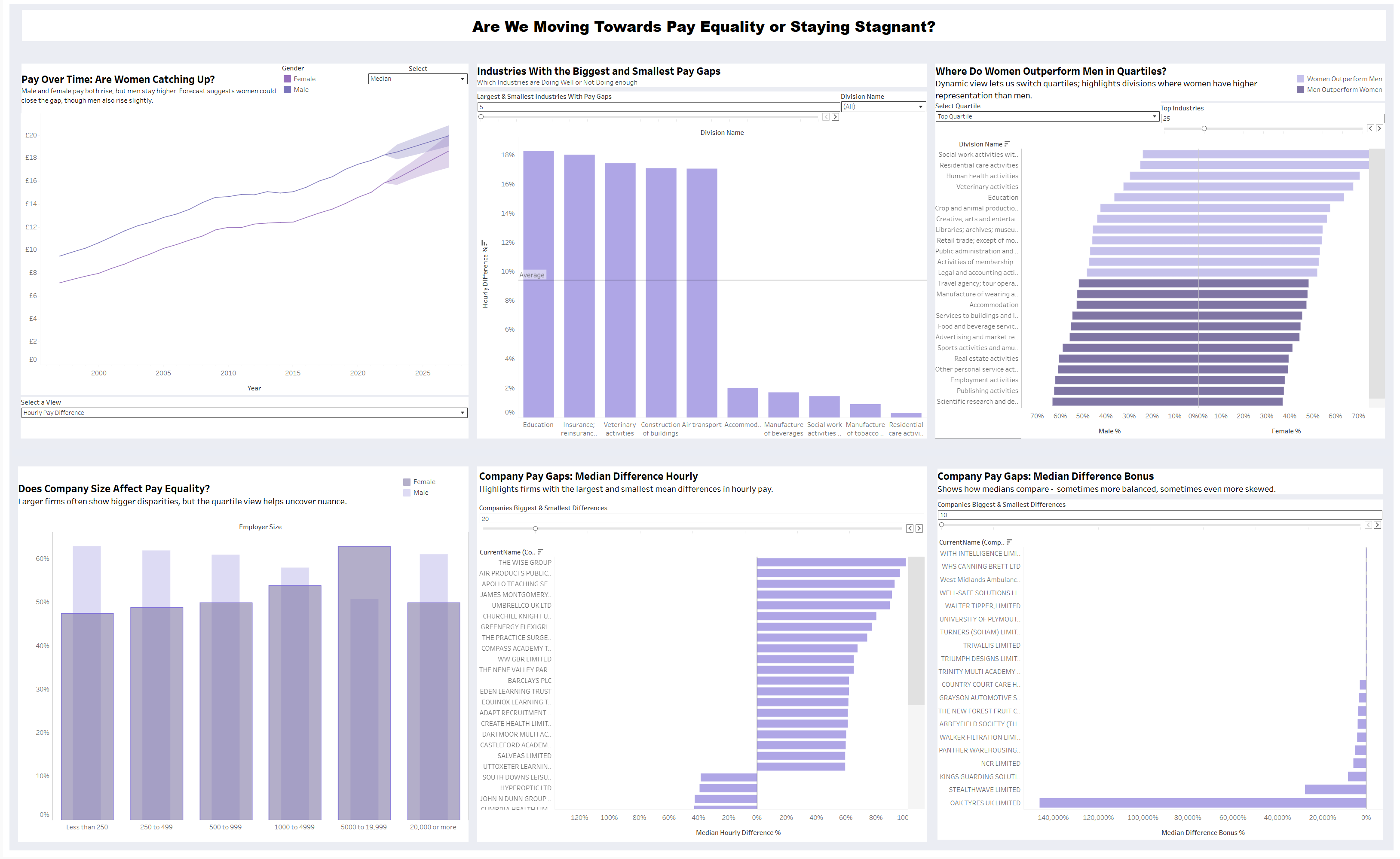
- The gender pay gap persists. London has a consistently higher pay gap than the rest of the UK.
- Median pay for men and women follows the same trend, but men remain ahead. Forecasts suggest the gap may narrow, but not disappear.
- Education surprised me. It had the highest hourly pay gap, yet women were also most represented in the top quartile.
- Residential care services stood out. They reported a 0% pay gap and the second-highest female representation in the top quartile.
- Quartile patterns were clear. Women were increasingly overrepresented in the lower quartiles, while men dominated the top and upper-middle quartiles.
- Company size didn’t matter. Inequality appeared across all sizes. Interestingly, companies with 5,000 - 19,000 employees had the highest female representation across all quartiles, but still showed inequality overall.
Lessons Learned
If I were to do this again, I would:
- Build three separate dashboards, each exploring different aspects, instead of relying on parameters and dynamic zone visibility to hide charts.
- Spend more time thinking about user interaction during the sketching phase, especially around filters like quartiles.
Final Thoughts
This project was a great way to end training. It combined technical challenges (like complex data cleaning) with analytical storytelling, and it felt like a realistic scenario - messy data, unexpected hurdles, and design trade-offs.
I’m really proud of the dashboard I created. It not only pulled together everything I’d learned but also gave me the confidence to take on complex data projects during placement.
You can explore the dashboard for yourself here:
https://public.tableau.com/app/profile/claudina.mukangabo/viz/AreWeMovingTowardsPayEqualityorStayingStagnant/AreWeMovingTowardsPayEqualityorStayingStagnant