


Sometimes, you need to show 3 values along a dumbbell chart. This could be to show the comparison over time between 2 points with an intermediatory point, to showcase the extent of value changes between a similar period of time. This blog will provide an overview of how to create them in PowerBI, using the Chocolate Index Workout Wednesday as an example.
The Process
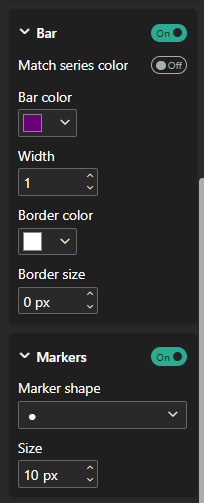
- Select a clustered bar chart and drag the 3 fields on to the X Axis, in this case the Indices for 2015, 2020 and 2025, as well as the category on to the Y axis. Adjust the legend position to top left. On the Format Visual tab, scroll down to the Bars section and turn all bars to be 100% transparent.
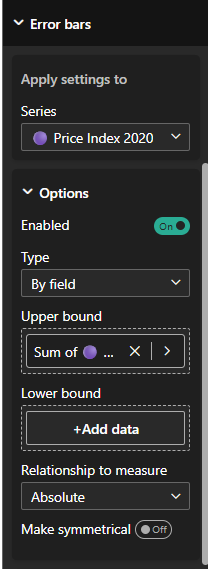
- To create the dots, navigate to the Visualisation Pane, then to the Analytics tab. Scroll down to the errors bars section. The following configurations need to be setup for the middle and most recent period fields, where the upper bound is set to the sum of the field itself, and marker type set to circle and maximum sizing. In order to get the line's connecting the dots, for the lowest value (2015 Index Field), set this as the lower bound and the upper bound as the highest value, with the bar colour set to grey.
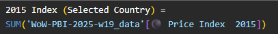
- For the tooltip, on a new page set the canvas background to the Tooltip size. For the values to adapt to each country when hovered over, new measures need to be created. For the Index Value for each year, the following measure is created for each.
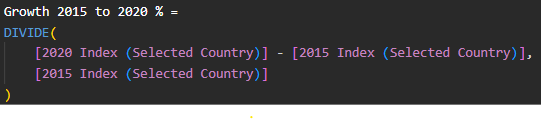
- For the growth between periods KPI, it requires a calculation for the value itself, as well as the measure for formatting. The value is found by dividing the difference between the 2 periods over the original year. For example, the growth from 2015 to 2020, take (2020-2015)/(2015).
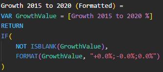
- Formatting the values, in this case to have the +/- sign and to a single decimal place is done by creating a new value for each of the change between period calculations.
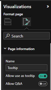
- After configuring the charts and KPI's as you wish, then go to the Format Page, Page Information and Allow use as tooltip should be toggled on.
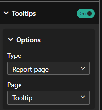
- On the page with the dumbbell chart, navigate back to the Format Visual tab, scroll to tooltips and select the page used to be the Tooltip page.
Voilà, you have your dumbbell chart shown below. You can hover over to see the tooltip appear for each country. If you would like to try this Workout Wednesday for yourself, click here.