


If you were to create a chart in tableau looking at how a percentage increase may change the number of sales you were making over time for example this is how you could do it...
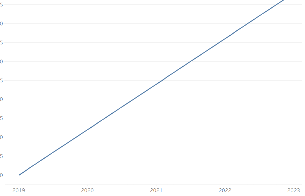
Firstly, create an axis looking at a change over time and create a calculation that will increase over time. It may be the case in your data that you know how things would increase or have been increasing in the past - in that case use that calculation to create a graph that looks something like this.
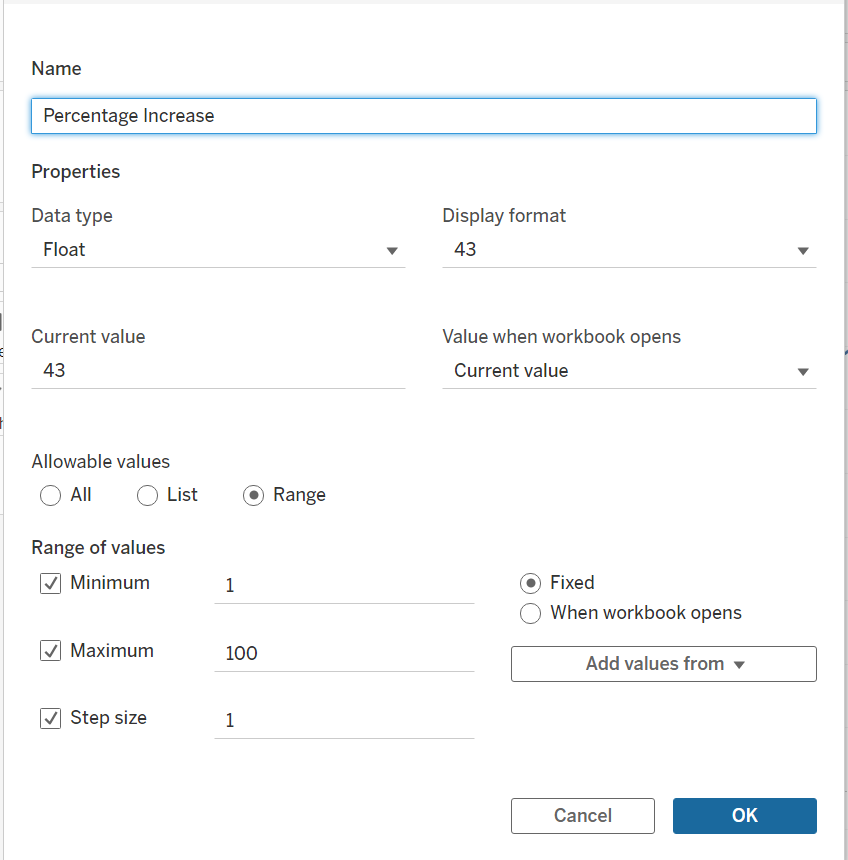
You then will want to create your parameter. I want to create a parameter that will look from 1% to 100% increase so have created a parameter as such.
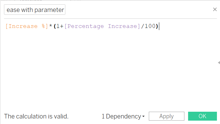
You know want to combine your parameter into your calculation. For this example I will be using my inital field [Increase %] and using day one as the first month of my [Order Date] and then working out the increase from that point. I then times it by my parameter [Percentage Increase].
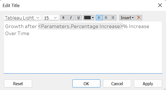
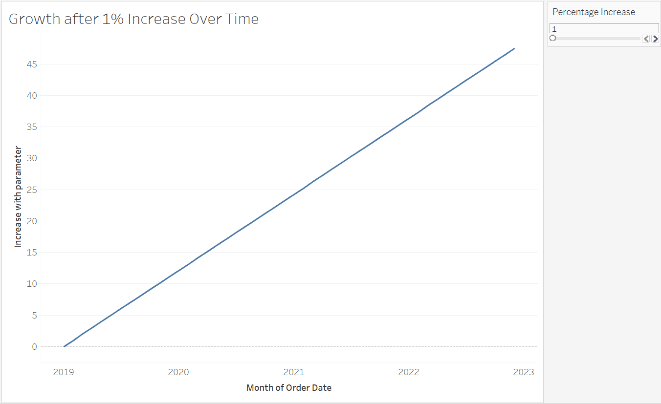
This calculation replaces the initial [increase %] on my rows and then you can toggle through the different percentage increases. For a nice final touch you can include the parameter in the title of your chart to really guide the user as to what may be happening.
and it will look something like this...
This process can be used in many different examples, including when you calculate a moving averages and want to change how far you may want to go back when calculating it. But here is a quick guide on how to involve parameter in your calculations and how they can allow a user to change their graphs