


For the final day of dashboard week we were tasked with creating a dashboard, using rugby league data, to answer a question about how teams or players have performed in either the world cup 2022, NRL or the UK super league. Here is Lornas post with our task. I decided to pick task 2.a which was looking at key stats in the 2022 rugby league world cup.
After a quick bit of data discovery I got on to sketching. I found in the data that there was an abundance of stats about each player in each game so decided to largely focus my dashboard on KPIs and also looking at how these stats changed over the world cup. Below is my sketch using excalidraw
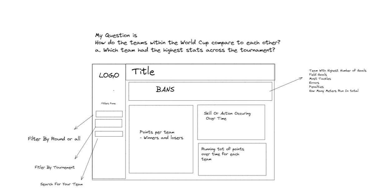
I followed this plan very closely and by the time my 3 hours were up I had the following dashboard
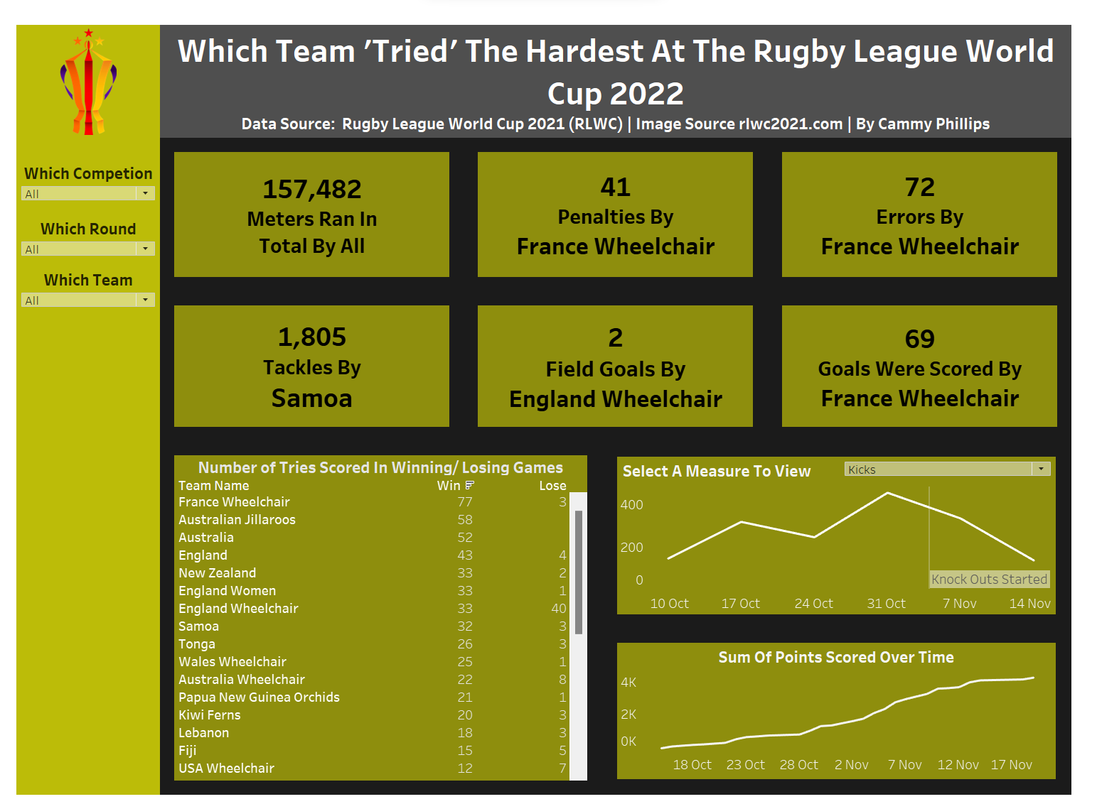
Some useful techniques that I used within my dashboard included
- Adding my filters pane filters to context. This meant that my BANs were accurately representing the 'top one' of what was filtered into view.
- Having a parameter with different measures (e.g. kicks and passes) and creating a case calculation so that changing the parameter will change the measure that is shown on the graph
- Addind context to my data, initally, I wasn't sure why my line graph with measures over time dropped off towards the end. After a quick search I found that this was likely due to the knock out stages starting at around this time so less matches were being played and hence less of my measures were occuring
- Sorting my rounds so that they go in order of the rounds and not in alphabetical order (this makes everything make a bit more sense)
- When creating my BANs duplicating the sheets to ensure uniform formatting