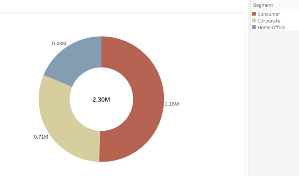
Pie charts have gained a bad reputation…
They are not always great at showing very subtle differences in proportion, and they cannot clearly show a large amount of different categories all at once.
For smaller numbers of categories, however, they can be pretty effective, and are worth considering for part-to-whole visualisations. Carl shared a video with us about the theory behind how we read pie charts by Robert Kosara, and it’s well worth a watch if you’re curious:
https://www.youtube.com/watch?v=NxmHDNNTFyk
To make a classic pie chart using the Superstore dataset, we might want to look at how the number of sales differed according to Segments (e.g. Consumer, Corporate, or Home Office).
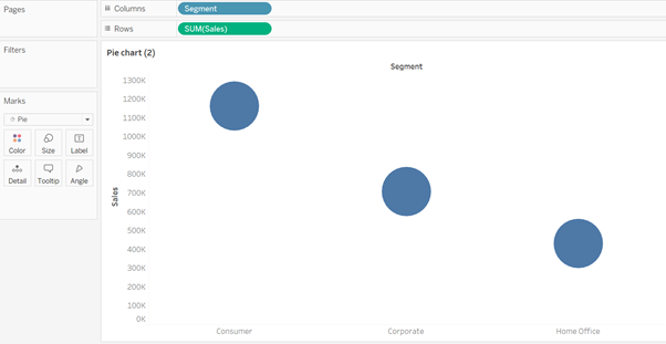
To make a simple pie chart of this data, drag 'Segments' to the Columns shelf and '#Sales' to the Rows shelf. In the Mark card, change mark type to ‘Pie’.
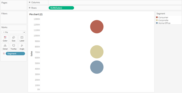
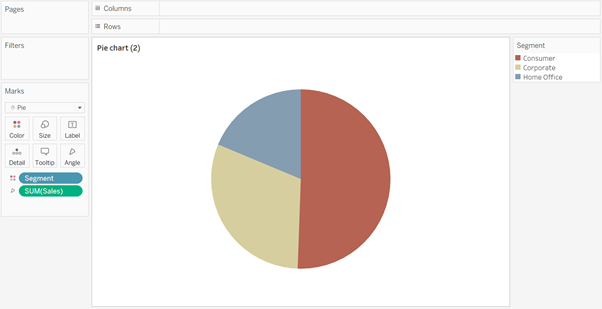
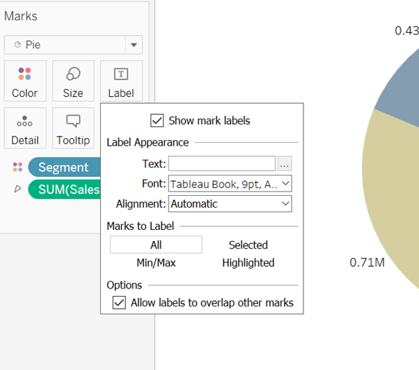
Now drag the Segment pill onto the Colour shelf, and Sales onto the Angle shelf. Labels can be added for more detail - in the Marks card, click 'Label' and check the 'Show mark labels' box.
Pie v.2: Donuts and Bagels
The ‘donut’ or ‘bagel’ chart can also be very useful; you can add big aggregate numbers in the centre to help dashboard users to quickly understand the total value being represented.
In your existing pie chart worksheet, right click in the Columns shelf to add a New Calculation 'MIN(0)', and then Ctrl + click and drag it across in the shelf to duplicate it. Right click on either green MIN(0) pill and select ‘Dual Axis’, and then right click on any axis to select ‘Synchronise’.
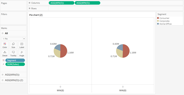
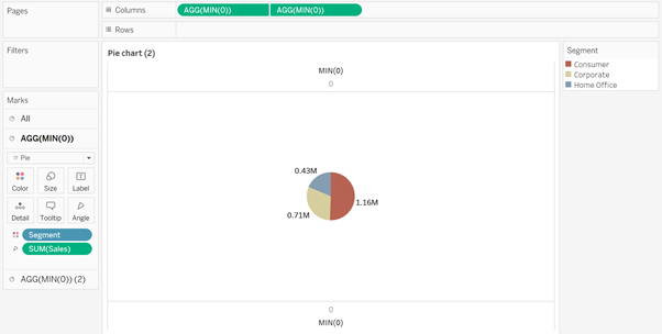
You will see that you have three sections in your Marks card: ‘All’, and the two pie charts (which are now basically stacked on top of each other). Go to the Marks for your second pie chart (which is the one that appears to be ‘at the front’). Remove any values from the Colour, Angle and Label shelves; you can now manually set the colour of the ‘front’ pie to white (or whatever your background colour will be), and manually adjust the size to make this pie smaller, revealing the angles of the pie underneath.
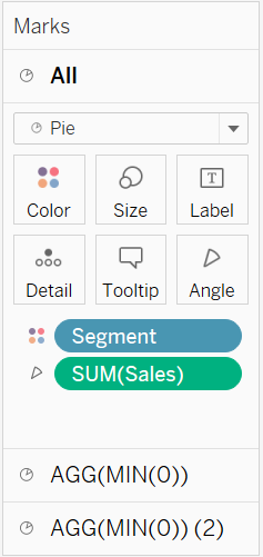
To add a number in the centre of the donut/bagel, you can drag it onto the Labels mark for the ‘front’ pie. You might want to format this label differently, to help it stand out from the others.
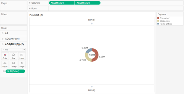
Right click on each axis and deselect 'Show Header' to hide the axes from view.
(Bonus: If there is a central line remaining on your canvas, you can navigate to 'Format', then 'Lines', and set Zero Lines to 'None'.)
