


What are measure names and measure values?
Measure names and measure values are two variables created automatically by Tableau.
- Measure Names is a dimension that contains the name of each measure in your dataset (does not include the names of dimensions);
- Measure Values is the combination of all measure values.
Why are measure names and measure values important?
They allow certain features in a plot, like:
- They make it possible to depict two measures in the same axis;
- They make it possible to depict multiple measures in the same table.
How to use measure names and measure values?
To show how to use these two special fields, we will be using a dataset containing information of hourly wages of individuals in the US and possible determinants according to the US Census Bureau in 1985. Please read more about the data here.
After loading the above .csv file, drop [Value Names] in the Rows shelf and [Measure Values] in the Text Marks.
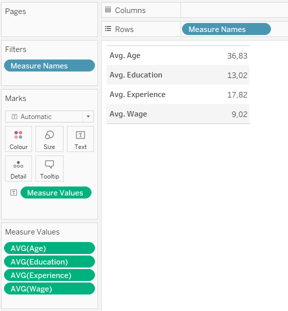
What you see above is that Tableau automatically creates a Measure Values card where you see all measure values and the function used to aggregate them. You can drag any of them out of the card if you wish to remove it from the plot. This way you can have a quick overview of the average of each measure in your data. You can also choose the function for aggregation.
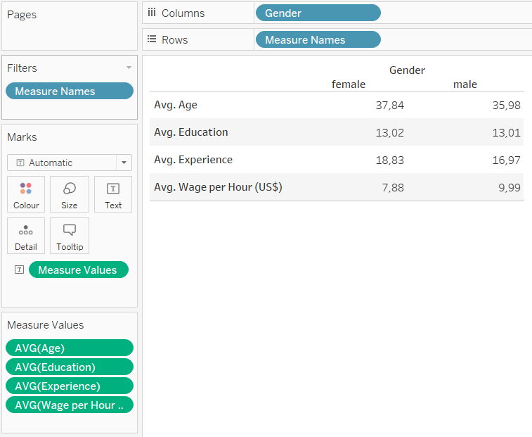
Now you can use additional dimensions to further explore subgroups in your data by dragging a dimension to the columns shelf. For example, you could analyse how the average value changes across gender.
How to use measure names and measure values to build a bar plot with multiple measures?
To plot a bar chart with more than one measure in its axis, build the plot first with only one measure. After that, drag the second measure of interest over the axis, to add it to the plot, as shown in the image below.
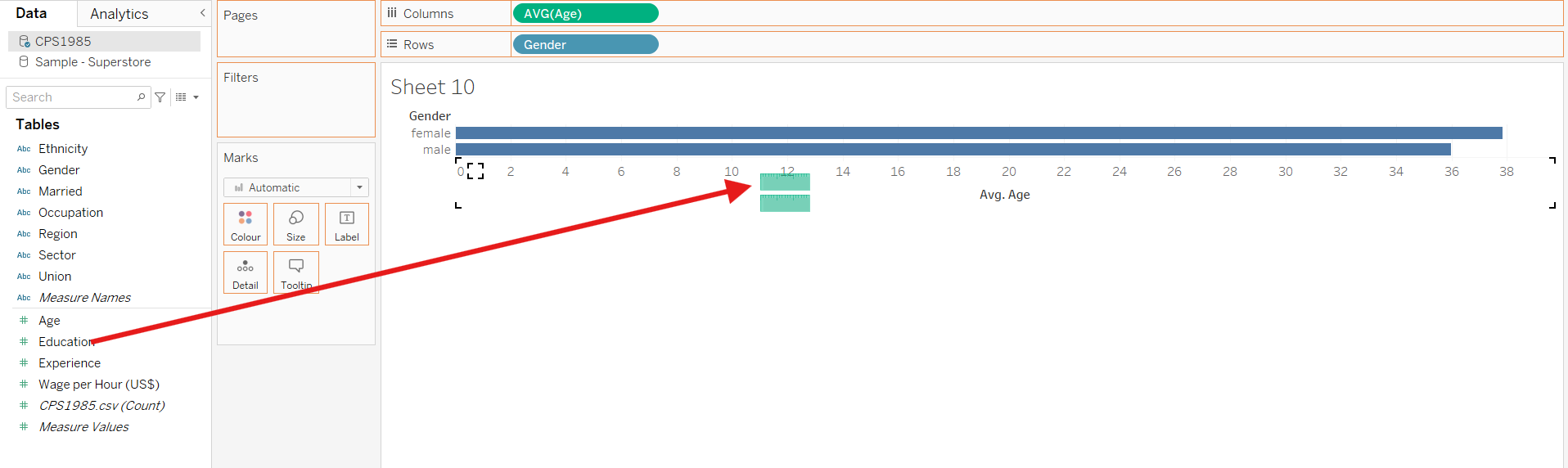
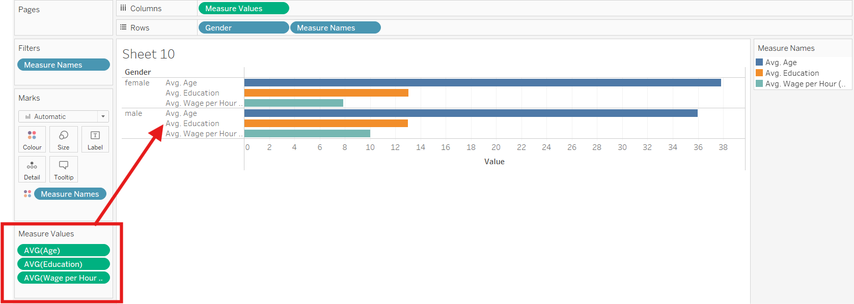
Tableau will automatically create the Measure Values card and you can define which measure you would like to include to the axis of the bar chart. You can also drag measure names to colour to have different measures in different colours, as shown below.
Conclusion
Measure Names and Measure Values are an effective way to show multiple measures in the same table or plot. Since dual axes visualisations only allow two measures, this method is a good alternative when you need to show multiple measures.