Period-over-period comparisons are valuable in many different sectors and can be used to extract important insights, so knowing how to calculate them is crucial. In this blog I'll walk you through all steps to create a PoP visualization that highlights a selected month and updates a colored line based on whether profit has gone up or down since the same month last year. This involves quite a number of steps, so I don't describe each in thorough detail. If you have any questions about certain steps, please reach out – I'm happy to help!
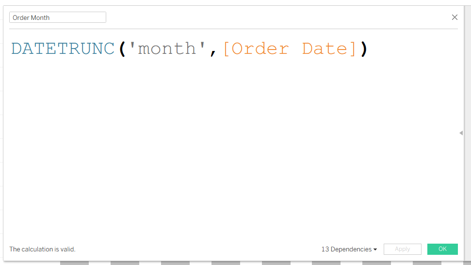
- Create a field for Order Month that you'll be able to reference moving forward, rather than needing to truncate in each individual calculation.
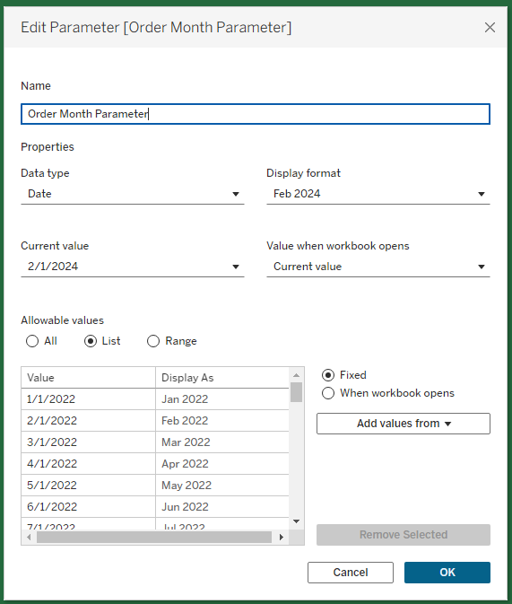
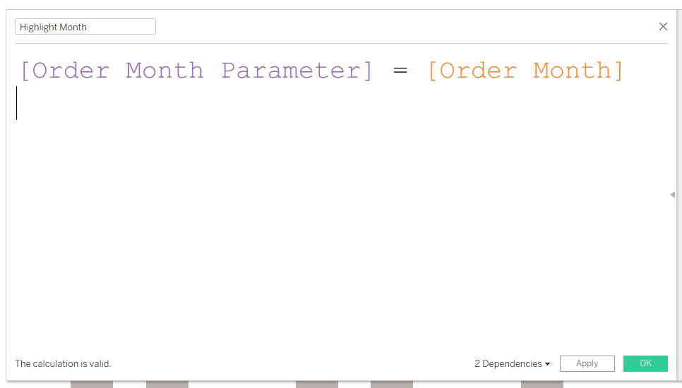
- Create a parameter for Order Month.
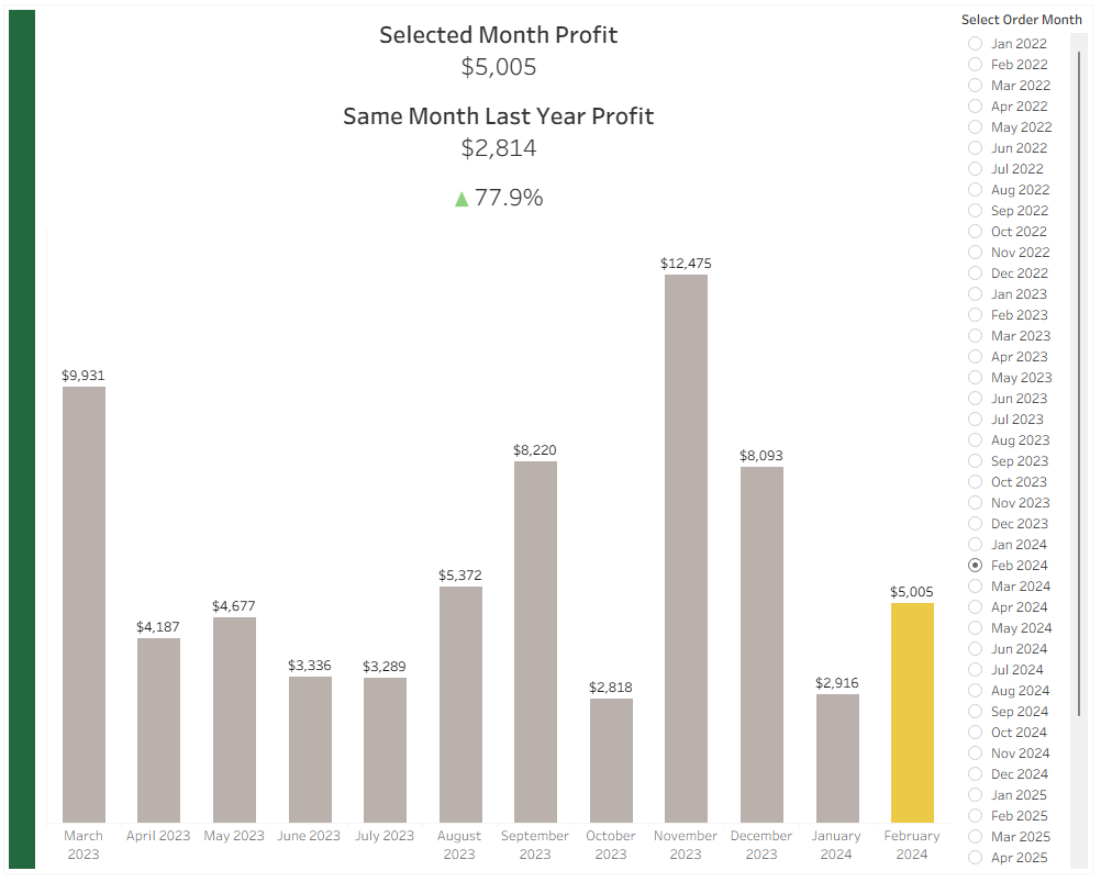
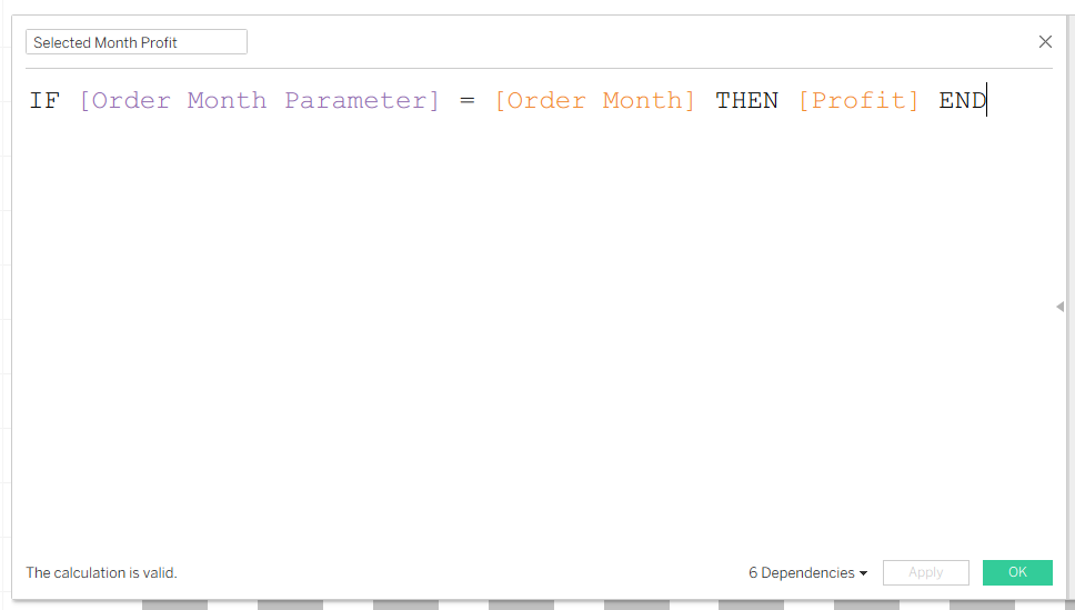
- Calculate the selected month's profit.
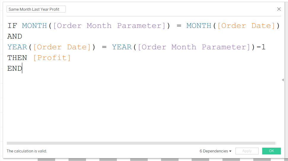
- Calculate profit for the same month last year.
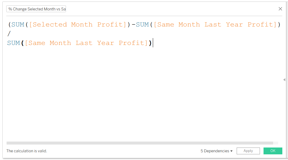
- Calculate the difference between the two.
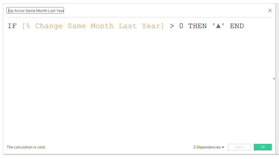
- Create a calculated field to generate an up arrow when the profit difference is greater than 0.
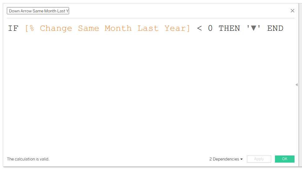
- Do the same for a profit difference below 0.
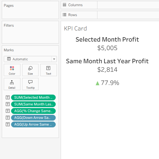
- Create a new sheet and drag the following fields onto Text: Selected Month Profit, Same Month Last Year Profit, % Change, Up Arrow Calc, and Down Arrow Calc. Edit the text to be formatted like so:
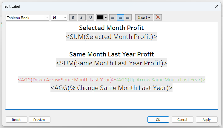
- Right click on the green pills and format the profit fields to be a custom currency with 0 decimal points, and the % difference field to be a percentage with 1 decimal point.
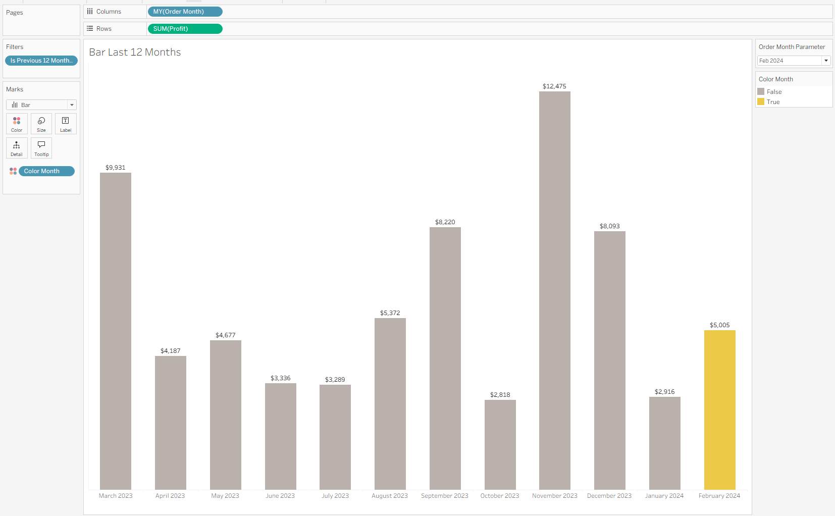
- Now that you've got the KPIs set up, you can create a simple bar chart displaying profit over time. Add profit to label. Format the labels to have a currency symbol and 0 decimal points.
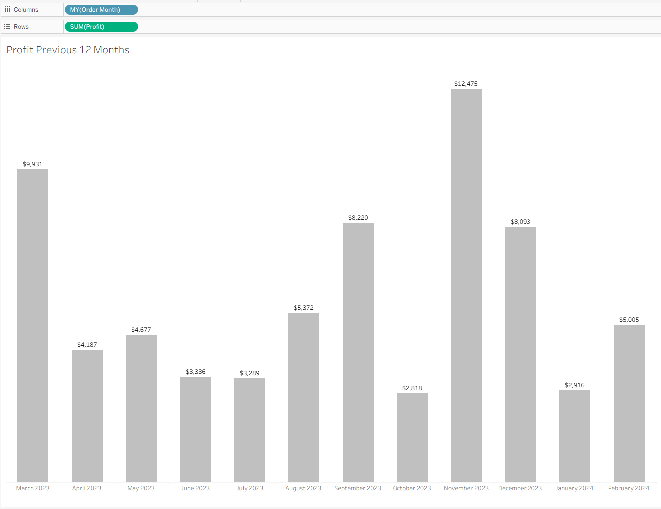
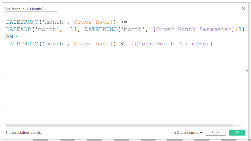
- Create a boolean calculation to show bars for 12 months prior to the month selected in the date parameter. Add this to the filter card and select True.
- Create a calculation to highlight the month selected in the date parameter. Add this to Color in the Marks Card.
- Your bar chart will now look like this:
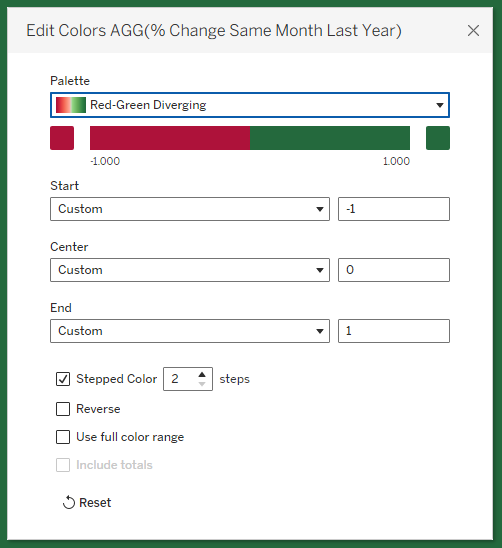
- To create the red/green line showing profit greater or less than 0, create a new sheet and drag your % difference calculation onto Color in the Marks Card. Change the view to Entire View. Edit the color settings like so:
- Now all the hard work is done and you can add your sheets to a dashboard! Be sure to check your work by selecting different months and seeing whether your calculations are updating as they should.