


What are some reasons why someone might have difficulty interpreting a tableau dashboard?
- Text to small
- Trying to communicate too many things with one graph
- Complexity ( cognitive overload)
- User interface
- Core Design of Graphs
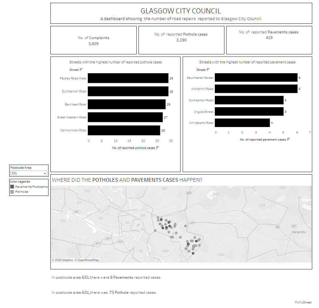
As part of this task we looked at data from Glasgow city council on exploring the number of reported road repair data. I focused on ensuring that the dashboard was accessible for people who only use keyboards, those with visual impairments, neurodivergent and people who require a narrator to navigate around the dashboard.
I started of with a sketch of how I wanted my dashboard to look like on excalidraw.
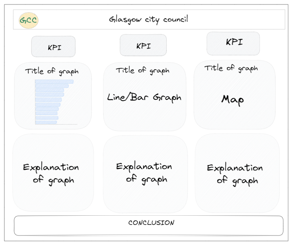
Reasons why I choose to do: 3 KPI's, 2 Bar Graphs and 1 Map
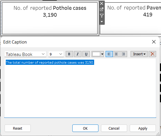
- KPI's: the KPI's include captions that can read out by the 'Speech Recognition Tool'. To ensure that there wasn't too much text on the screen I made the captions white to blend in with the background of the dashboard.
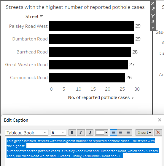
2.Bar Graphs: I decided to add captions to the bar graphs to rather then using the default captions. I wrote out the captions explaining the graphs in the most simple way and his the captions and again made the captions white to blend in with background of dashboard.
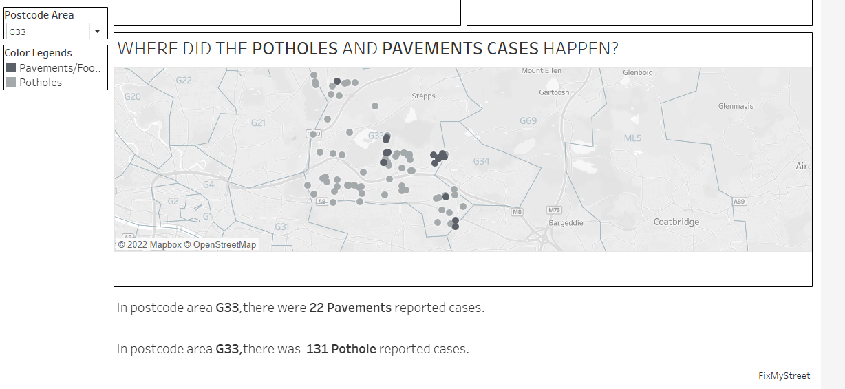
3. Map: the purpose of this map was to allow users to explore how many potholes and pavements/footpath cases there was. By selecting a Postcode Area to see where exactly the road repair had been reported. I decided to keep the color legend within the grey scale to ensure that those who are visually impaired can easily distinguish between the two road incidents.
Things I missed out:
- Make sure the font size is 12 or more, so those with visual impairments could easily read the dashboard
- Perhaps exploring color options outside of the greyscale to help people tell the difference between the two
Limitations:
- Adding captions to graphs can sometimes push the actual graph out making it seem uneven.