Analysing wine data!
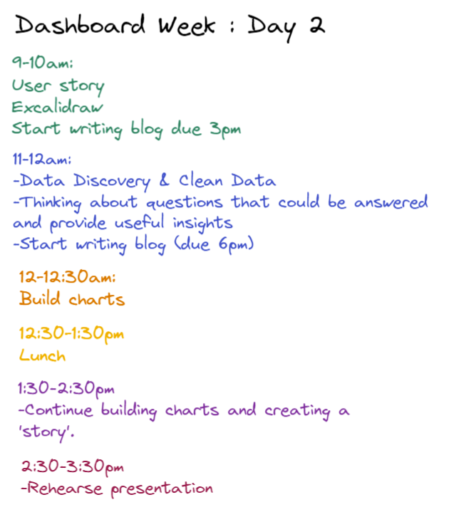
1. Firstly started of the day by drafting up a plan for how I wanted to plan my day.
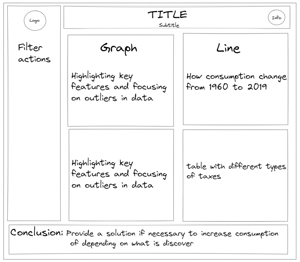
2. Then down a quick sketch on how I wanted my dashboard to look. (Adding descriptions to help re focus my analysis)
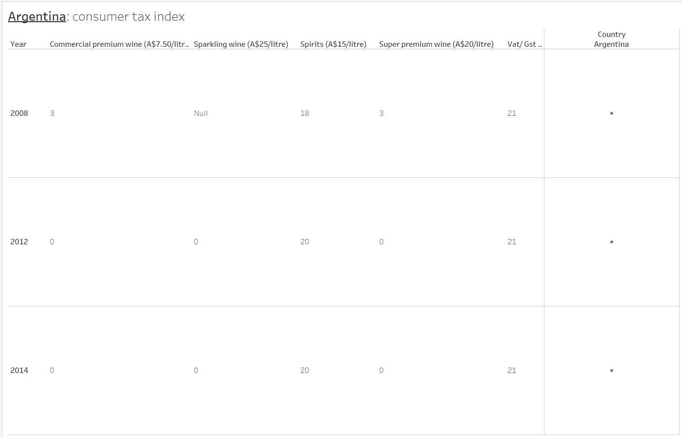
3. Now time to prep and cleanse the data: selected sheets from the mega data set that I wanted to focus on and cleaned them individually.

- Looking at the consumer tax data this was very fiddly. I had to separate each year of data separately then union them together in order to have a column for everything.
- Tried to make the workflow as simple as possible to avoid

4. Time to create some charts: This is one of the charts that I created as part of my analysis (perhaps may not have been the best chart choice to show this data.)
Key takeaways: Didn't get that much analysis done but learnt so much!
- It's fine to let go of parts of your plan if it's not working out. I was very adamant to look at certain variables without actually considering if it was going to be helpful for the user.
- "Measure once, cut twice"- I wanted to make my Alteryx flow very simple and cleanse my data in the most simplistic way without over complicating it and that's when things went left bringing the data into tableau prep.
- Think about what type of graphs are the most appropriate for telling the story.
- Research the data topic if you have no knowledge on it. This really helps you to understand the data and produce a dashboard/charts that provide useful insights.
- Check dimensions carefully: discrete or continuous, check role of data.