


It’s day two of Dashboard Week at the Data School New York! In case you aren’t familiar, Dashboard Week takes place during our final week of training here at Data School. During this week Data Schoolers are tasked with creating and presenting a dashboard each day using a data set provided by our coach. Additionally, this data is often accompanied by specific tasks or instructions for us to address in our dashboard design.
Here is the link to my final viz
Day 2 Topic
Today’s topic was much more open-ended than yesterday's golf courses in Portugal. This time around, we had to pick a data set from UNICEF's website and "build a beautiful informative visualization" to raise awareness about an issue and highlight our most important insights. Our focus for the day was on storytelling and visual design and our coach encouraged us to move away from the business dashboard mindset.
Data Exploration and Preparation
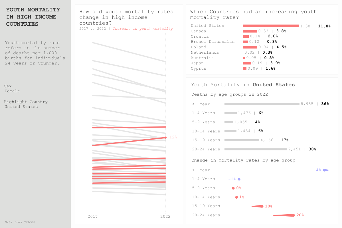
The majority of my day today was spent on 1) choosing a data set and 2) getting that data in good shape for Tableau. UNICEF publishes A LOT of good data so I found it very tough to decide what to focus on. Ultimately, I decided to use their data warehouse to build my own query, focusing on youth mortality rates and deaths across the world. I will say that although building the actual query took some trial and error, it made cleaning the data a lot easier than if I had used their existing Excel reports. To complement the UNICEF data and add an extra layer of analysis, I pulled in data from the World Bank that categorizes countries into an income group.
To Wireframe or Not to Wireframe
Because exploring and preparing the data took much longer than anticipated, I decided to forgo sketching a wireframe. Instead, I focused my energy on gathering insights from the data and crafting the story I wanted to tell with my dashboard. Not having a clear direction, I decided to start tinkering with the data in Tableau which helped me uncover several insights that then informed my chart selection and dashboard design.
My key insights were as follows:
- Most countries categorized as "high-income" experienced a decrease in youth mortality rates from 2017 to 2022. However, there were a few notable exceptions.
- The USA had the greatest increase in youth mortality rate among high-income countries.
- The USA's increase in youth mortality rate was largely driven by a disproportionate increase in mortality rates for individuals aged 15-24 while infant mortality cases decreased
Dashboard Design
Once I established what insights I wanted to highlight I focused on building charts that would help me tell that story. I decided to use a slope chart as the main visualization in my dashboard. This chart shows the change in mortality rates in high-income countries, highlighting only those whose mortality rates increased over those 5 years. I then built three more charts that would help the user get a more in-depth understanding of the findings presented in the slope chart.
In terms of the dashboard design, I stuck with a more conservative color palette given the nature of the topic. I chose a font I've used in the past for vizzes on social issues. I feel like the type-writer-esc font mimics the look and feel of official documents.
What Could Have Been
Generally speaking, I'm pleased with the outcome of my dashboard but would have definitely loved to get more into the why of the matter. While my viz helps the user identify a troubling pattern, it doesn't address the course of that pattern. If I had more time to work on this I would try to incorporate data that contextualizes my findings.
Lessons Learned
- Creative freedom is fun but hard. When you have a well-defined task it is much easier to find a path forward than when almost every aspect of your project is up to you to decide. Decision fatigue is real.
- After months of building business dashboards, I found it challenging to break away from that mindset and build more creative visualizations. This makes me want to take on more personal projects to expand my repertoire of viz designs.