


Being at The Data School for nearing two months I've had plenty of practice creating, critiquing, and understanding Tableau dashboards. So, today I thought it would be nice to critique my own initial application viz.
For the premise, I had found NFL betting Data and my mission was to design a dashboard that would provide betting insights for sports bettors.
We will break this down into the 5 parts of my dashboard individually and give a pro's/con's list associated with each part and any changes I would have made.
Part 1: Intro

Goal: To give a higher overview of the dashboard, familiarize non-sports bettors with common terminology, and give the user options for time periods.
Pros:
-Short Intro, straight to the point and sets a clear goal for the dashboard.
-How to use, data dictionary, and frequent terms grabs user attention and let them choose what time period they'd like to view.
-Letting user choose a timeframe is nice but in sports looking past 5-10 years is not great for analysis because teams change from year to year and 99% of players are not on the team that were 20 years ago.
-Hovering over each terminology would reveal a description of what that term means and how it relates to sports betting.
-Utilized sheet swapping to have custom date filter not visible for user unless its the chosen option.
Cons:
-Pictures at the top are not needed, would look cleaner without or just NFL logo.
-KPi's are not necessary here, they don't add much context to this section and are not centered.
-Time selection, would have been nice to break this down to a year by year for the past 5-10 and an option to look at all them together.
-Terminology is not centered, would have looked better as a table view and had a dropdown that revealed the descriptions. Would have saved on space and looked cleaner but think its necessary to have in there somewhere.
Part 2: Home Field Advantage

Goal: To give an analysis of individual teams when they play at home and their win details.
Pros:
-I like separating each section with a bar but I think there are better ways to do this. Such as spacing or taking the title out and having a very thin bar.
-Good supporting text to help people understand what they're looking at.
-I like the overall thought behind wanting to see how field win advantage affects games, I think it has potential for valuable insight.
Cons:
-Map provides no real value here. Hues look ugly with logo. (Not all geographical data needs a map)
-Donut chart is unnecessary and definitely not best practice.
-Wording for 'Less Favored' and 'More Favored' is a little confusing.
How I would rework it: Would have scrapped both charts and instead gave the user a way to looks at just home field win % for every team. This would be able to identify top and bottom performers at a glace. I then would have taken the spread grouping and added them as a filter that the user could choose from. This now breaks us down by overall team and each grouping of spreads. Also gives flexibility to see the opposite side of the spread and not being limited to just having favorited spread groupings.
Part 3: Over/Under's vs Home wins
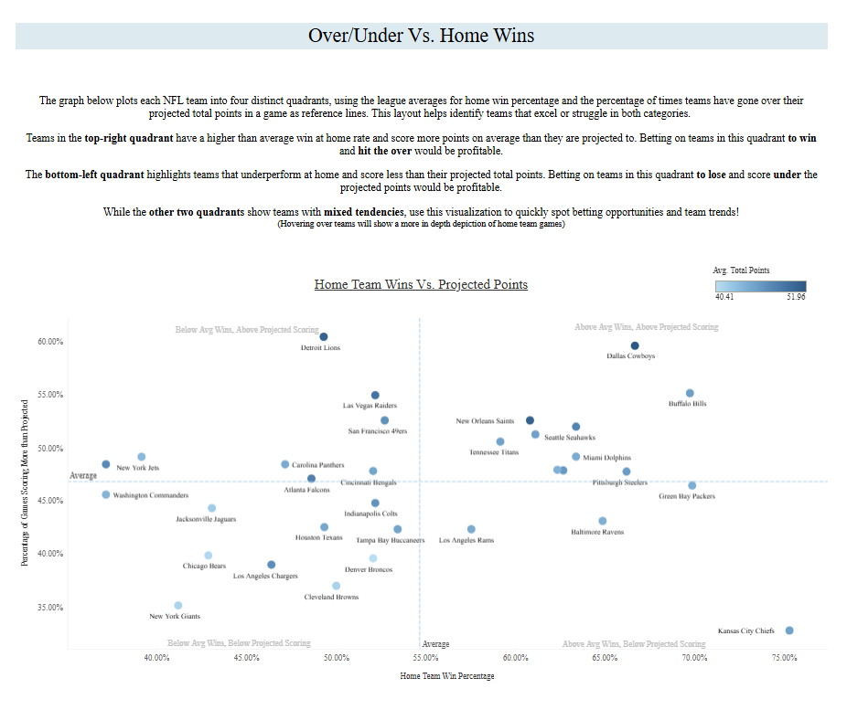
Goal: To see the relationship between home team wins and their over/under.
Pros:
-Again, description explains everything clearly and almost too much but it's nice for non data users to understand
-Love a good quadrant chart, think it shows exactly what the goal of the chart was meant to be.
-Coloring by Avg total point gives us a little more insight as to how the lines are being made against teams, we would expect the darker circles to be in the top part of the graph but we see some outliers.
-Labeled each quadrant for clearer understanding
-Honestly, provides very good insight for what it shows
Cons:
-Axes typically should not get cut off but in this case too zoomed out might not be relevant.
-Not much flexibility with filters, stuck on home teams only. Would have definitely been nice to include an option to see Home, Away or all games
-Projected scoring is a little confusing because
Part 4: Away Team Warriors
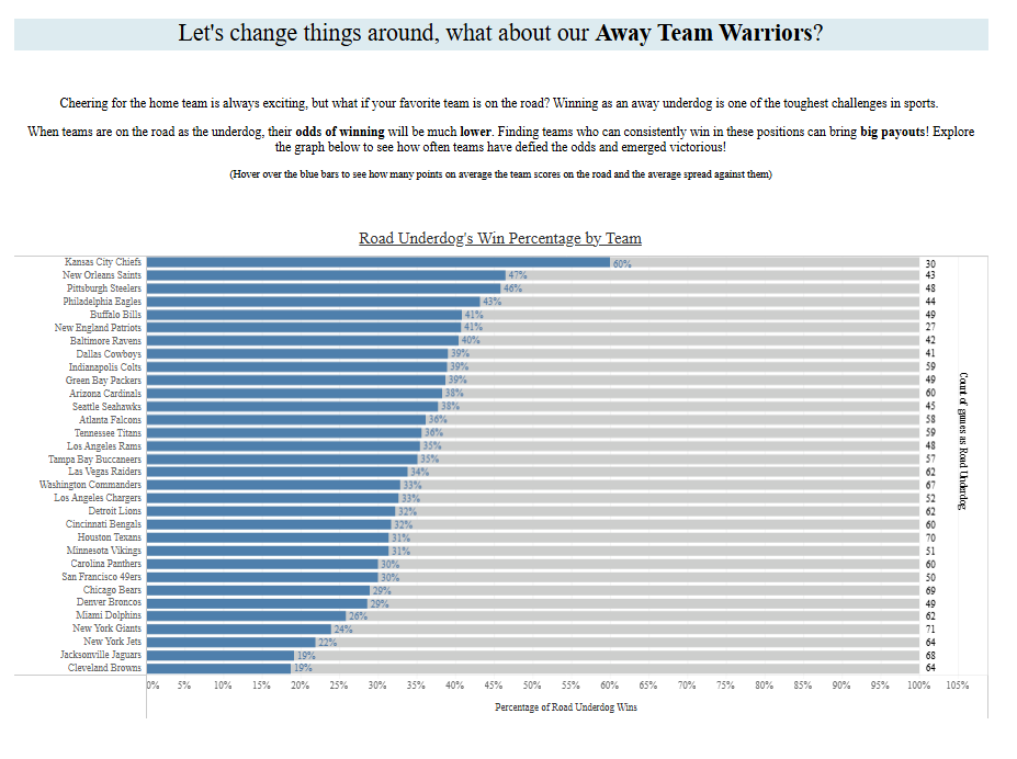
Goal: To give insights on when teams are the away underdog.
Pros:
-Quick insight. We immediately know who the top teams are vs the bottom team.
-Tooltip is very explanatory, gives deeper insights on each team.
-100% stacked bar chart makes sense here because we are comparing on a % of basis and the goal for each team to be 100%.
Cons:
-A lot going on here, Count of games as road underdog on the right isn't necessary because its in the tooltip.
-Gray bar needs to be toned down a lot, blue bar should be the main focus
-Zero lines need to be taken out and dividers.
How I would rework this: This is where I would have combined the Part 2 that we were looking at. They are essentially the opposites of the same categories. Could have made a similar chart but give the user the flexibility to dynamically change home, away, all and change by all or certain spread groupings. Also now that I'm thinking of it, comparing teams to themselves when home vs away in different categories could have also produced some meaningful insights
Part 5:
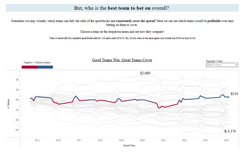
Goal: To show how teams compare to their spreads and over time and which teams make or lose money.
Pros:
-This is and always be one of my favorite charts in my Tableau Career. Biased because I think this was the first time I did something semi-complex and was so happy to see how it came out
-I think this hits the goal right on the head. I brought a simple data row to show an actual monetary value associated with each team. That was the goal of this whole dashboard and is missed in a lot of other visualizations because I didn't have the data but this one did.
-Color is blue for positive and red for negative money, colorblind friendly, and showing the total for current is a great touch.
-Being able to see the comparison to all other teams in the background is also something that is super helpful.
-Max and min of the view is great to see the highest or lowest range you'd be up or down
Cons:
-None because I still look back and love this chart. Just kidding, lines need to go once again. Only line that would make sense to keep would be the zero line as it is the premise of being above or below.
-Knowing what I know now, I'm not sure if I'd keep it as a parameter action, opposed I think it would be nice to click on the actual line and highlight a different team. Would help on quickness to insight as you'd see the top/bottom line and immediately want to see who it is.
-Overall other than a little polishing I wouldn't change much.
Conclusion:
This was much more fun than I expected it to be. I will say almost everyday during training when I learn something new, I think back to this dashboard and realize all the simpler/more efficient ways I could have made this dashboard and its fun to actually sit down and think through my thought process from then till now.
Thank you so much for reading, if you're interested in viewing the dashboard I will link it here. And if you'd like to see about my experience in making this dashboard/applying to The Data School, you can find that here.