


Today we we're introduced to accessibility and how it impacts our design choices to ensure that nobody feels excluded from being able to interpret a visualization.
Below is a summary of the three types of design to ensure this.
Inclusive Design:
- Inclusivity refers to the practice of ensuring that all individuals, regardless of their abilities, backgrounds, or characteristics, are included and have equal opportunities to participate in various activities or environments.
- Inclusive approaches aim to embrace diversity and eliminate barriers, fostering a sense of belonging for everyone.
- Accessible Design:
- Accessible design focuses on creating environments, products, or systems that can be easily accessed, understood, and used by a wide range of individuals, including those with disabilities.
- This design approach aims to remove barriers and provide accommodations to make spaces or products usable for everyone, promoting equality and independence.
- Universal Design:
- Universal design goes a step further than accessible design by seeking to create products, environments, and systems that are inherently usable by the widest range of people, without the need for adaptation or specialized design.
- The principles of universal design emphasize flexibility, simplicity, and consideration for diverse abilities, ages, and backgrounds, ensuring that everyone can participate without the need for separate accommodations.
Challenge 1: Re-Design a Tableau Dashboard for Screen Reader Users.
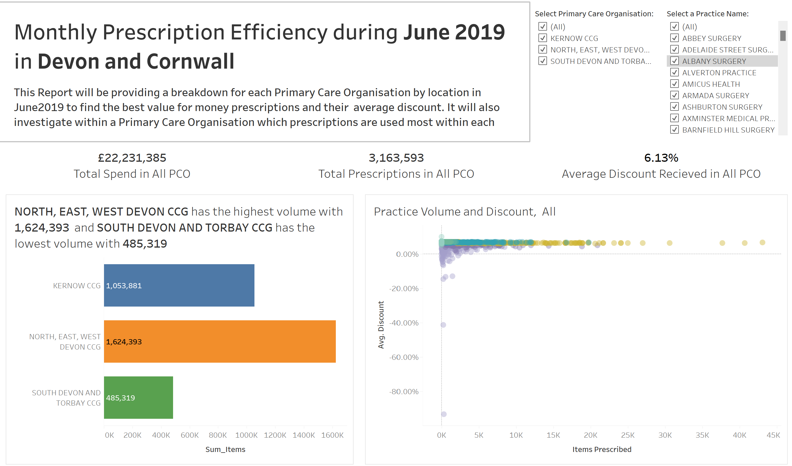
Below is a Screen Shot of what I had to edit:

These are the edits which I had in mind to change. The main focus was to be able to listen to the the main takeaways from the Chart titles. So making these Dynamic was the most important part. This could only be done however once I had chosen the narrative of the dashboard.
- Pick a user story line to follow
- Reduce the decimal points
- Descriptive and dynamic title with answers
- Containers in the correct order to be able to screen read in the correct order
- Remove any abbreviations
- Remove date from KPI (inc in title)
- Remove Map
- Edit alias of 'physiology' to remove numbers for clarity
- 2 charts for physiology, to be able to click to filter to see the drill down as(As two columns is harder to read in cross tab)
- Add caption in charts with full descriptions
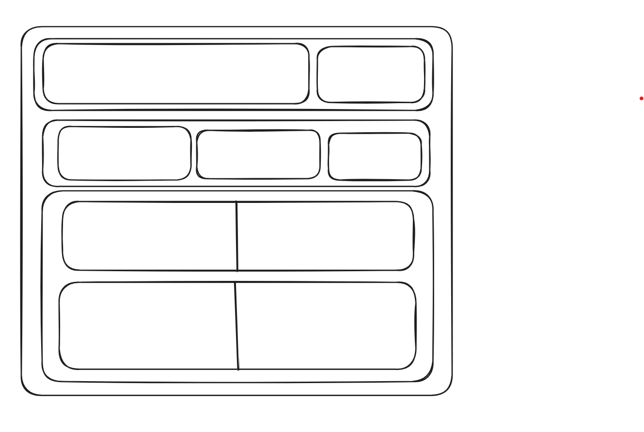
As Tableau naturally screen reads from top left to bottom right, sheets must be in the correct orders within containers, this can be checked by pressing the TAB button between them. So I used Excalidraw to plan out how I wanted to layout the dashboard / containers.
I was able under the time constraints to produce this Dashboard:
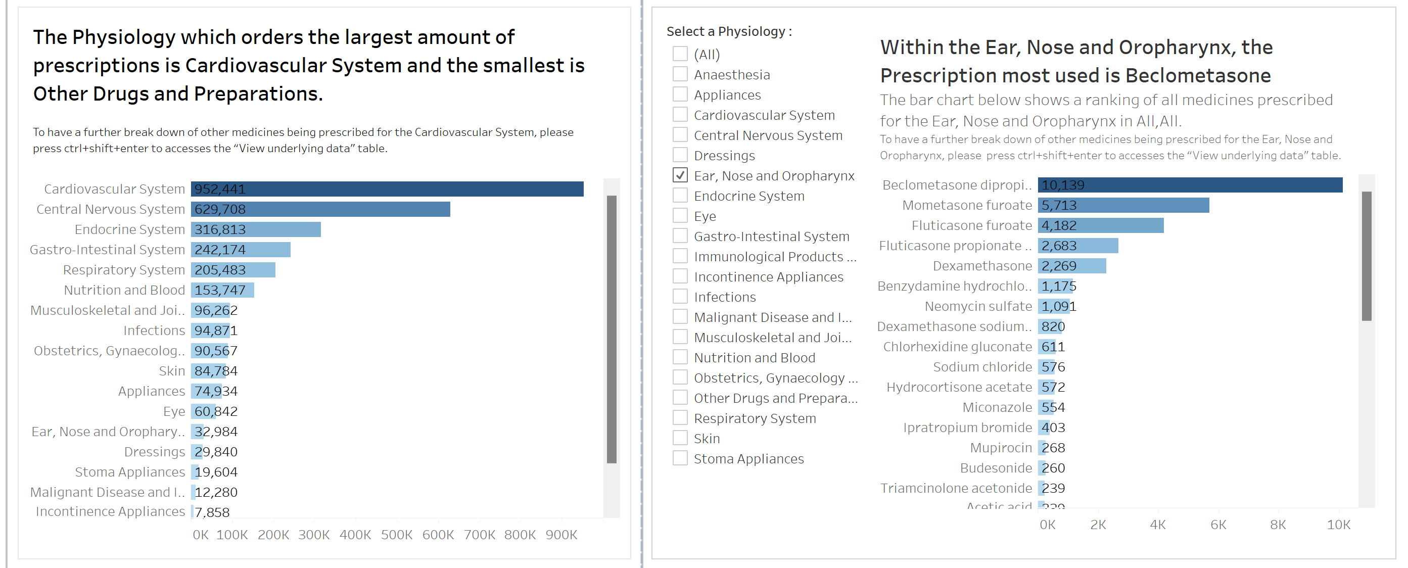
The main takeaways that I tried to implement:
Dynamic Titles for Clarity:Screen readers only read titles within sheets, not the charts themselves.Utilising easily understandable dynamic titles becomes crucial for users to grasp key takeaways.
- Enhancing Data Exploration:Since tooltips are not accessible to screen readers, informing users about the option to press ctrl+shift+enter allows them to explore underlying data in a table for a more in-depth investigation.
- Numeric Abbreviations for Conciseness:Despite potential accuracy reduction, abbreviating numbers (e.g., 2,711,980 to 2.7M) in BANs can enhance user experience, aligning with how information is commonly conveyed verbally, though this is subjective.
Overall a very insightful day learning about accessibility. Always try to make an effort to ask if there is anybody that you may need to make adjustments for - hopefully this can become the new norm!