Creating a graph within a tooltip in Power BI can be a valuable way to provide users with additional insights and data visualizations without cluttering your main report. Here's a step-by-step guide on how to achieve this:
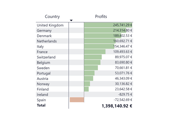
1. Create the Chart for the Tooltip: Start by designing the chart or visualization you want to include in the tooltip. You can create this chart in a separate sheet within your Power BI report, the one below is named Profits Table.

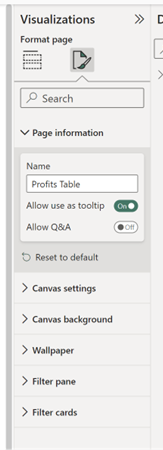
2. Enable "Allow Use as Tooltip": Once your chart is ready, go back to your report and select the sheet where you've created the chart. To enable the tooltip feature, click on some white space on the sheet to ensure you're in the right context. Then, follow these steps:
- Click on the "Format" tab.
- Choose "Page Information."
- Toggle on the "Allow Use as Tooltip" option.
This setting allows you to use this particular sheet as a tooltip.

3. Adjust Tooltip Size (Optional):Power BI doesn't automatically adjust the size of the tooltip popup like Tableau does. You can manually adjust the tooltip size to your preferred dimensions. Here's how:
- In the "Format" tab, click on "Canvas Settings."
- Edit the width and height to customize the tooltip size according to your needs.
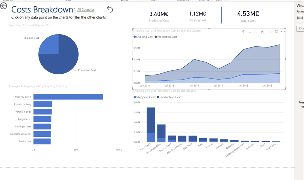
4. Select the Target Sheet and Chart: Now, go to the sheet where you want to add the tooltip, in your case, the "Cost Breakdown Sheet," and choose the specific chart you want to attach the tooltip to (in this example, the Area chart).

5. Configure the Tooltip: To link the created tooltip chart to the target chart, follow these steps:
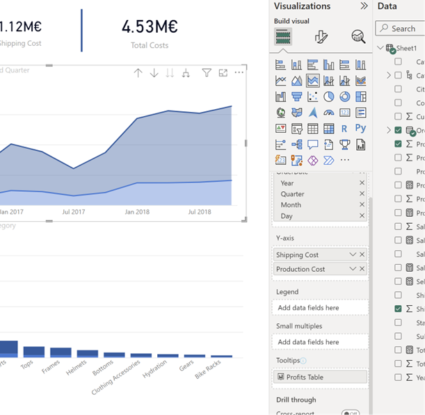
- Scroll down in the left-hand pane to the "Build Visual" section.
- Locate the name of the sheet containing your tooltip chart in the "Data" tab (e.g., "Profits Table").
- Drag this sheet's name into the "Tooltips" section of your target chart.
Shown in the bottom right hand side of the image:

This action establishes the connection between the target chart and your custom tooltip chart. When users interact with the target chart, the tooltip chart you created will be displayed with the data and insights you've designed.
In summary, Power BI allows you to create informative tooltips by building a separate chart, enabling the "Use as Tooltip" option, and configuring the tooltip size if necessary. Then, you can associate this tooltip chart with a specific visual element in your report. This feature enhances the user experience by providing additional data and context in a clean and organized manner.
