For day 2 of dashboard week, we were challenged to create a dashboard inspired by the ‘natural history’ of LEGO, using the Rebrickable LEGO Database. For my dashboard, I began by preparing the data in Snowflake, and then creating the dashboard in Tableau.
SQL:
After looking at the database, I knew I wanted to focus on LEGOs botanical sets and see which elements of these went into individual ‘species’ from the Botanical collection. The database had the following schema:
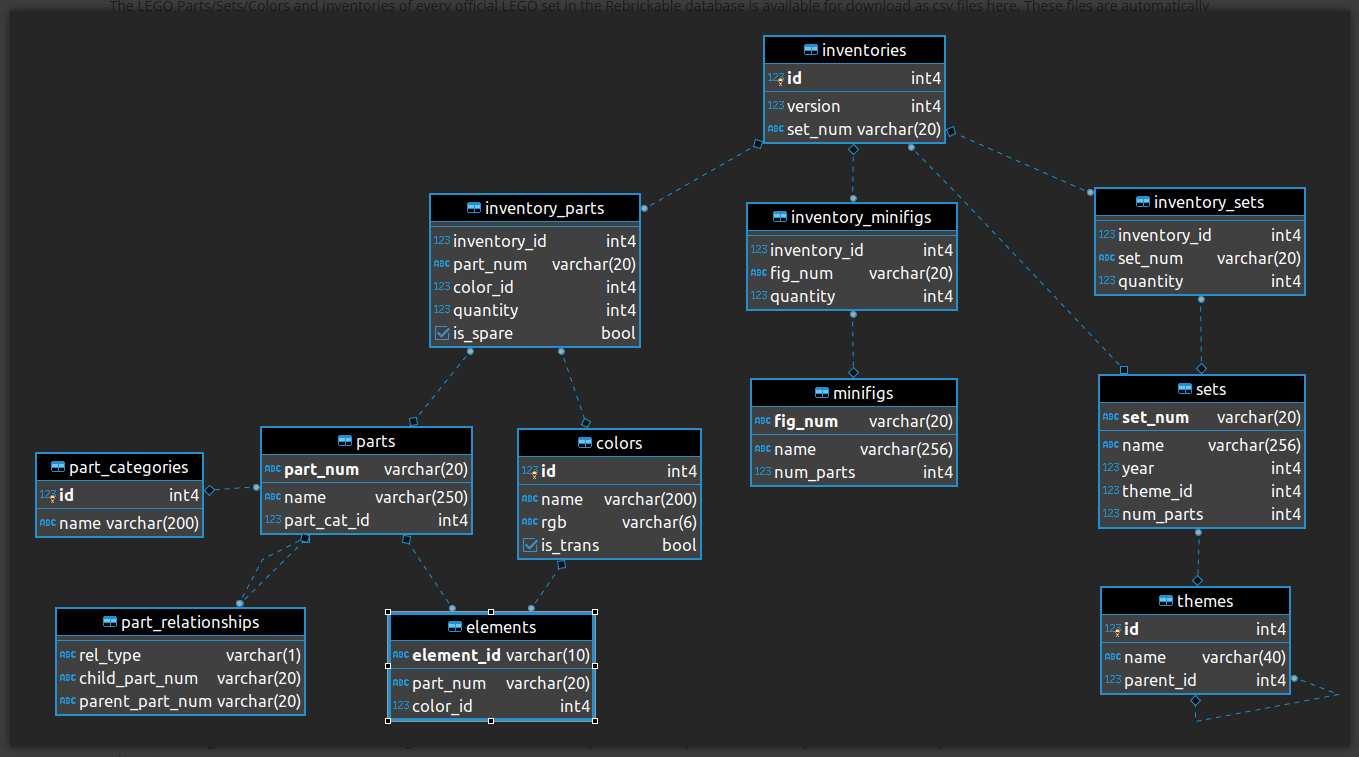
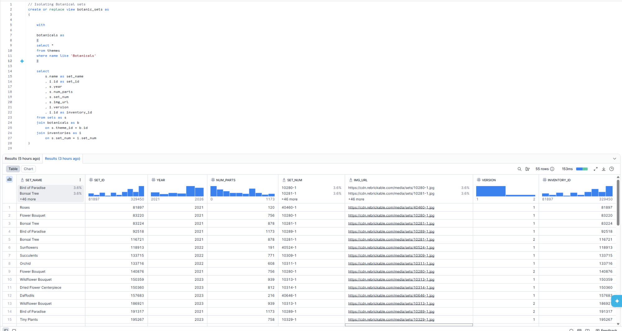
For my analysis, I wanted to build two tables: one that looked at specific botanical sets, and one that had additional information about the parts required to make them. I began by isolating the sets within the botanical theme. I could then use joins to apply this filter to both tables that I needed.
For the first table, I joined the themes (filtered to ‘botanicals’) with the sets table and the inventories table, so that I could get a table including the year of release; the image url; the number of parts for the set; and the different versions needed for the set. This table also included the inventory ID so that I could set up a relationship between the tables I planned to output.
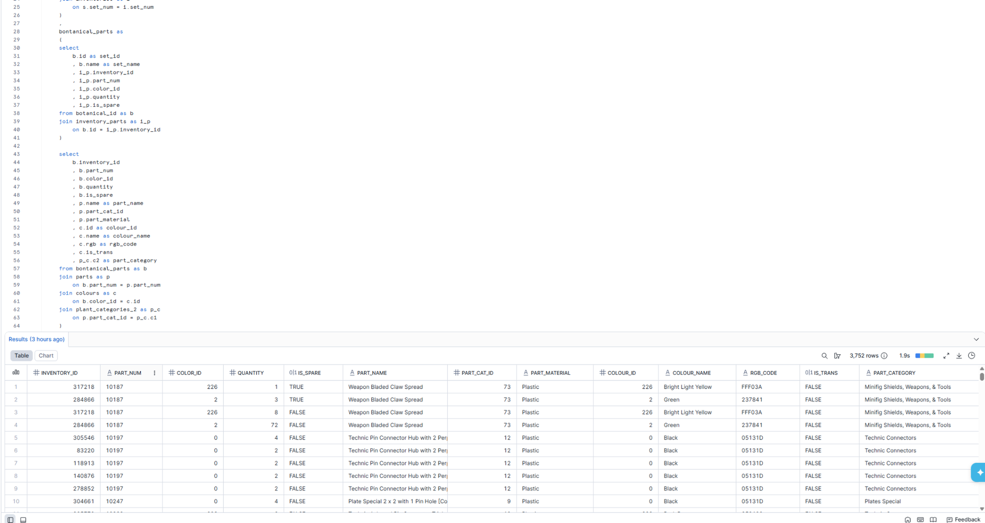
For the second table, I joined the work I had created to the inventory parts table, the parts, part categories and colours tables. Using a combination of CTEs and the select tool I limited the fields so that my output only included those I needed.
The Dashboard:
Having created my dataset, I was able to start building my dashboard.
Within the time constraints of Dashboard Week, I was unable to get my dashboard to a level I was happy with, and my first output was the dashboard below. However, I was able to rework this later on.
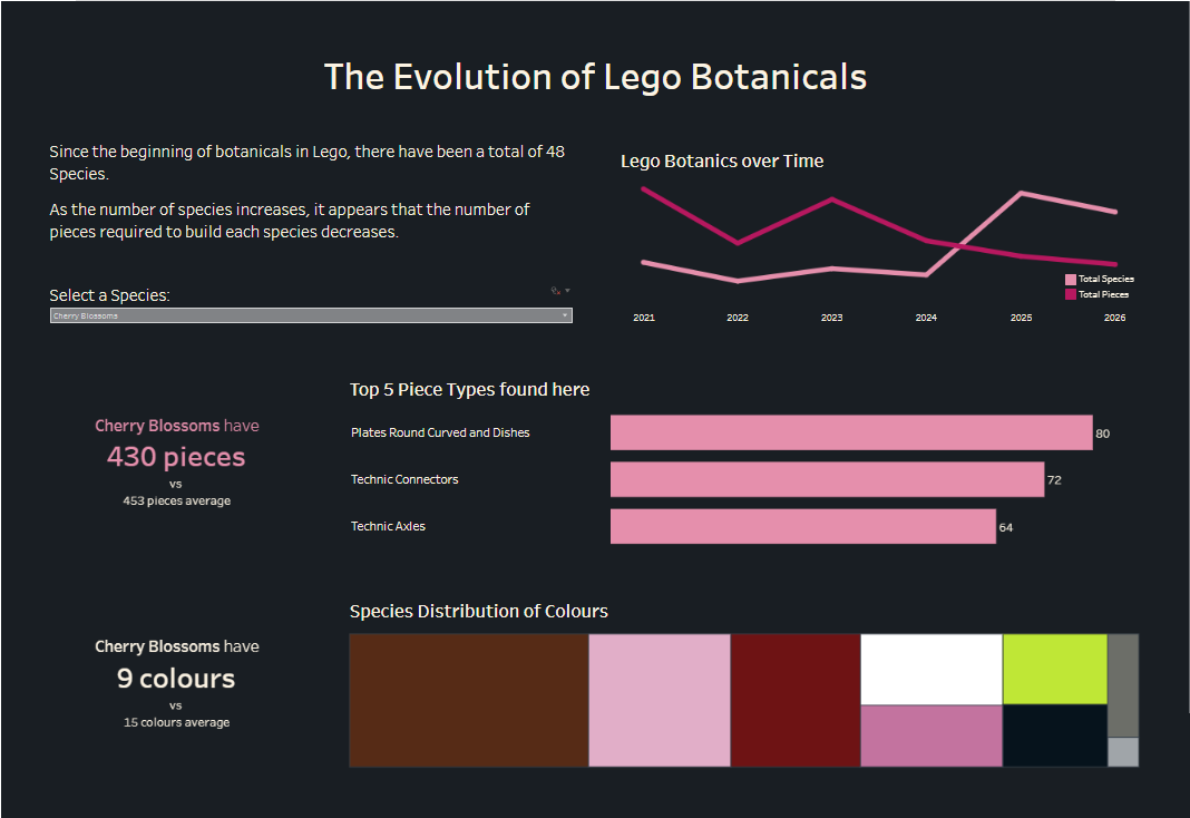
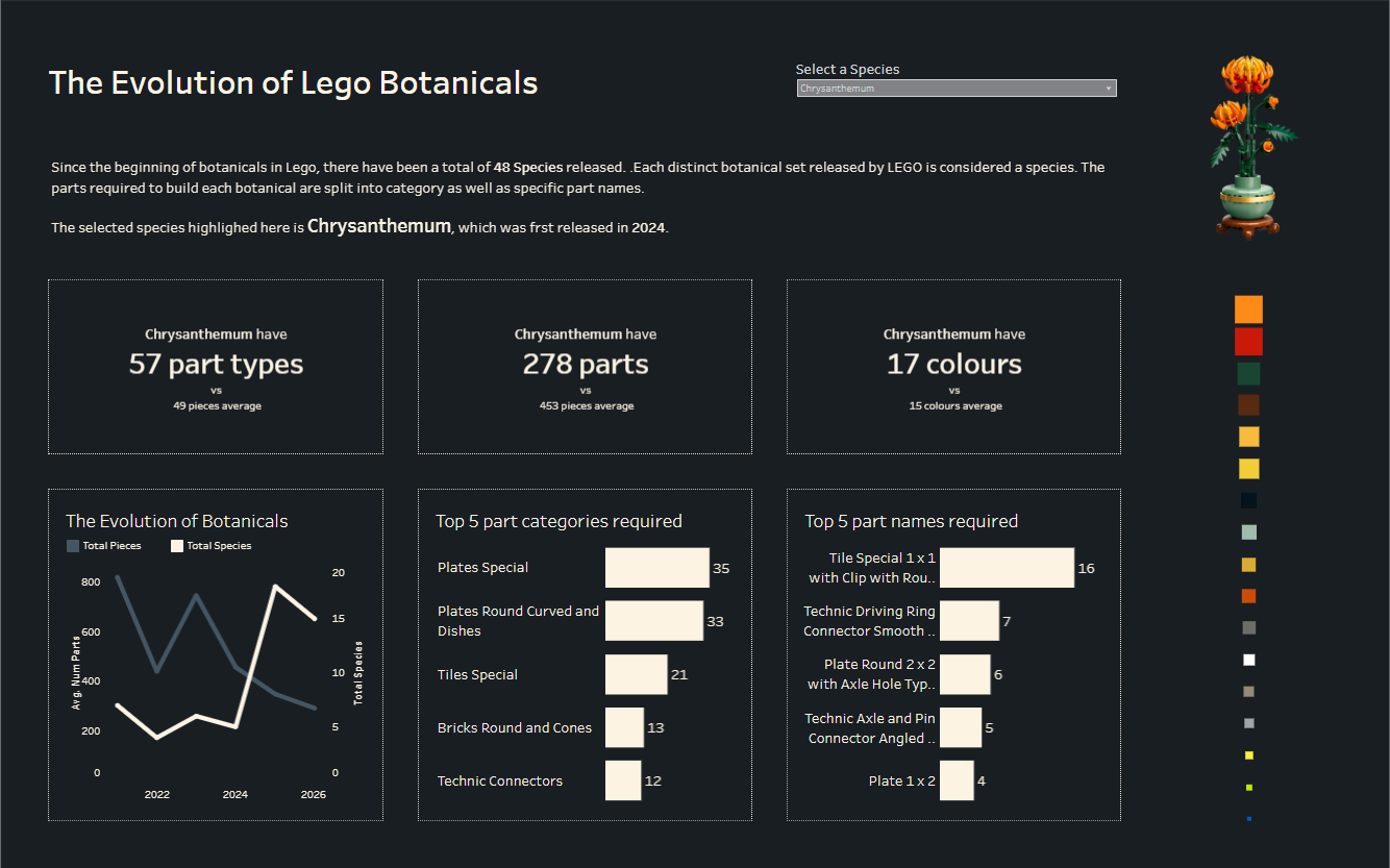
I wanted to analyse the species selected by the user (which was done using a set filter). To do these I created KPIs, using fixed LODs to include comparison points. Alongside these I created bar charts to show the distribution of colours and part types.
Alongside this, I used a line chart to analyse how many LEGO botanical species had been created over time, comparing this to how many pieces were required on average to build these.
Finally I wanted to show some colour analysis of the parts that made up the botanical, using the RGB codes in the dataset. This in particular was a struggle during the limited time frame.
After the stress of another day of Dashboard Week, I was able to rework the dashboard to create something I was happier with, which also included an image of the selected botanical: