


After my first month at The Data School, I look back at the dashboards I built before I started and see so many things I would do differently. In order to put my new skills into practice (and develop them further), I decided to rework the first dashboard I ever built. This week I decided to focus on user stories and concept sketching.
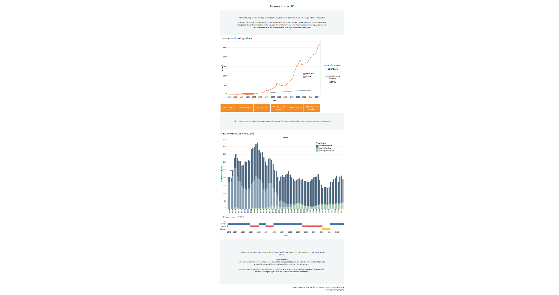
The dashboard in question looks at house building in the UK between 1949 and 2025. My initial attempt had many ideas for comparison with household income, increase in house prices, and government policy, but had no real direction for the dashboards story.
To rework this I decided to use user stories to give my dashboard a clearer direction. I thought about who might find the dashboard useful and why:
- Potential first-time buyers: to understand whether home ownership is realistic and why it feels out of reach.
- Government policy makers: to understand structural drivers of affordable housing shortages
- Developers: to understand financial viability and building trends
- Journalists: to communicate evidence based explanations on housing shortages
- Investors: to understand building trends
- Housing advocacy groups: to communicate and understand evidence based explanations for housing shortages
From these I selected three potential users to build user stories:
Government Policy Makers - AS A Government housing policy maker I WANT TO Analyse affordable housing completions alongside major policy interventions and funding changes TO DISCOVER Whether policies are increasing the supply of affordable homes SO I CAN Make evidence-based decisions about future housing strategy and investment
Housing Advocacy Groups - I WANT TO Compare affordable housing completions before and after major government policy changes TO DISCOVER Whether policy decisions have increased or reduced affordable housing supply SO I CAN Use evidence to advocate for more effective housing policies.
Potential First Time Buyers - AS A Potential first-time buyer or renter I WANT TO Explore housing affordability, policy impacts, generational comparisons and regional housing supply TO DISCOVER Whether home ownership is realistically achievable compared to renting, how today’s market compares to previous generation, what impact government policy has had and where housing availability is strongest SO I CAN Decide whether buying is a goal worth pursuing and determine the best location to buy.
I chose to focus on the following:
Government Policy Makers - Understand structural drivers of affordable housing shortages.
AS A Government housing policy maker
I WANT TO Analyse affordable housing completions alongside major policy interventions and funding changes
TO DISCOVER Whether policies are increasing the supply of affordable homes
SO I CAN Make evidence-based decisions about future housing strategy and investment
Now that I had my direction, I started planning charts for my dashboard that would offer clear insights:
- KPIS
- Percent change in houses being built
- Average household income
- Average house price
- Number of homes by year completed colours to show types of homes
- Show the housing trends over time
- Income vs housing price
- Show how prices have changed against avg household income
- Add labels for policy
- Changes in governments and policy over time
- Show comparison against new homes being built
Finally I put these ideas into a concept sketch:
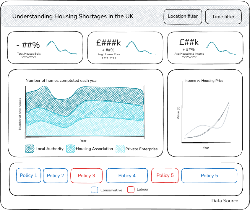
Here I really saw the improvement that user stories and proper planning have on a creating insightful dashboards. Next I need to prepare my data so I can realise my sketch in Tableau!