For days 4 and 5 of dashboard week, we were challenged to webscrape data from Letterboxd and turn it into an infographic dashboard. Since this was a two day project, I spent most of the first day gathering my data in Alteryx and planning my story, and then left the second day for building the dashboard.
Collecting the data:
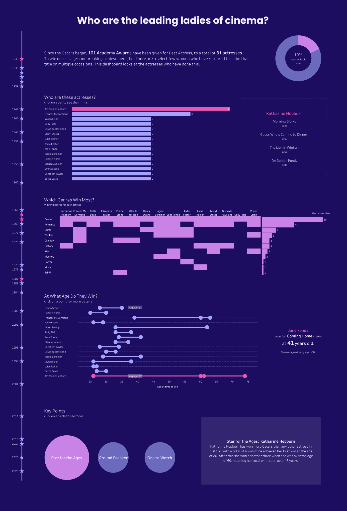
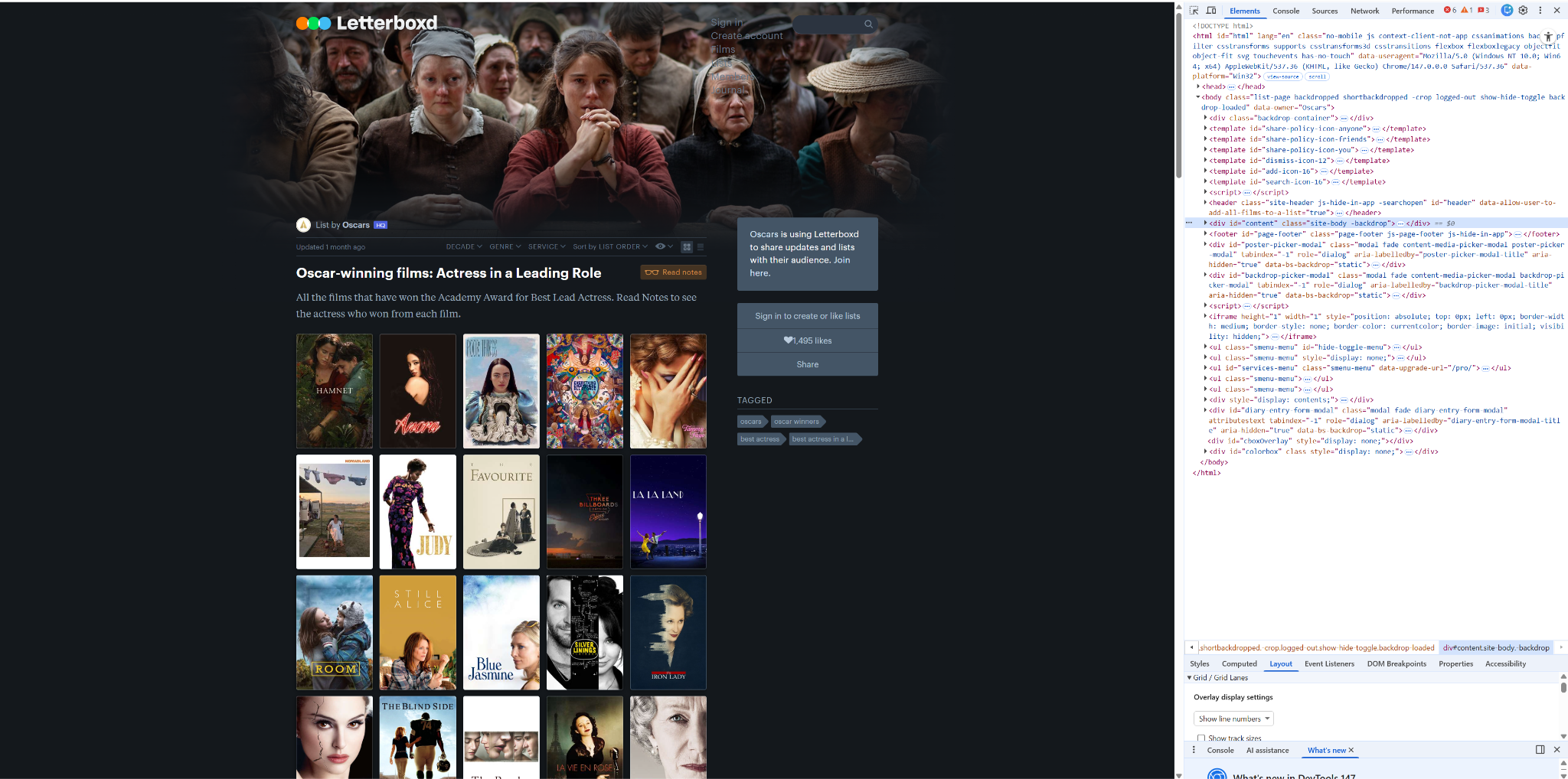
First, I looked at the Letterboxed website to decide on a topic to explore in my dashboard. I chose to look at Oscar Winners for Best Actress, wanting to gather data on each film and the actresses who won.
To do this, I created an Alteryx flow that downloaded the data from each page in this list. Within here I used RegEx to parse the bits of code that I needed, in particular, the weblink for each individual film page.
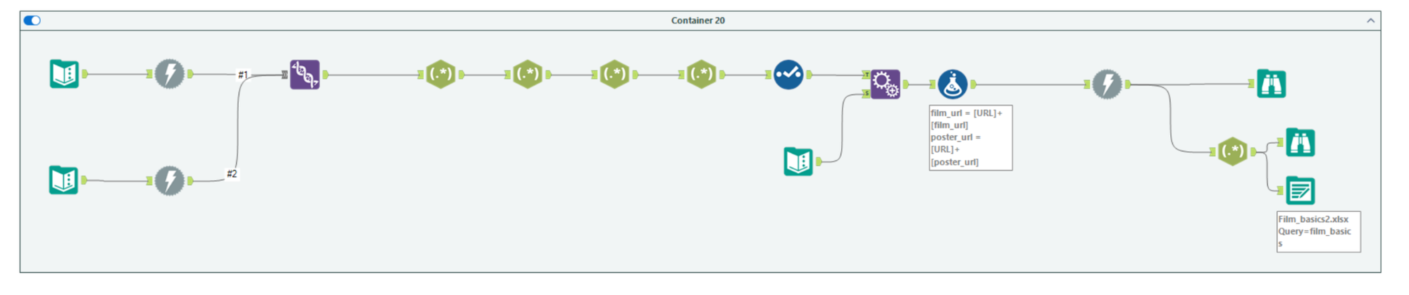
Using this, the latter Download tool in this flow was used to scrape the data for each film page, which included a section of JSON code containing key data fields for each film. Once I had isolated the JSON code, I outputted this as a file, so that I could avoid having to rerun the download tools too many times.
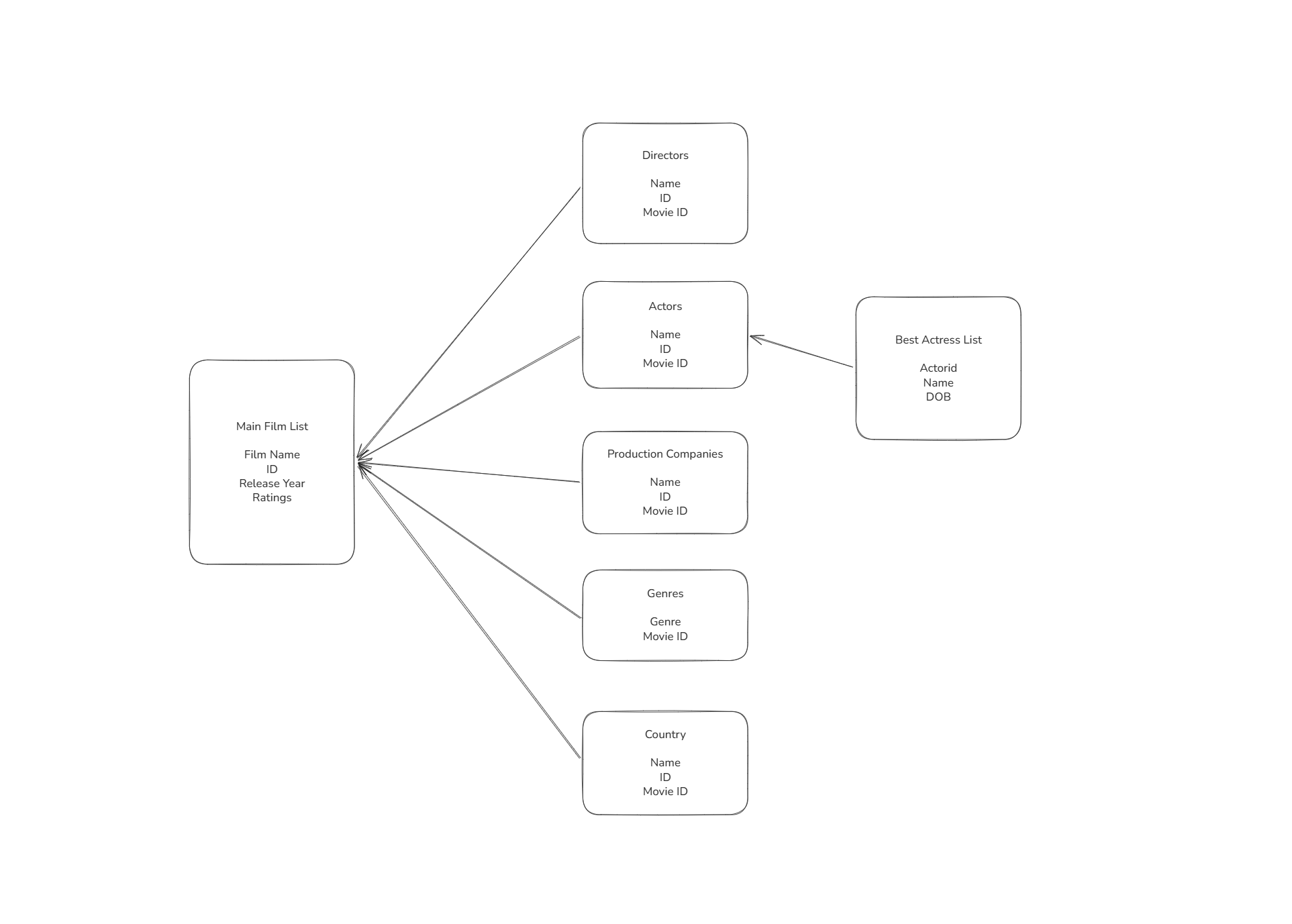
Now that I had access to the data I needed, I planned a schema for the tables I wanted to create, so that unnesting the JSON code wouldn’t explode the rows too much.
With my schema plan and many JSON Parse tools in Alteryx, I was able to construct these tables as I needed using the following flow, outputting each section to a sheet in an excel document, which I could open in Tableau:
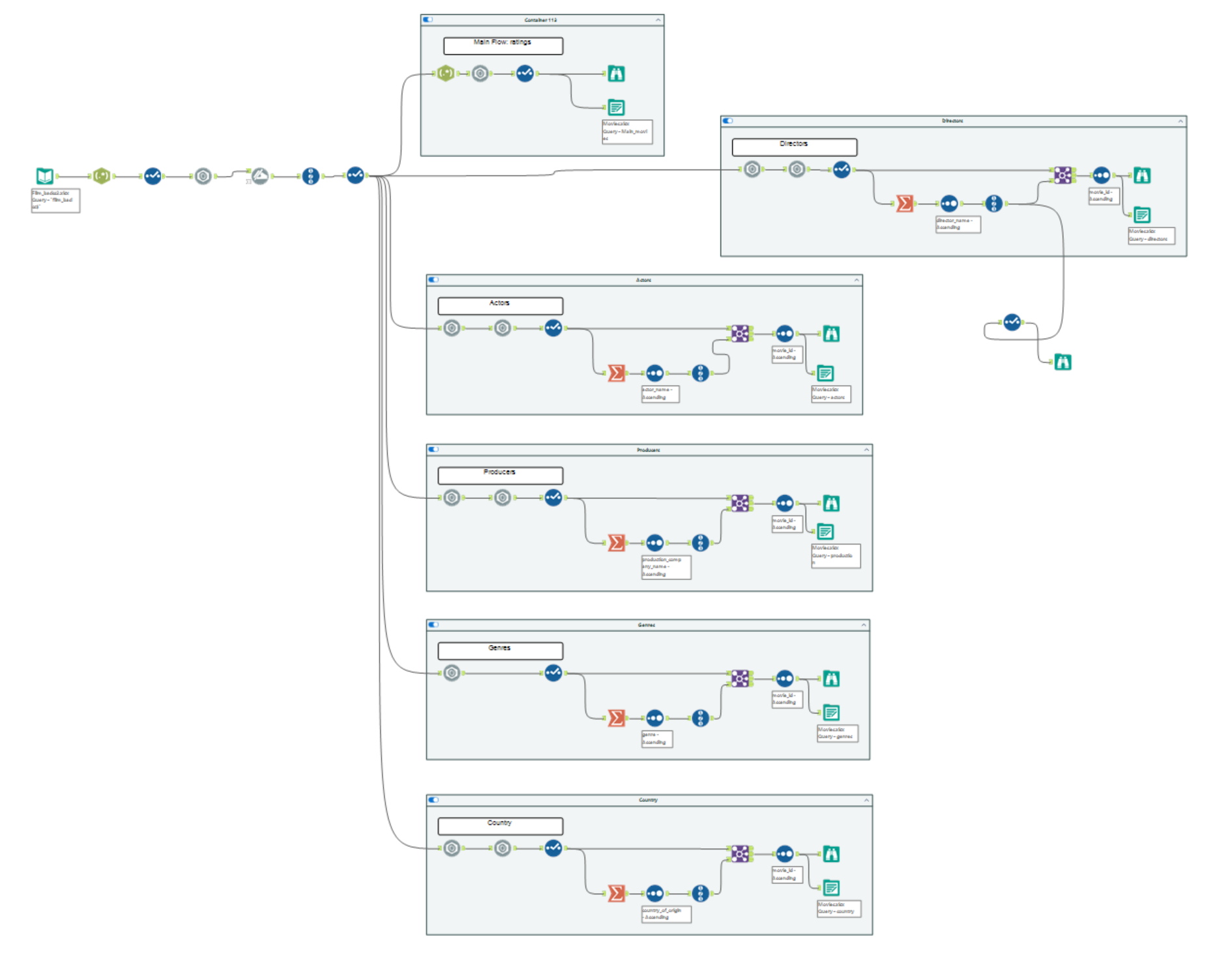
JSON Parse Hint: If the code has ‘{ }’ outside, Unnest. If the code has ‘[ ]’ outside, use Flatten.
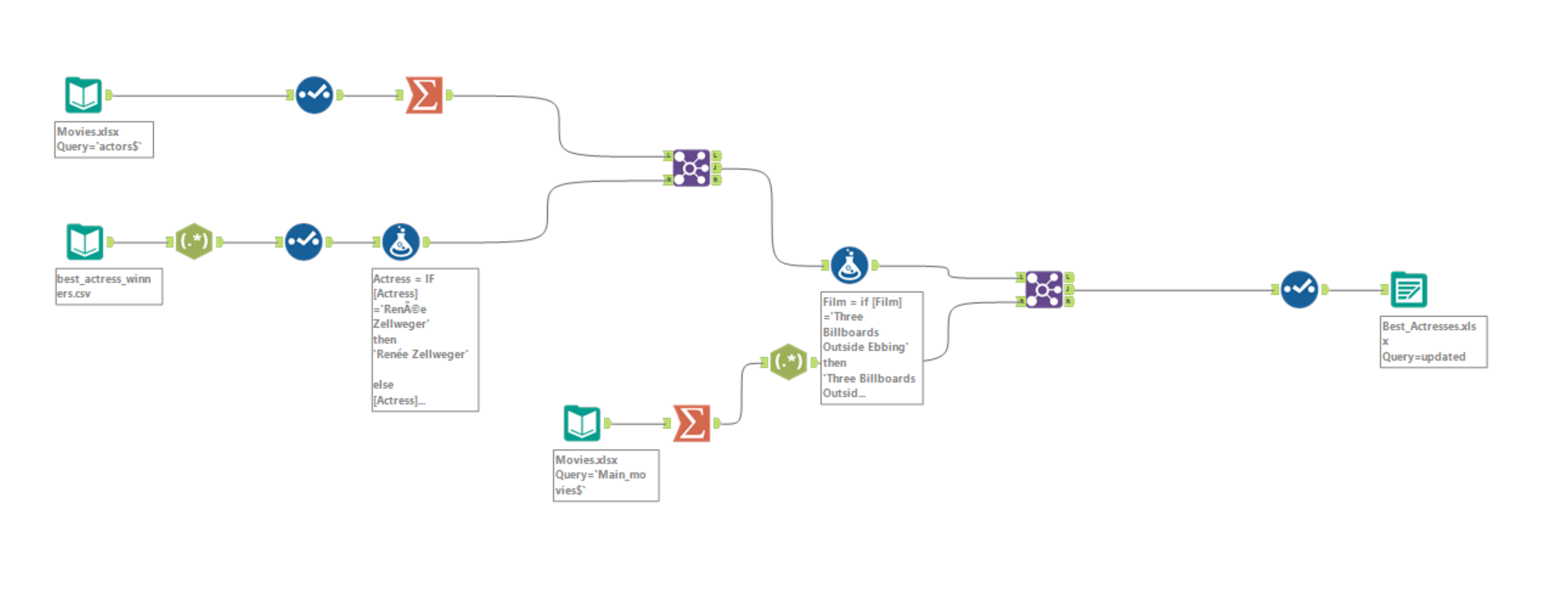
At this point I realised that I had a full list of all actors in each film, with no identifier of whether they were actually the Oscar winner. For my analysis, I somehow needed to isolate these, and as much as I tried to webscrape the data, it seemed impossible. Given the time constraints for this project, I eventually turned to Gemini, asking it to create a dataset of all Best Actress winners, including the following fields: date of win, actress name, film name, date of birth.
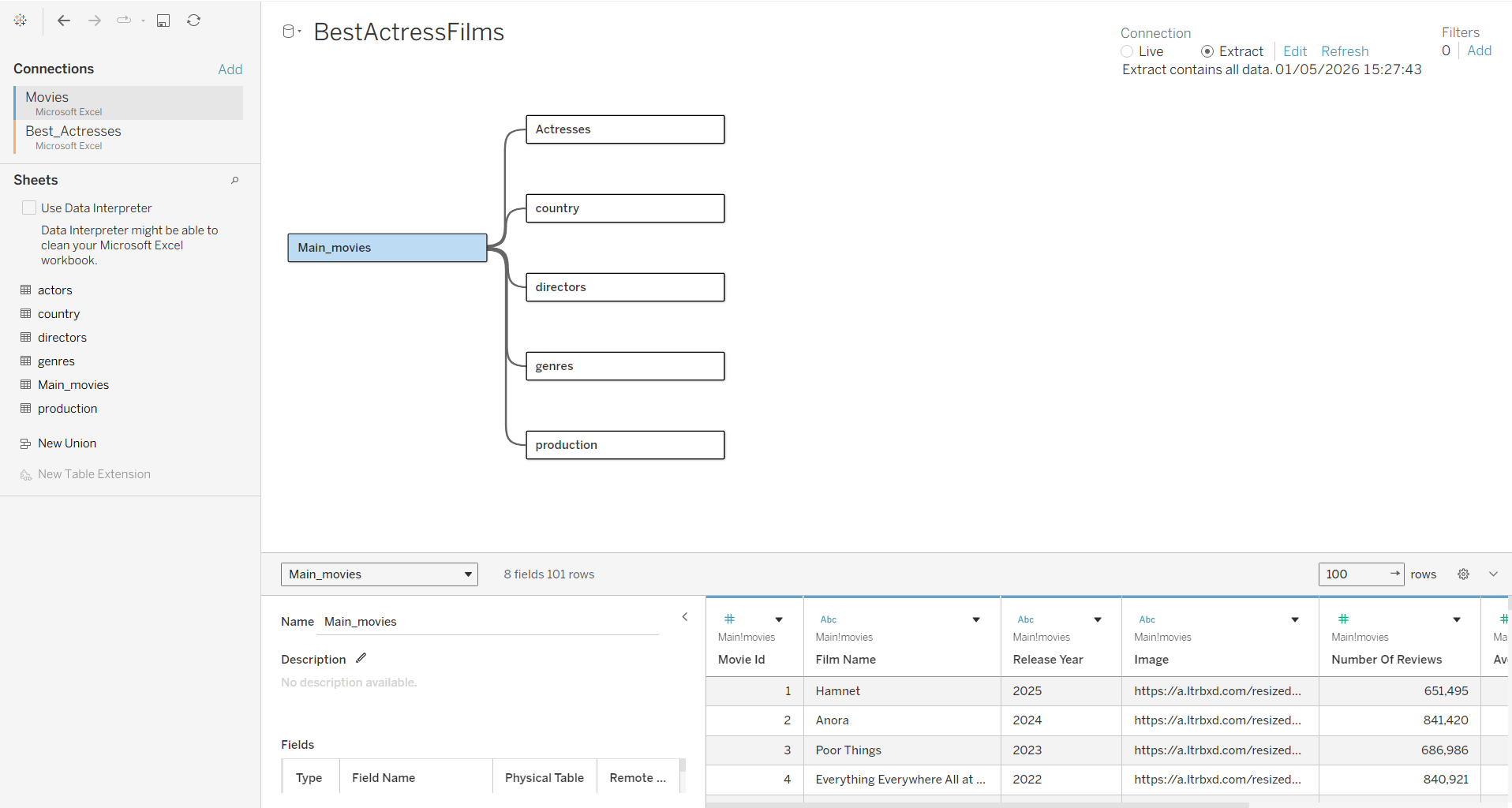
Returning to Alteryx, I combined this with the actors and main movie sheets I had already created to find the actor ID and movie ID. These were needed so that I could create a relationship between tables in Tableau. Finally I cleaned up the fields and outputted this to a new document.
Building the dashboard
Having collected my data and created the relationships between tables in Tableau, I now needed to plan a story and build my dashboard.
Since this was an Infographic style dashboard, I first wanted to find a more specific focus. I began by writing down some questions and found that I was particularly interested in the actresses who had won this award multiple times. I decided that this would be my focus, and began sketching a plan for my dashboard, thinking of chart designs, and putting together a colour palette.
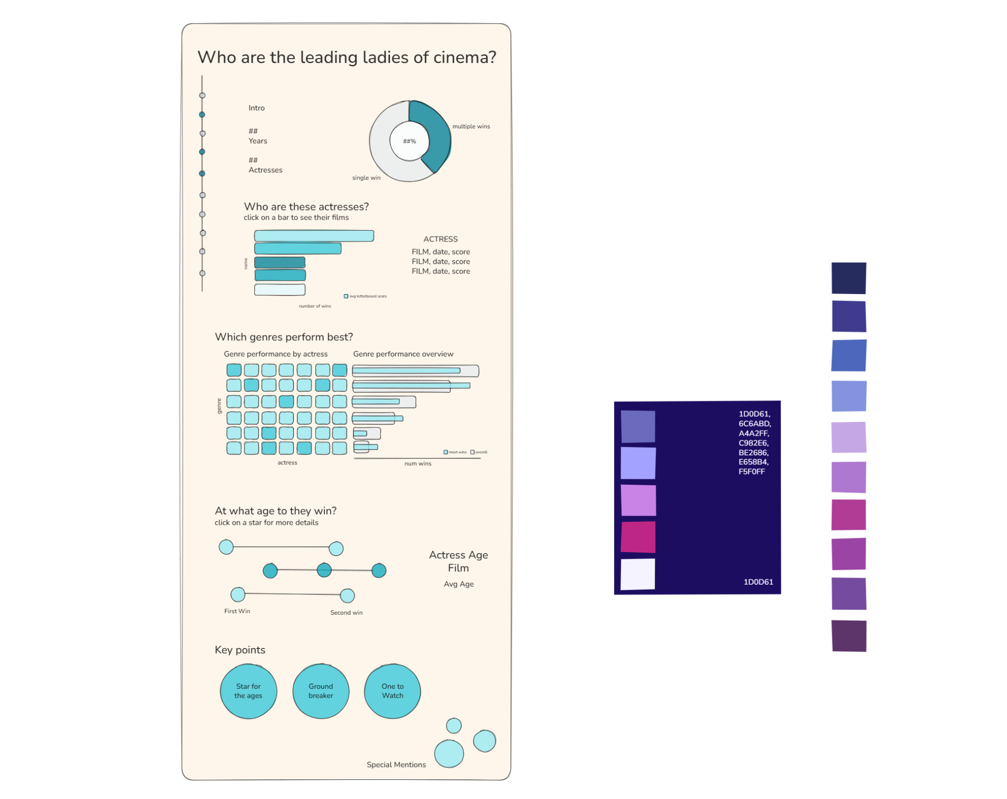
I decided I wanted this to be a more longform dashboard, and I wanted to use deep blues, pinks and purples to capture a film colour grading feel. I also decided I wanted a vertical timeline to run down the side as a decorative feature that tied the different sections together.
Once I had established my plan, I built the dashboard in Tableau, making any necessary tweaks along the way, resulting in the following: