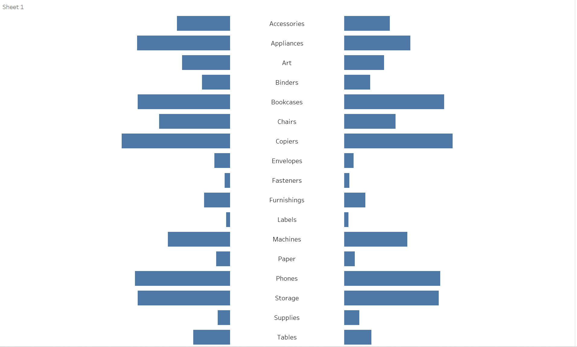
There are many ways to create a diverging bar chart with titles in the middle and I’m going to show a simple way. To do so we need for our example the well known Superstore data set again.
Let’s say we want to show the sales of the sub-categories of 2020 compared with 2021 in a diverging bar chart. Ok let’s create two simple calclulated fields called Sales 2020 and Sales 2021 which look like below

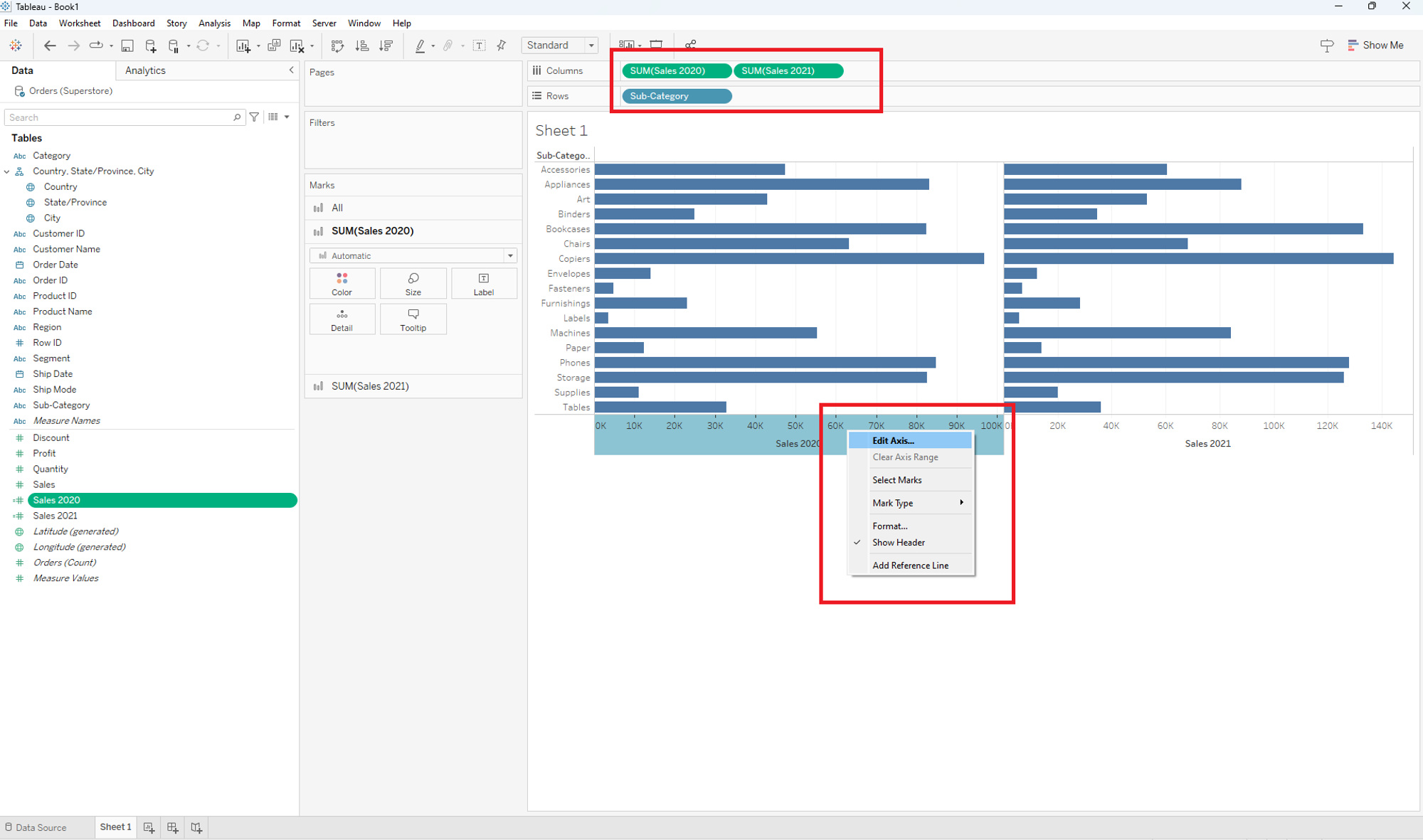
Drop and drag both into the column shelf and sub-category into the row shelf. Chose one of the x-axis, click the right mouse button and go to Edit Axis…
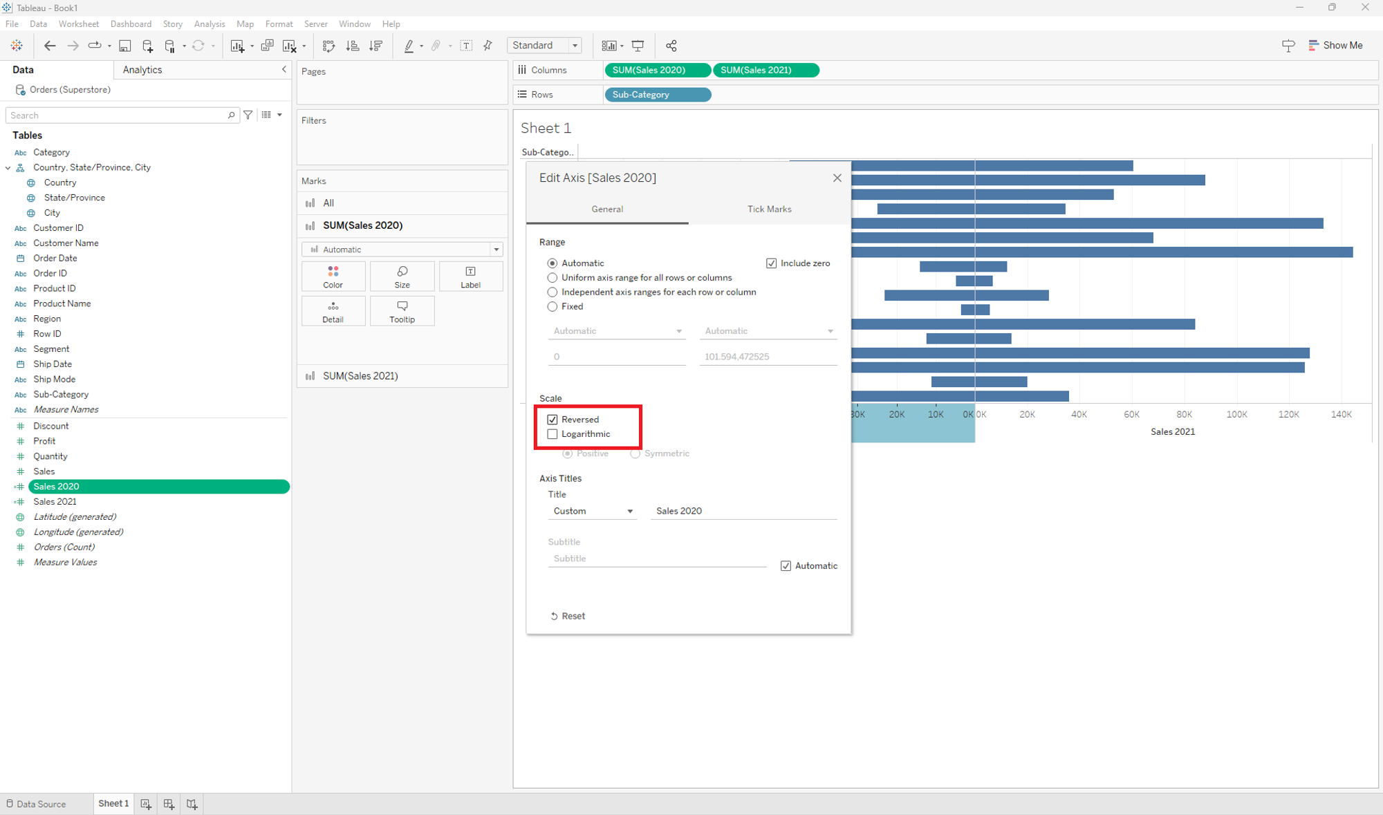
Change the Scale to Reversed like in the following picture.
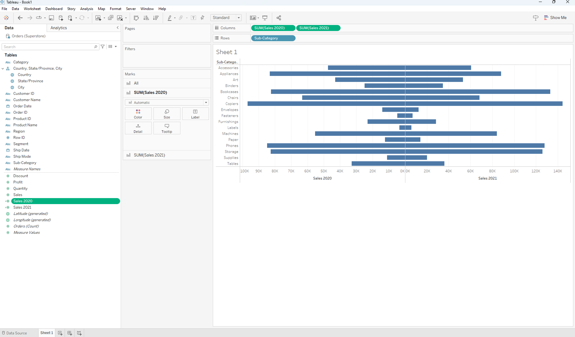
Your chart should look like this now:
Now let’ create three functions called Col Space Left,Col Space Right and Col Space Middle. Each function just contains the following

Drop each of them into the column shelf like in the picture below.
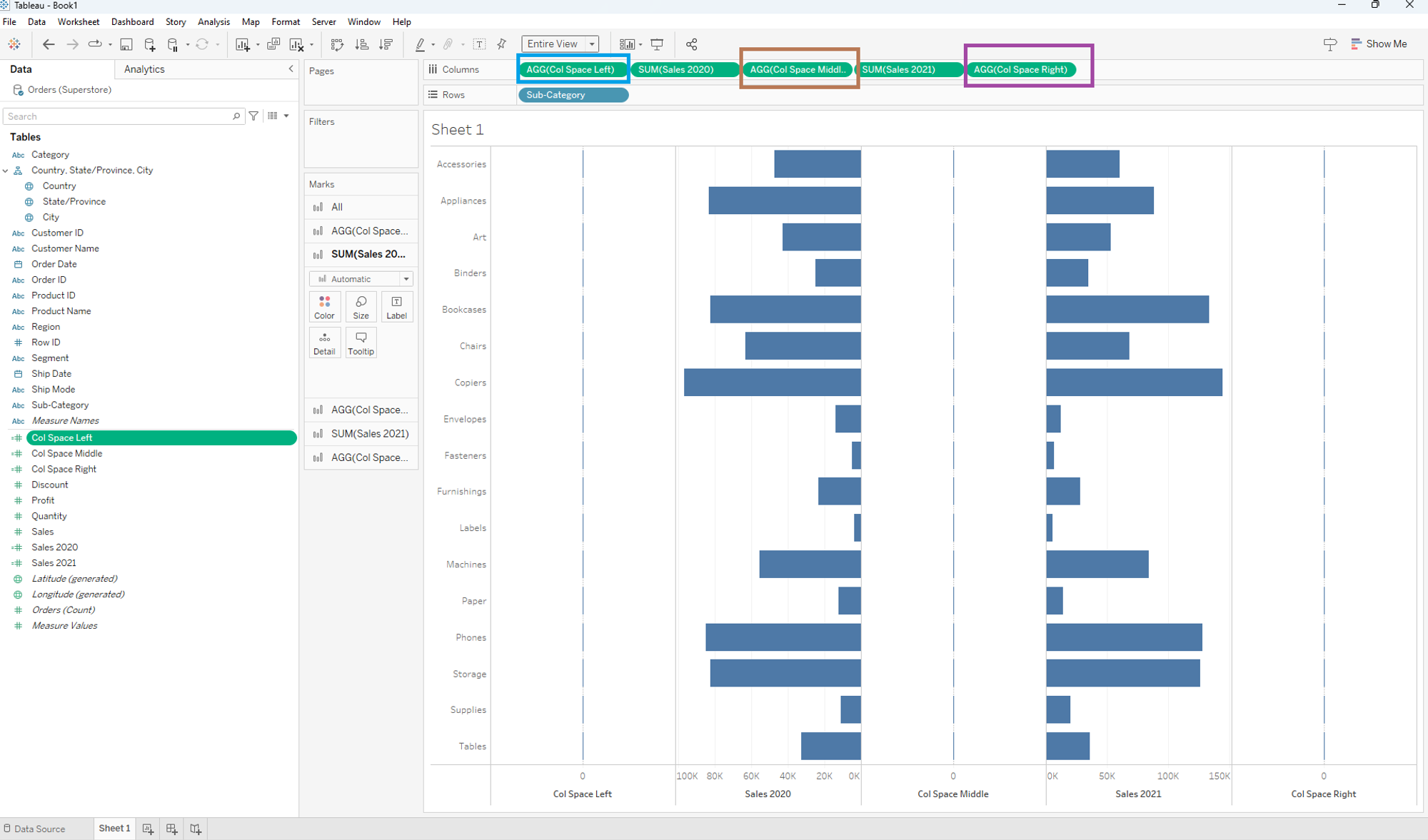
So far so good. Now click on AGG(Col Space Middle) in the Marks field and drop and drag the sub-category field to the Label field. Your chart should look like this now:
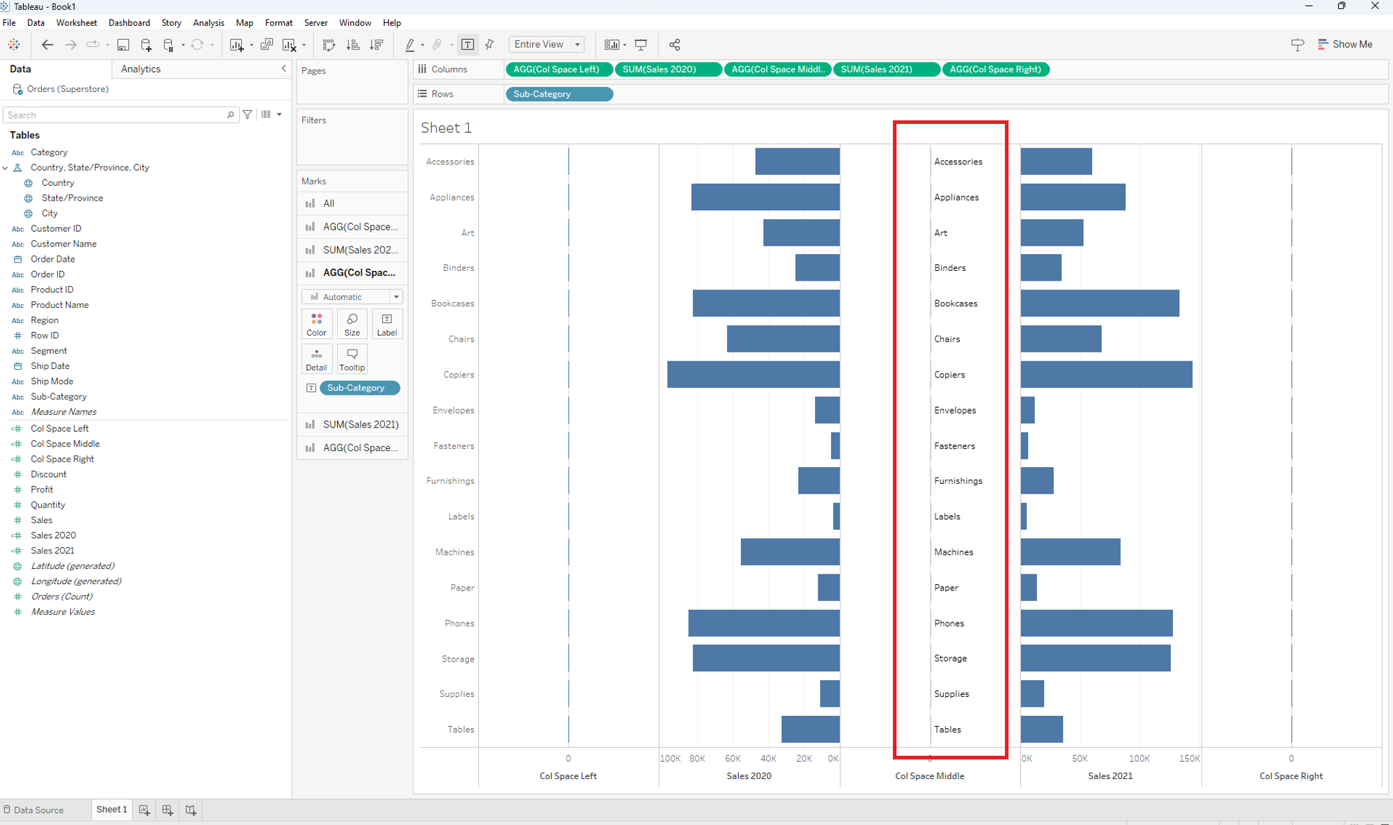
To center the labels of the sub-catregory, click on Col Space Middle in the marks field, go to Label and then to Alignment. Change it from Automatic to Center.
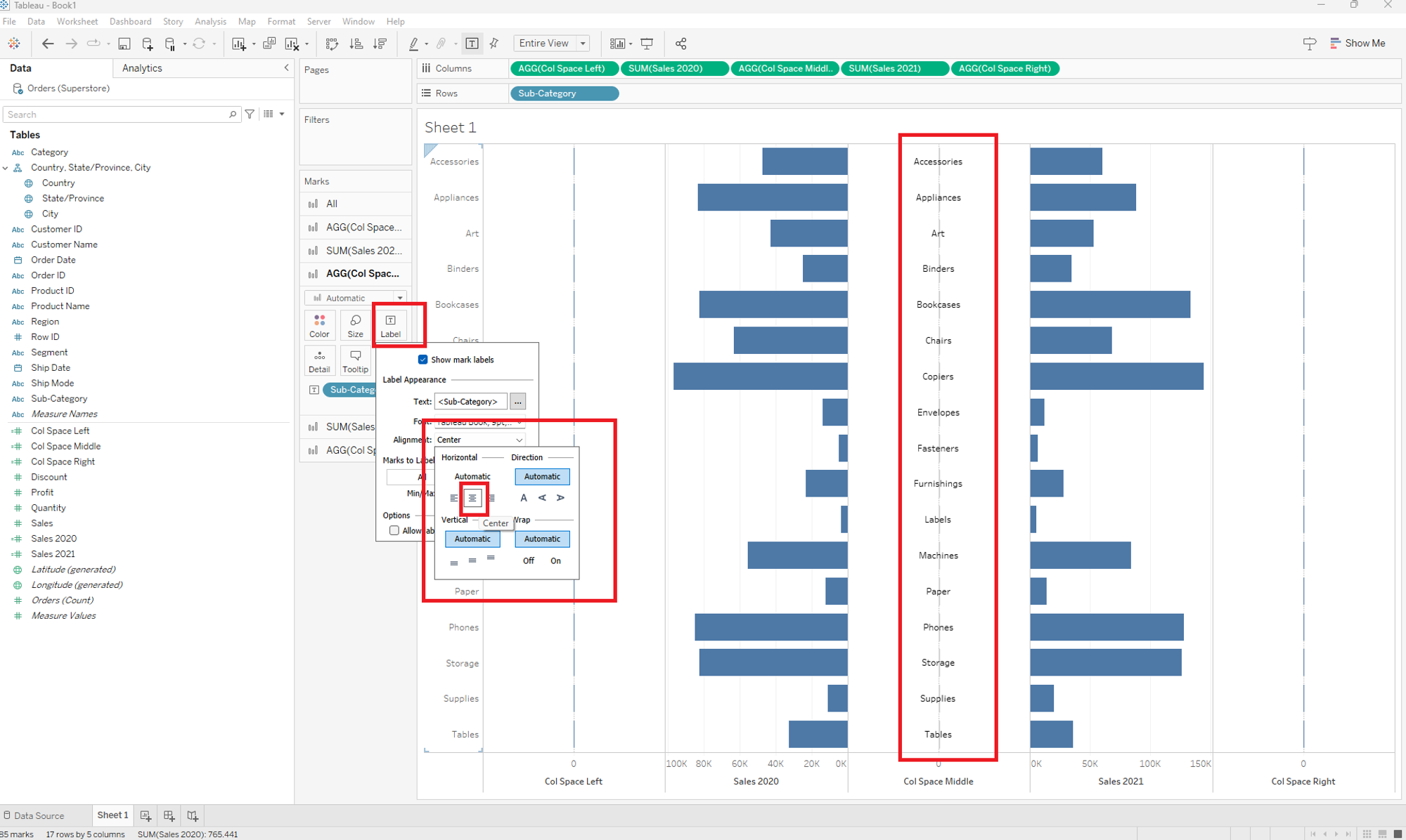
Now all labels of the sub-category should appear in the middle of both bar charts. For our next step we need to hide the labels of the x-axis and the header of the sub-category on the left hand side. Hence we have:
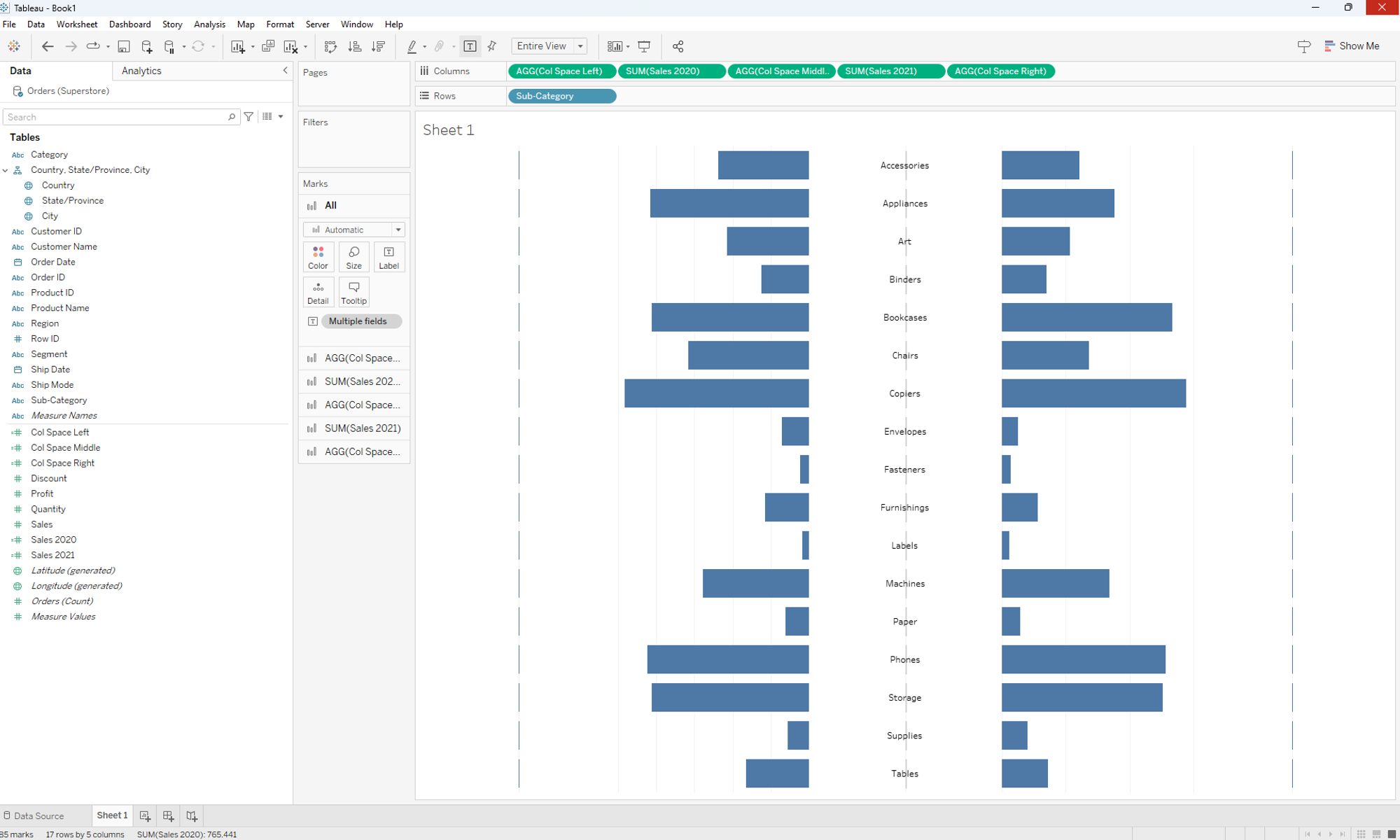
So now we have to change the chart type of the functions Col Space Left and Col Space Rightfrom Automatic to Polygon.
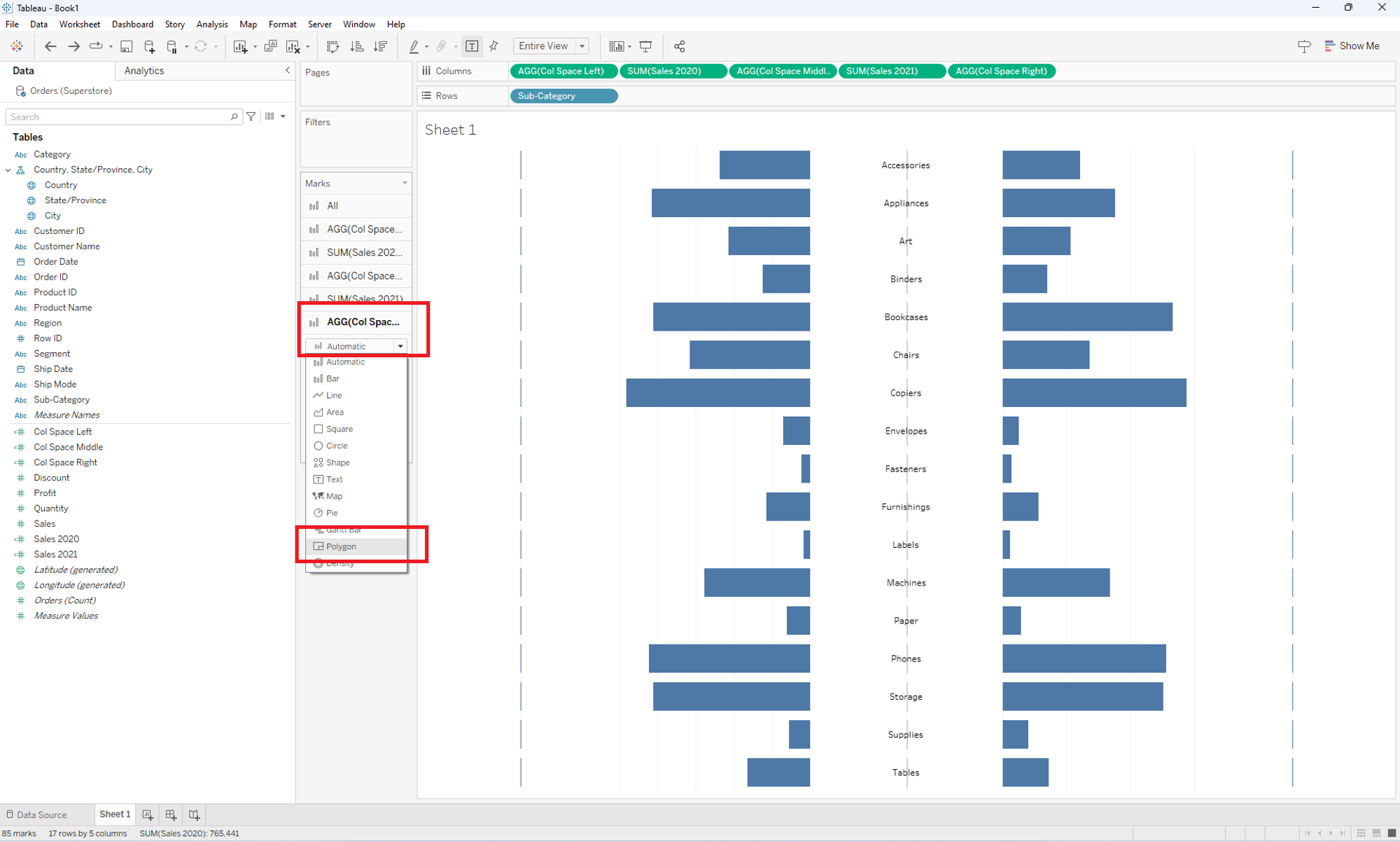
After changing just format the sheet, means remove all unnecessary lines. Your chart should look like as follows:
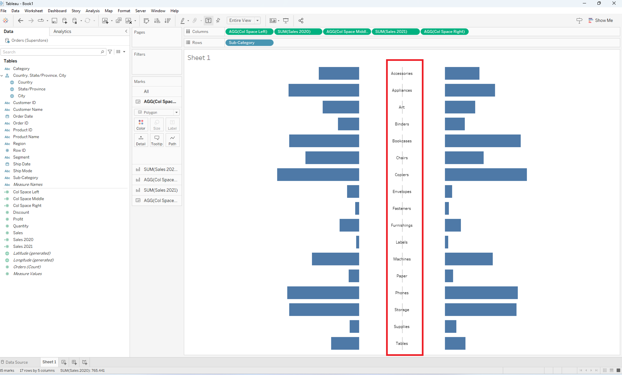
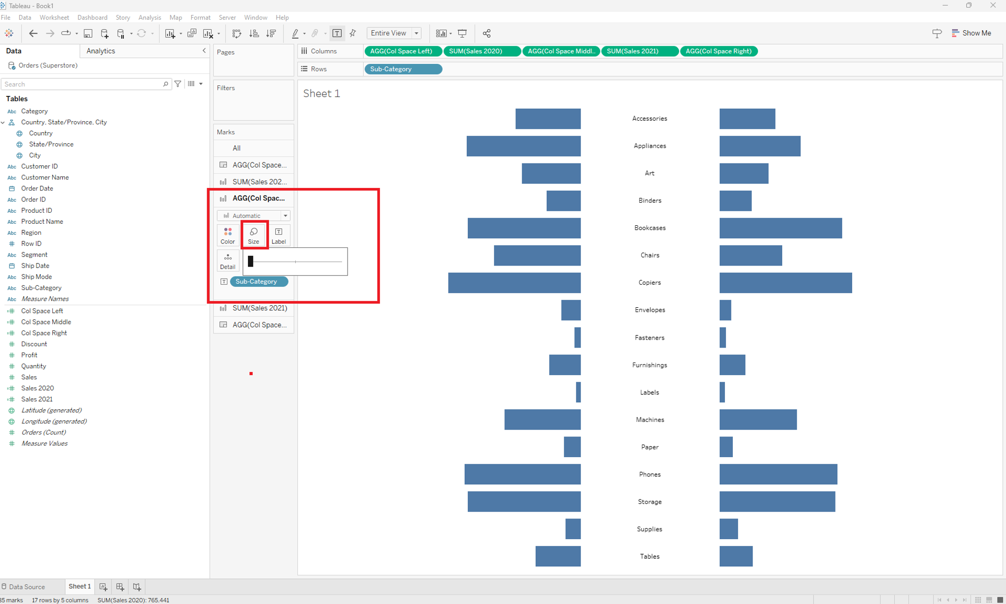
So as you might see in the middle of the sub-category labels appear small lines. To remove them just go to the AGG(Col Space Middle)function in the middle and change the size to zero. Your chart should look like below now.
The last step will be changing the size of the sub-category labels. In order to do that just go the same field I mentiend above, click on text and then on the three dots and there you can change the size of the labels directly.
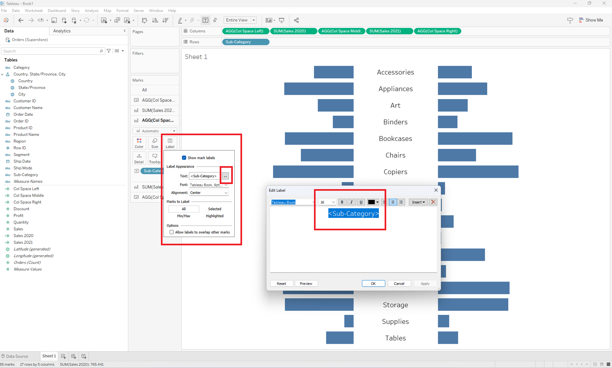
In the end your diverging bar chart should look quite similar to this:
