


After receiving the data for our second day of dashboard week mild panic set in. Climate change data (as measured by rising sea level (RCP)) was our topic.
Overall my aim was to accommodate my dashboard for those who are unable to use a mouse and those that require a speech narrator.
Having briefly looked at the data I had decided I would like to supplement my data with both population and the average temperature for the UK.
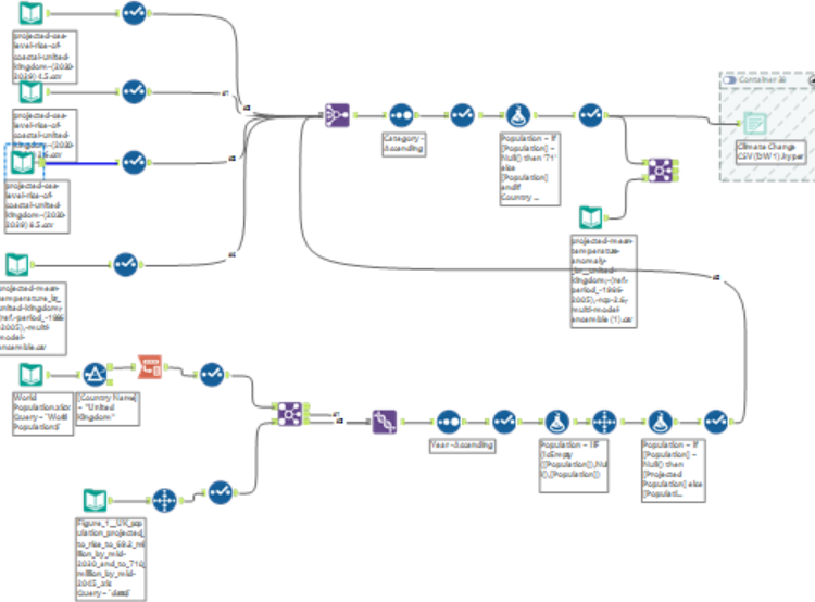
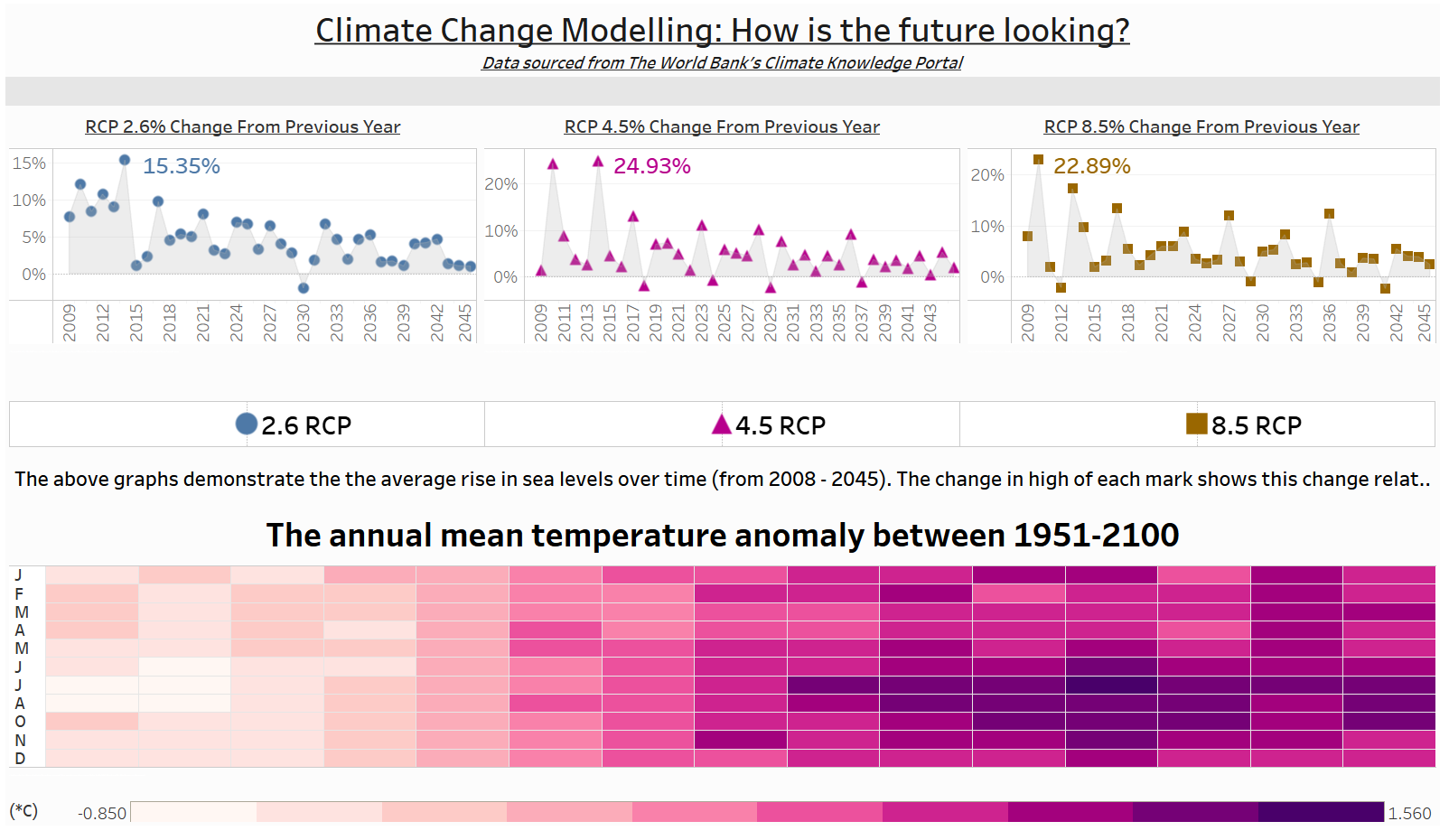
While successful, its effectiveness was limited. Firstly, the population data I had sourced ranged from 1995 to 2045. This was a problem because there was no meaningful correlation I could draw between the rise in population and that of rising sea levels, it was simply too broad a connection to make. Secondly, the average temperature data I was able to obtain (from the World Bank's Climate Knowledge Portal) did not join that effectively to that of the original dataset. Therefore, the interactively was somewhat limited - however given more time this would have been possible.
The outcome is as follows:
Further issues I had surrounded the speech narrator function and its ability to interact with Tableau. It had missed certain pieces of information and was not as consistent as it could be (in terms of what it read out), so this is something that could be improved.
Overall, my simplistic design made for a fairly successful start, long may it continue...