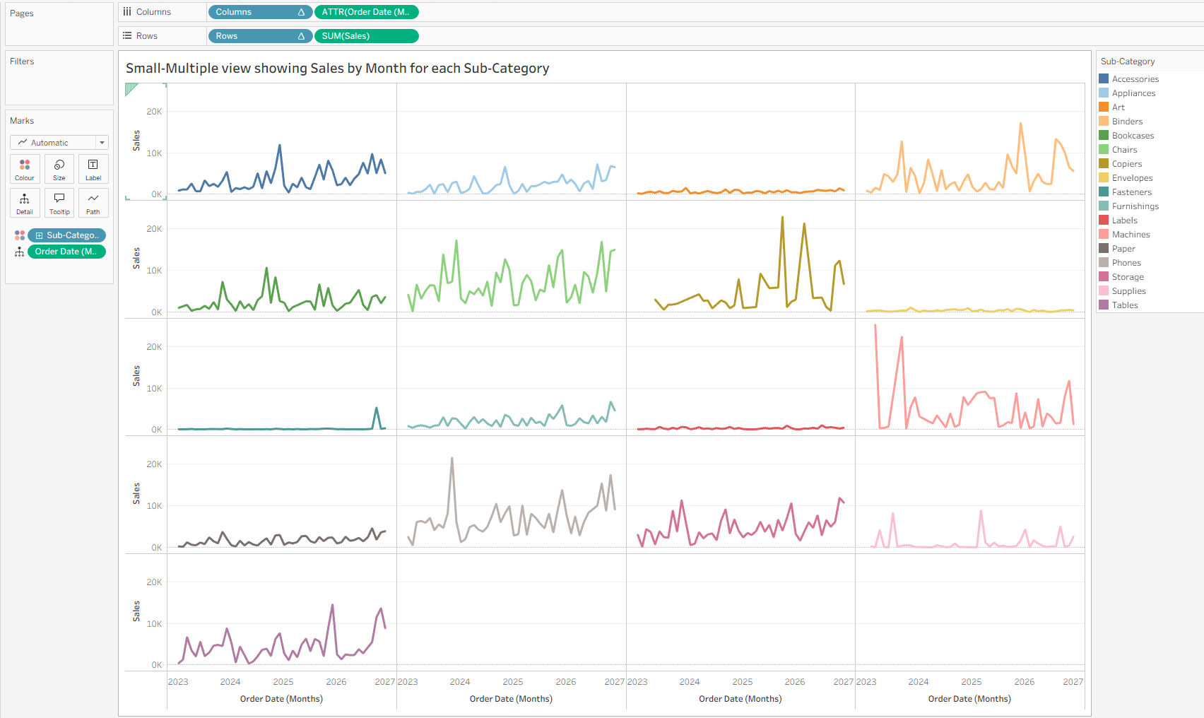
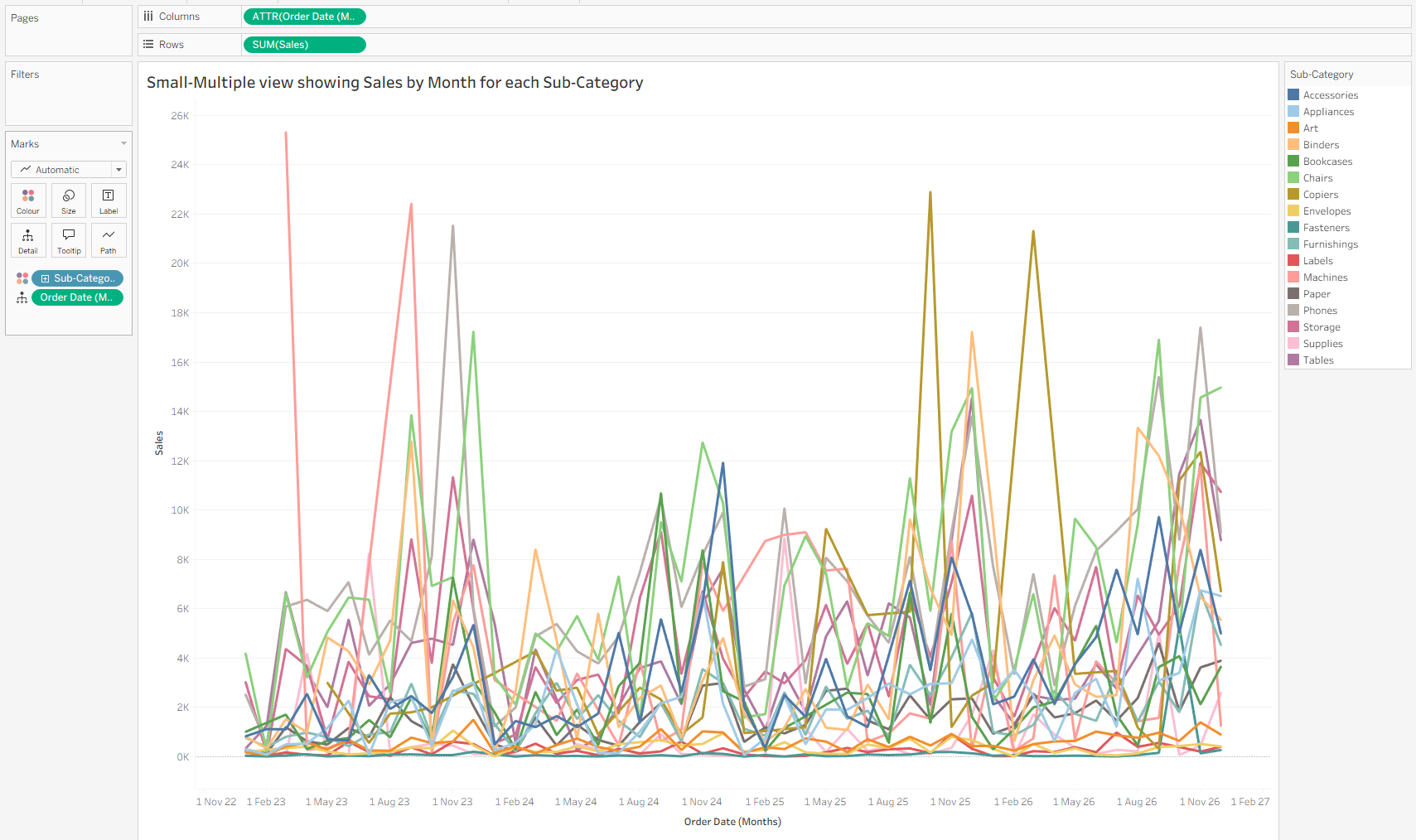
Small multiple charts are incredibly useful for transforming a messy "spaghetti" line chart into a clean grid of individual trends. In this post, I'll cover how to build a chart like this in Tableau using the Sample - Superstore Dataset.
Sorting out our Date Field
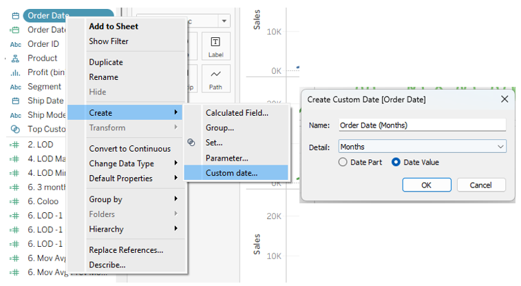
To start with we create a Custom Date truncated to "Months" because we need to lock in the exact level of detail before we wrap it in anATTR() function. If we didn't, ATTR() might look at the exact daily timestamps, realize there are multiple days in a month, and just return an asterisk (*), which means "multiple values."
Next we turn our new custom date into an Attribute. This is because when inside an ATTR() Tableau stops treating it as a structural element that slices the data, and instead treats it like an aggregate. Because it is now an aggregate, Tableau's table calculation engine ignores it when figuring out the grid. Your INDEX() formulas can safely count your categories (e.g., Sub-Category) without the Date field getting in the way and restarting the count.
This is important as we need to use ATTR([Order Date (Months)]) on our Columns as a continuous attribute. We create a Custom Date truncated to "Months" first because you need to lock in the exact level of detail before we wrap it in the ATTR() function. If we didn't, ATTR() might look at the exact daily timestamps, realize there are multiple days in a month, and just return an asterisk (*), which means "multiple values."
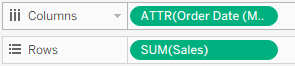
We also need to ensure we have our [Order Date (Months)] we created on detail such that we can use it as an addressing field for our table calculations. This is alongside our Sub-Categories on colour.
Creating the Grid
In order to force our sub-categories into a grid we need to create Columns and Rows calculated fields.

1. ROUND(SQRT(SIZE())) allows us to create a dynamic grid.
SIZE(): This function counts the total number of items (e.g., sub-categories) in your view.SQRT(): This takes the square root of that total number. This is because the square root naturally finds the dimensions of a perfect square. Importantly this will force our grid into a square and and leftover grid space will be blank charts.ROUND(): Since you can't have a fraction of a column, this rounds the square root to the nearest whole number.
Example: If you have 12 categories, SIZE() is 12. The square root of 12 is roughly 3.46. Rounding 3.46 gives you 3. Tableau now knows it needs to build a 3-column grid.
2. (INDEX() - 1) produces our zero based index.
Both formulas also start with this logic.
INDEX()tells Tableau what position an item is in (1st, 2nd, 3rd, etc.).- Subtracting 1 turns this into a zero-based index (0, 1, 2, 3...).
3. Columns: % causes items to wrap back to the column zero.
The % symbol is the modulo operator. It divides the first number by the second number and only returns the remainder. This is what forces the charts to wrap back around to the first column.
Example: If our dynamic grid size calculated earlier is 3 columns, here is how the modulo plots the first four items:
- Item 1:
0 % 3 = 0(Plots in Column 0) - Item 2:
1 % 3 = 1(Plots in Column 1) - Item 3:
2 % 3 = 2(Plots in Column 2) - Item 4:
3 % 3 = 0(Wraps back to Column 0)
4. Rows: INT() and / integer division.
The INT() function stands for integer division. It divides the first number by the second number, drops any decimals, and only returns the whole number. This effectively tells Tableau when to drop down to the next row.
Example: Using our same 3-column example:
- Item 1:
INT(0 / 3) = 0(Plots in Row 0) - Item 2:
INT(1 / 3) = 0(Plots in Row 0) - Item 3:
INT(2 / 3) = 0(Plots in Row 0) - Item 4:
INT(3 / 3) = 1(Drops down to Row 1)
So putting it all together we get the formulas:
Columns: (INDEX() - 1) % ROUND(SQRT(SIZE()))
ROWS : INT((INDEX() - 1) / ROUND(SQRT(SIZE())))
Fixing the Table Calculations

Dragging our new Columns and Rows into the view will not quite give us the small multiples chart we were hoping for. The final step is to configure the table calculations so Tableau knows exactly how to group our dates and plot the grid.
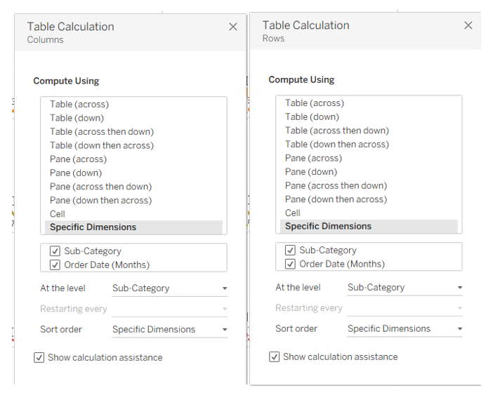
To do this, right-click on both your Column and Row calculation pills in the view and select Edit Table Calculation. You will need to mirror the exact settings below for both:
Select Specific Dimensions: This tells Tableau to evaluate the entire dataset as one complete list, rather than breaking the grid apart for every single month.
Check both Sub-Category and Order Date (Months): Ensure both boxes are ticked, and verify that Sub-Category sits at the top of the list. This sorting order forces Tableau to group all the months for a single category together in its memory.
Change "At the level" to Sub-Category: By default, Tableau increments calculations at the deepest level (the exact month). Changing this setting overrides that behaviour, instructing Tableau to plot an entire chronological line into a single grid coordinate before ticking the index over to the next category.
Once you apply these settings to both your Rows and Columns, your messy spaghetti chart will snap into a beautiful, dynamic small multiples chart.