A useful way to visualize the distribution of values in Tableau is through box and whisker plots. They show the median, the interquartile range, as well as our outliers. However, if we split our data into groups and want to compare outliers for groups with a different mean and distribution, we may also want to use Z-scores.
Z scores are used to standardize values so we can make inferences from our data in cases where groups have a different mean and standard deviation. An example of this would be comparing test score performance across two different subject classes. If you take two students with 'high' scores, you can't confidently say which student performed better based on the raw score if the mean and standard deviation of results differ across the class.
Before we delve too deep into Z-scores, let's have a look at our basic box and whisker plots for three different groups. The example we'll work with compares the average price for a stay in an Airbnb across London boroughs for three different property types: 'Shared Room', 'Private Room', and 'Entire Home/Apartment'. The data has been filtered to remove properties above £400 per night to ensure that the properties are still comparable.
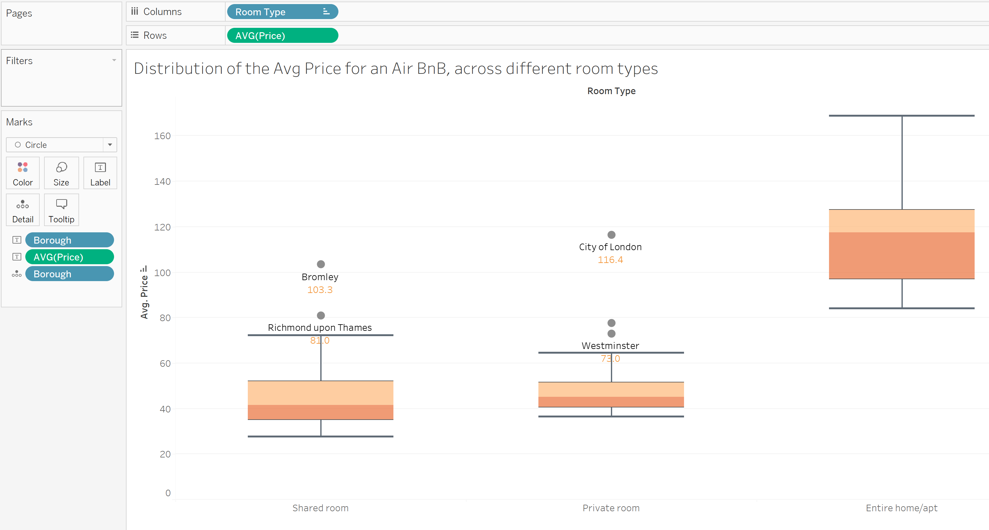
In this view, we can see that there are at least two outliers of interest: a shared room in Bromley, at an average price of £103.30, and a private room in the City of London at an average price of £116.4. We can see that both of these points are outliers in their category, but as they have a different distribution (a different mean and an interquartile range which differs) it is difficult to make further inferences on which value is more of an outlier.
To get a fairer comparison, we can standardize the values across all three categories using Z scores.
To do this, we need the following calculation:
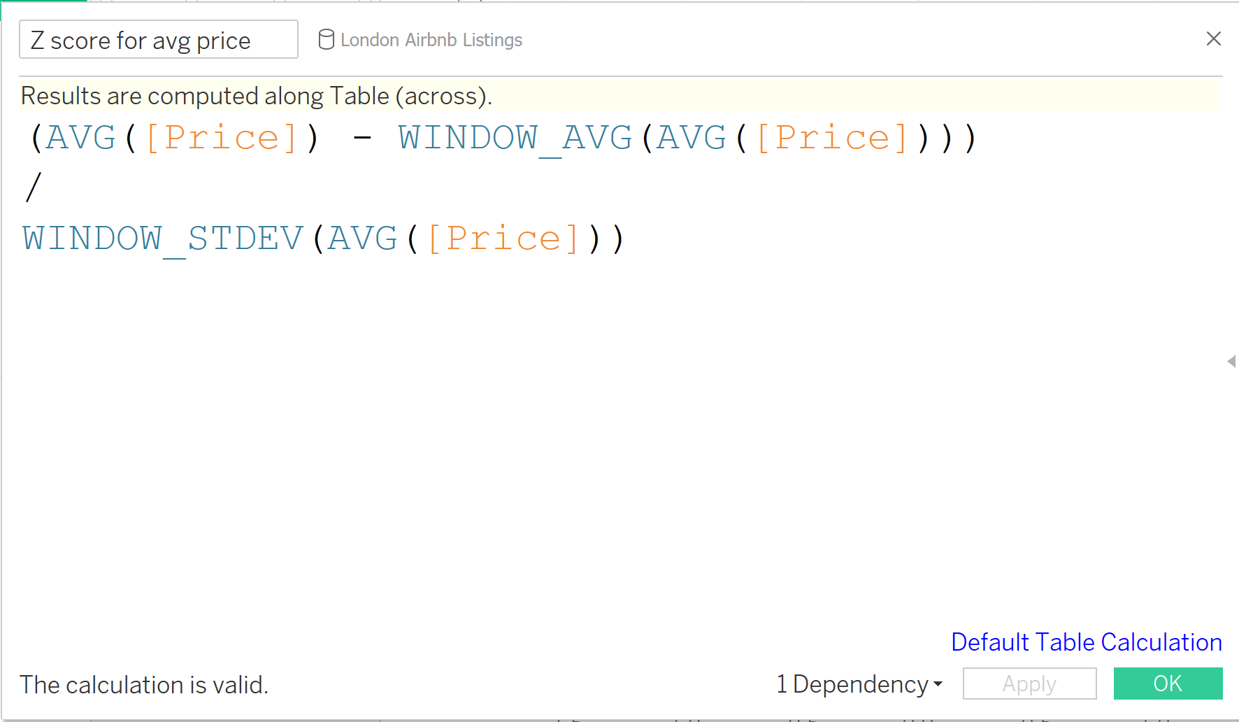
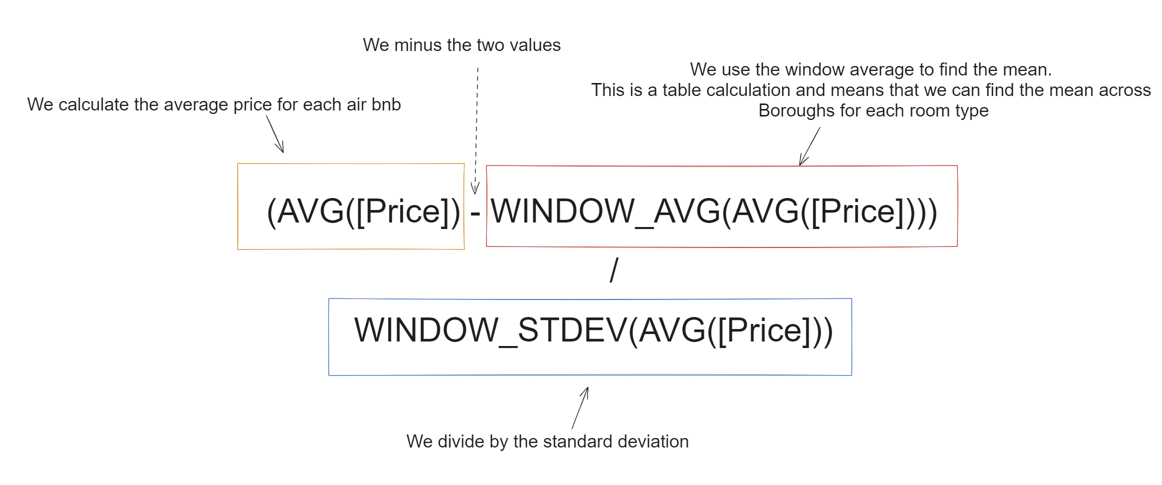
This calculation can be broken down as follows:
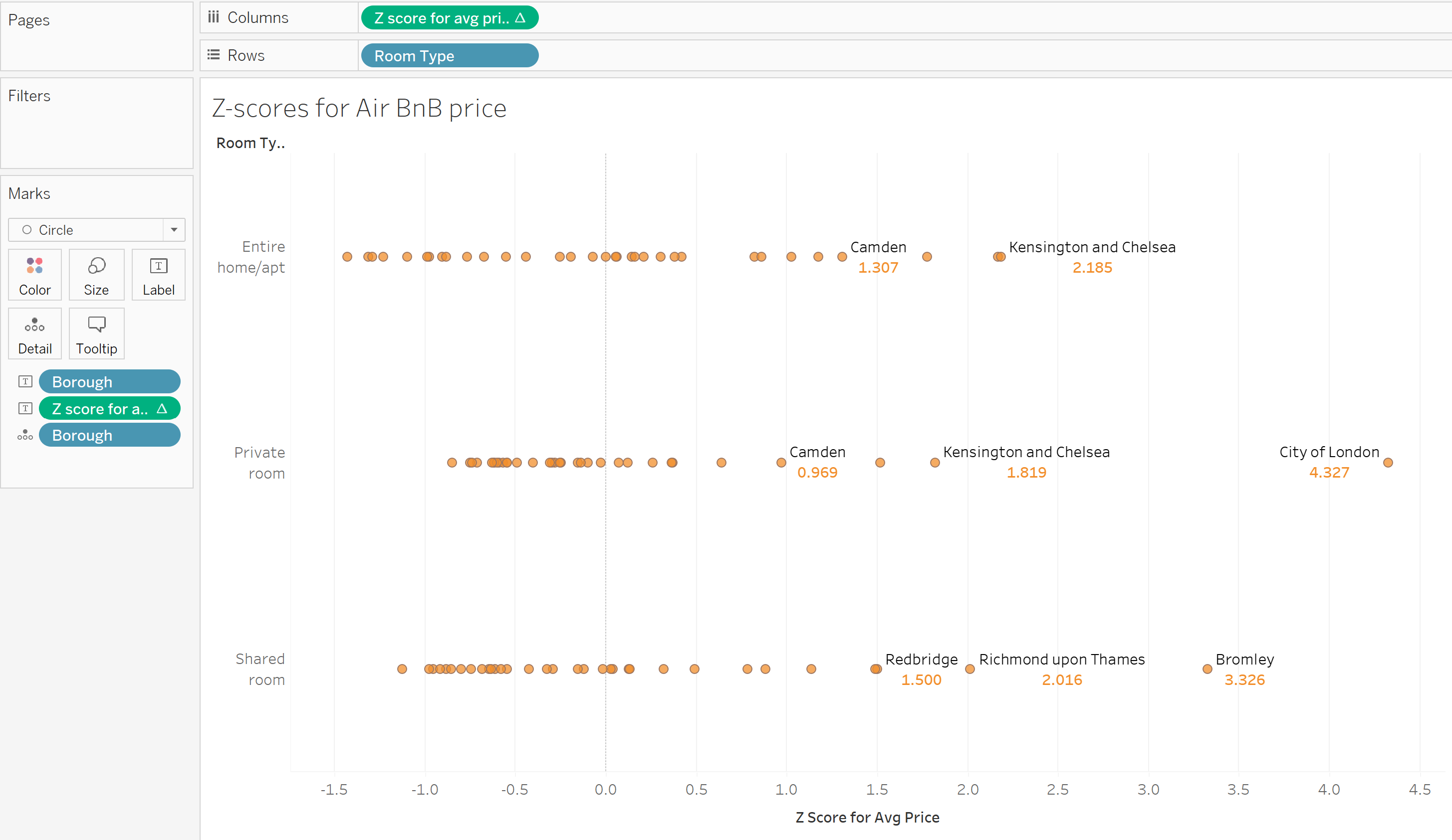
Z scores standardize the Mean to 0 and Standard Deviation to 1. Once we have calculated our Z scores, we can visualize this in Tableau to investigate our outliers further. As we can see in the image below, the Private Room in the City of London has a higher Z-score and is actually further away from the mean than the shared room in Bromley. In the context of average Airbnb prices, a private room in the City of London looks to be the biggest outlier hence the worst deal price-wise. Of course, there are many factors that influence price, such as location, which are not taken into account here. However, what Z-scores have allowed us to do here is compare across categories with different means, so maybe a shared room in Bromley is not looking so bad now?
As a final note, if your visualization does not look as expected, this may be due to the configuration of the Z score. As the Z score is a Table Calculation, we need to ensure it is correctly configured. This is what the TC should look like:
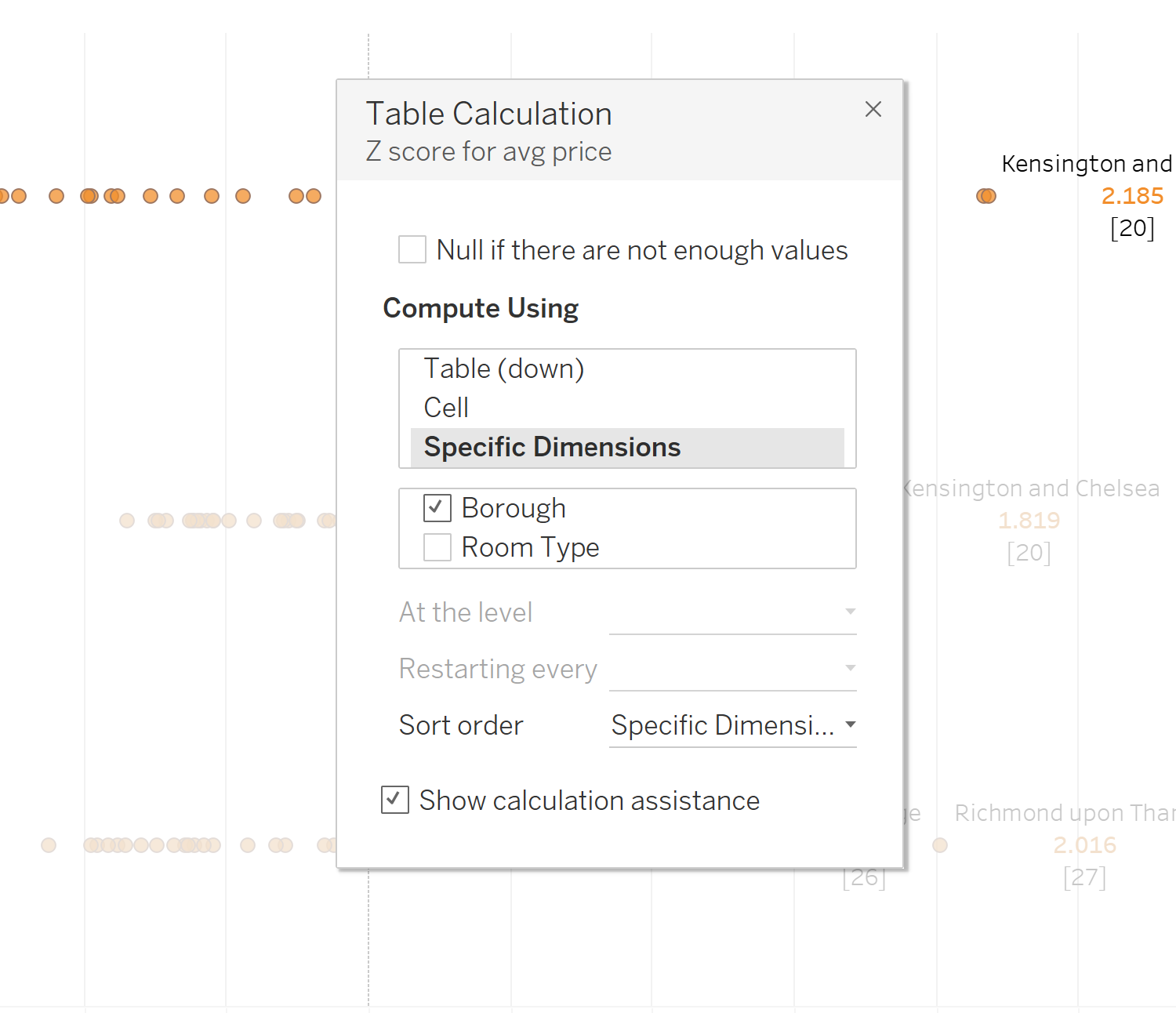
We set the specific dimensions to be ticked for Borough and unticked for Room Type; This is because we want to work out the Z score across Boroughs, re-starting every room type.
