Power BI has some great features that can be added to enhance our visualisations. One of these is adding specific report pages into tooltips.
The dashboard I am looking to add my tooltip is the following.
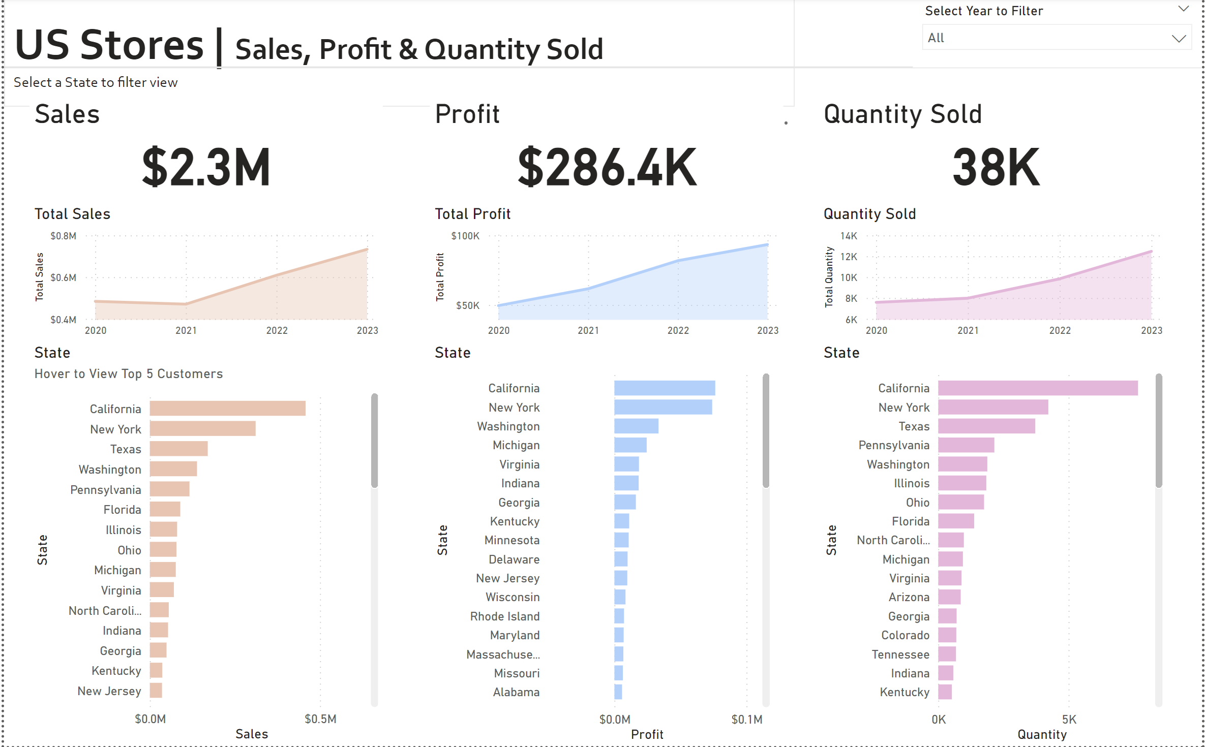
And this is an image of what the tooltip will look like at the end of this walkthrough, when the user hovers over any state in bar chart.
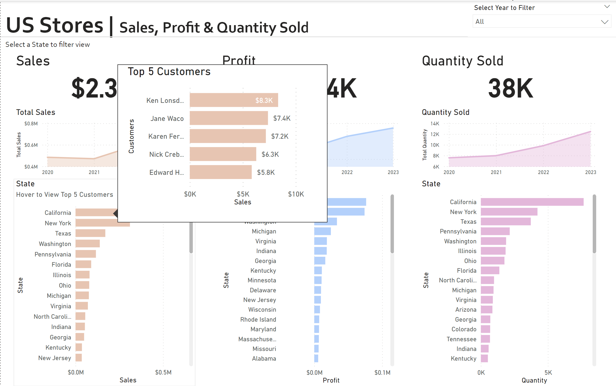
We can see in this image, when the user hovers over California, they can see the top 5 customers for that state, in terms of their sales.
To create this, the first thing we need to do is add a new page to Power BI and format that page to be the size of the tooltip.
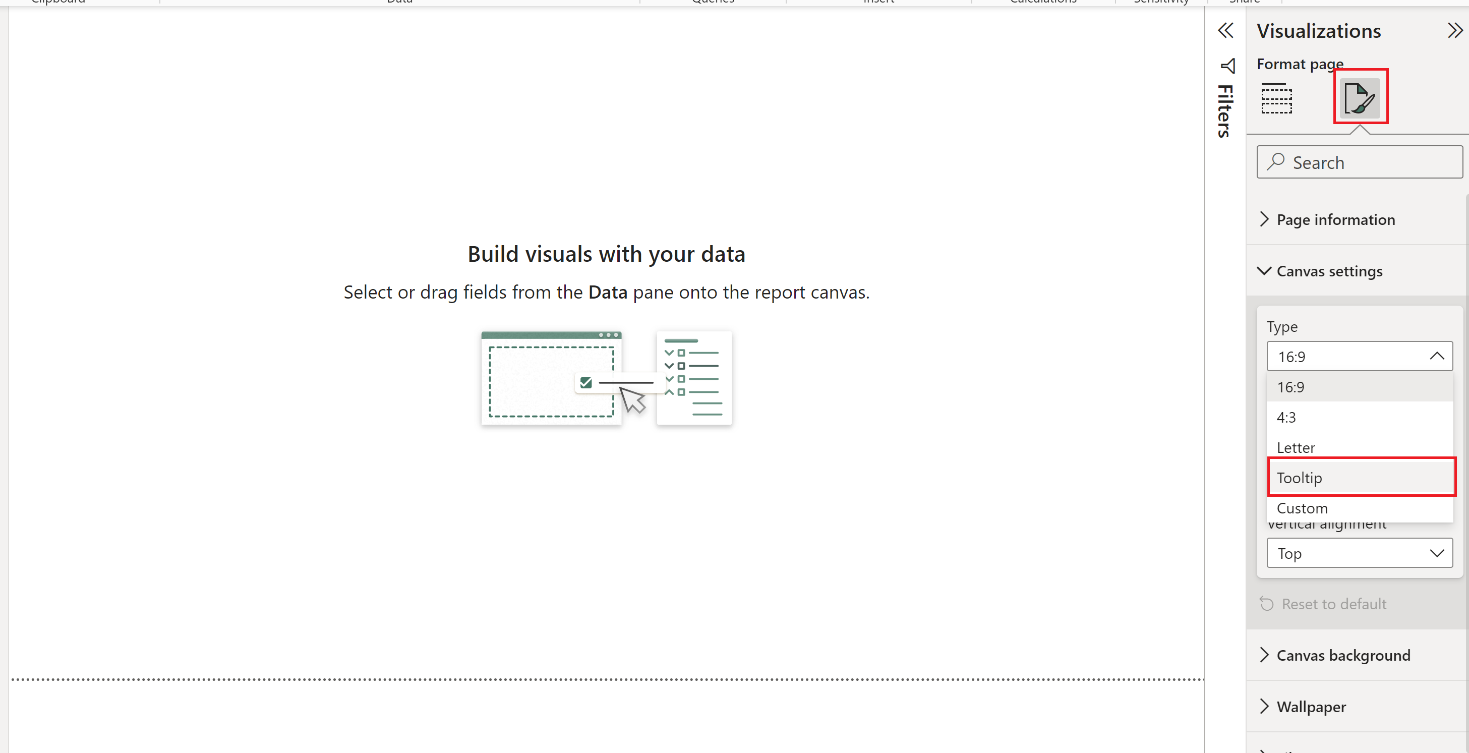
Following this, the size of the page will reduce drastically, to be the size of the tooltip. To this newly formatted page we will then add the visual that will appear in the tooltip. In this case, we want that to be a bar chart showing the top 5 customers by the sum of their sales.
The first step we do here is add a bar chart visual, with customer name on the y-axis and sum of sales on the x-axis.
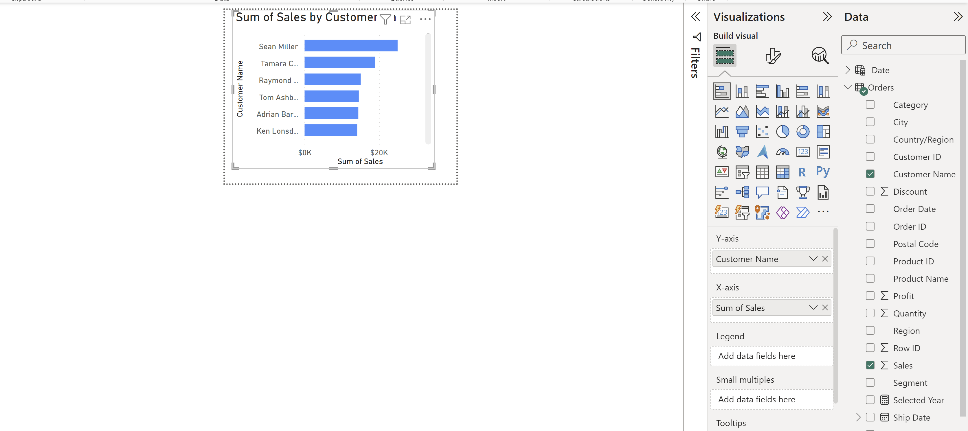
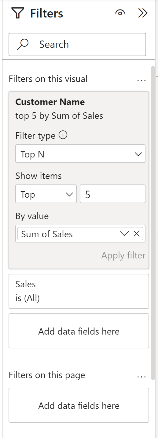
Following this, we need to add our 'top n' filter, which is configured through the filters pane. In the filters pane, we expand the customer name field and add the sum of sales, selecting top n, choosing '5'.
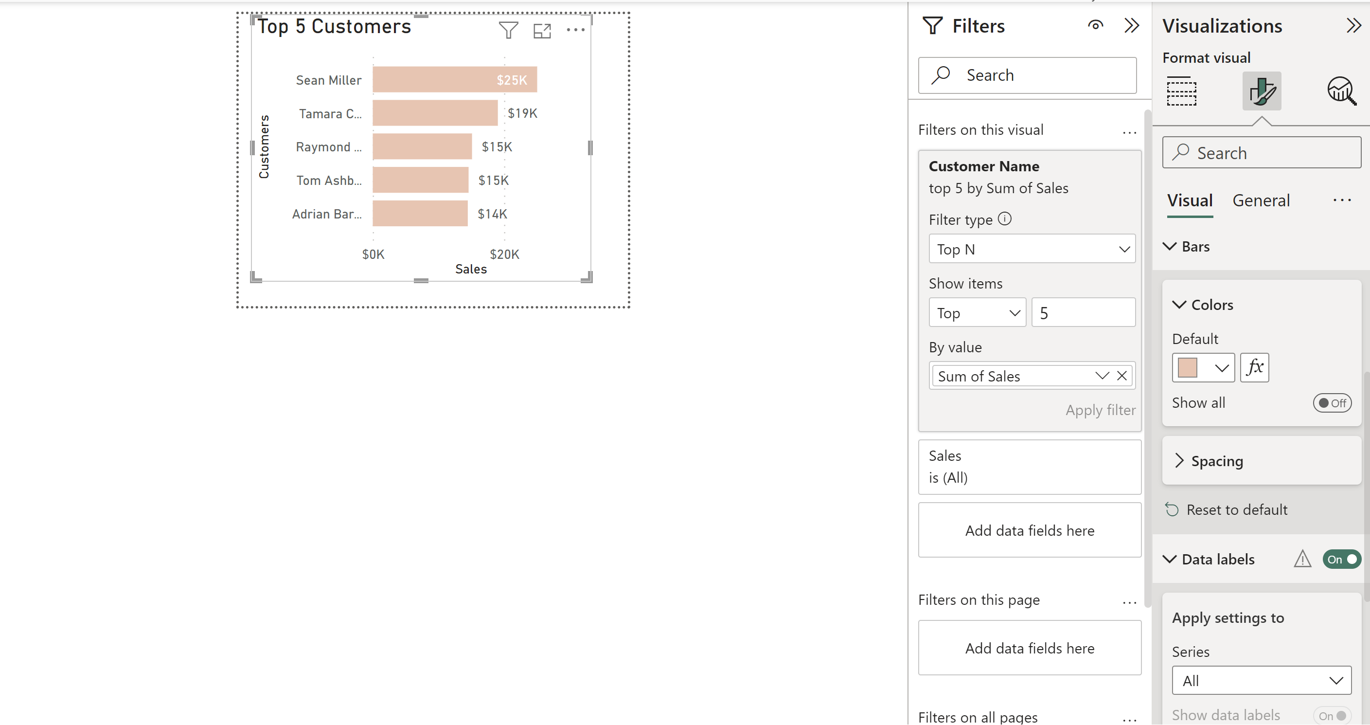
Once we have our top 5, we can do some basic formating to change the colour to match our dashboard, which is in the 'bar' dropdown, as well as adding some data labels.
Once we have our formatted tooltip page, we have to finish off by adding it to our specific bar chart visual. To do this, we return to our dashboard report page, click on the bar chart, and click on to format your visual in the visualisation pane. Following this, we select general, and expand 'tooltips'. In here, we simply select our type as 'report page' and page as the name of the report page where we created our tooltip. You can see that in the following image.
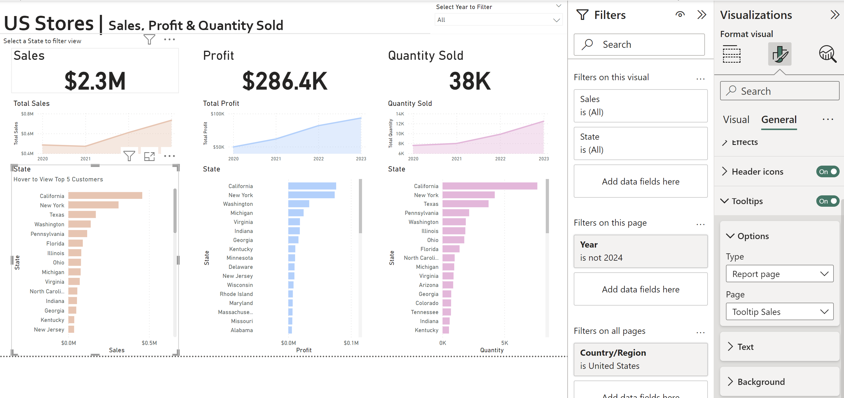
Once these settings are configured, hovering over any of the states in the sales bar chart will produce a tooltip of the top 5 customers in that specific state.
Happy tooltip formatting!
