


Chelsea FC Player Performance Analysis
Dashboard Week kicked off with a dataset from Chelsea FC — tracking player performance using GPS data. Each of us was asked to take this dataset and create a Power BI dashboard, deciding our own angle of analysis.
After a quick look through the fields, I decided to approach it from the perspective of a football coach. I thought it’d be interesting to look at how players perform in training compared to actual matches, and whether their training efforts translate to high-intensity match performance. The goal was to make something practical that could help a coach answer key questions about player workload, effort, and consistency.
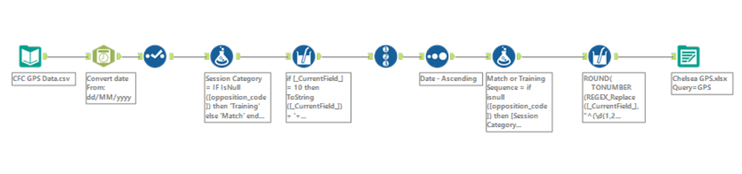
Cleaning the Data in Alteryx
Before anything could be visualised, the data needed some tidying. One challenge I noticed early on was that the dataset didn’t really separate out each session clearly — especially the training ones. The 'Match' column was either blank or filled with the name of the opposing team, so there was no unique ID for each session.
To fix this, I created a new column that labelled sessions as either "Training" (if the match name was null) or "Match – [Team Name]" (if it had a name). Then, I added a Row ID that restarted whenever the session type changed. That way, I could uniquely number each training session and each match against a team, like:
Training (1),Training (2), etc.Match Arsenal (1),Match Arsenal (2), etc.
This helped a lot when trying to group and compare sessions later on. It meant I could count how many sessions there were, how many matches were played against each team, and have a clean reference for each instance.
Shaping the Story: Thinking Like a Coach
With the cleaned data ready, I stepped back and asked myself: If I were a coach, what would I want to see from this data?
I settled on three key questions:
- Are players putting in as much effort in training as they are in matches?
- Are there patterns in performance over time?
- Which sessions — training or matches — show the highest intensity?
This gave me a clear direction for the dashboard. I wanted it to feel simple, useful, and focused. So I started sketching out some ideas on paper before building it in Power BI.
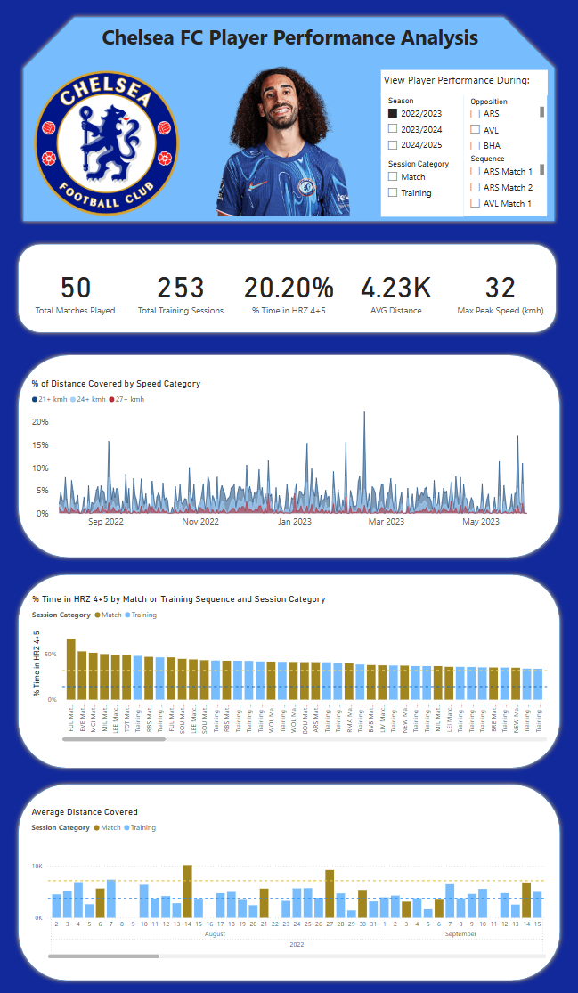
The Dashboard – Built in Power BI
I started the dashboard with a few key stats at the top — total number of matches and training sessions, average distance covered, peak speeds, and how much time players spent in high heart rate zones (zones 4 and 5). These stats are all interactive, changing depending on filters like season, session type, and opponent.
Below that, I included:
- A bar chart comparing distance covered at high speeds as a % of total distance covered (split into bands like 21–24 km/h, 24–27 km/h, and over 27 km/h)
- A chart showing % of time spent in HR Zones 4 and 5, broken down by session
- An area chart tracking average distance per session, with benchmark lines for matches and training sessions so the difference is easy to spot
I wanted to highlight when training intensity matched (or didn’t match) match conditions, and whether there were any spikes or dips that stood out.
Behind the Scenes
There were quite a few DAX measures working behind the dashboard, mostly for calculating percentages, averages, and custom benchmarks that wouldn’t change when filters were applied. I won’t go into the details here, but they were essential for getting the logic and interactivity working properly.
Final Thoughts on Day 1
Overall, this project offered a great opportunity to sharpen my data preparation and dashboarding skills, especially under time pressure. From exploring the dataset to cleaning and transforming it in Alteryx, and finally creating a tailored dashboard in Power BI, it was rewarding to go through the full end-to-end process.
One interesting takeaway for me—based on the metrics—is that performance in matches appears significantly higher than in training sessions, especially in areas like time spent in higher heart rate zones, distance covered, and high-speed efforts. To me, this could suggest that training sessions might need to be dialled up a notch to better prepare players for match-day intensity—or perhaps the players are just saving their energy for the big stage! Then again, I won’t pretend to be a football expert—just someone who likes asking questions through data. ⚽📊
Looking forward to what Day 2 brings!
Disclaimer
The image used in this post is for illustrative purposes only. The data presented does not correspond to the player shown. This analysis was conducted purely for educational purposes using anonymised GPS performance data from one unnamed player.
The dataset was publicly shared by Chelsea FC Performance Insights and can be accessed here:
https://github.com/Chelsea-Fc-Performance-Insights/Competition/tree/main/DATA