On the 2nd day of our dashboard week, we were tasked to create a dashboard using climate change data for a user that accessibility needs. I attempted to create a universal dashboard, essentially incorporating users that have: Colour blind, Dyscalculia (number dyslexia), keyboard only users & Blind users (require a narrator).
Creating a colour blind friendly dashboard was the last change I had to make, unfortunately I was not able to complete this within the time frame. However, if I had ample time I would ensure that the colour scheme used was able to seen by all colour blind users: Trichromacy, Dichromacy & Monochromacy.
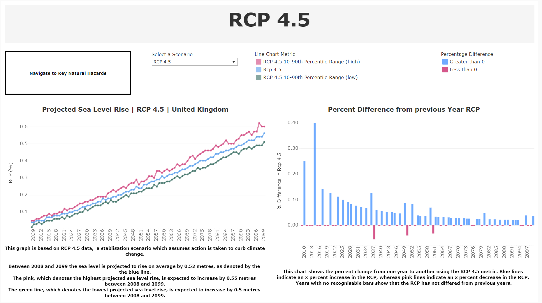
To allow keyboard only users to view my dashboard, I had to ensure that all graphs, filters & legends were in set order. This would allow for a simplistic experience for a user that was tabbing between objects rather than the tabbing order to jump all over the screen.
To allow for a blind user to be able to utilise the dashboard, I included captions for the graphs created so that the narrator would explain the graph to the specific user. This feature worked in conjunction with the tabbing for the keyboard user as when you tabbed onto a graph the narration would automatically play.
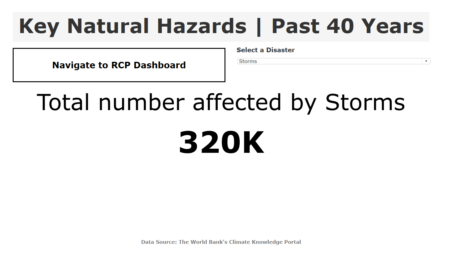
Lastly, in making a Dyscalculia friendly dashboard (as seen below), I made sure that the numbers were to 1 decimal place to ensure that an individual with Dyscalculia would not experience difficulty when reading digits. In addition, I created another dashboard that was entirely KPIs; In doing this I used dynamic zone visibility to switch between what KPI was being shown so that a user with Dyscalculia would only be viewing one number at a time. Users with Dyscalculia have difficulty in viewing multiple numbers at one time.