On day 1 of dashboard week we covered what it means to build dashboards with accessibility in mind. Some key points that were new to me were:
-CRTL+SHIFT+ENTER while viewing a dashboard will bring up the underlying data table of the selected chart, this can make accessing the underlying data easy for keyboard only users (ie no mouse).
-Using titles and captions intelligently to be compatible with text readers. You can provide hidden instructions by adding a caption and making the text small and white (or the same color as the dashboard background) so it's invisible to the eye but will be caught by a text reader.
-Using tab to understand the focus order of a dashboard. If there are multiple filters or buttons to flip through, you will want to understand how easy the focus order is to follow. We learned that before 2021, the tableau focus order would be the order in which you added an element to the dashboard. This led to really confusing navigation of the dashboard when only able to tab through. Since the 2021 release, the focus order is more intuitive and obvious to follow.
-Understanding what colors are not colorblind-friendly as well as taking steps to check whether two colors are contrasting enough to be legible when put together.
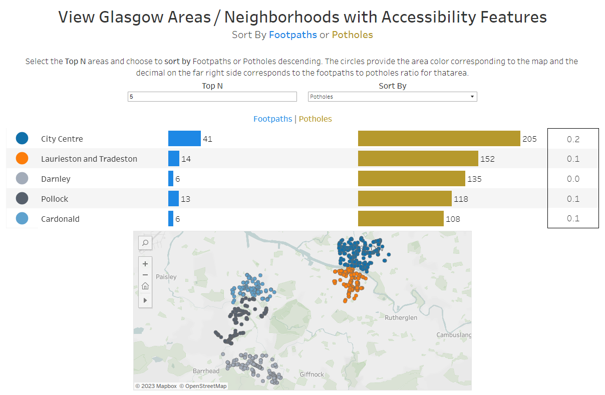
For our accessibility dashboard challenge, we were assigned Glasgow Fix My Street data where we had longitude and latitude of reported footpaths and potholes. I wanted to focus on creating a simple dashboard that is well explained and easy to navigate using only your keyboard and a text reader.
The specific accessibility elements I included were:
-Title with descriptive text as a sheet to ensure the text reader captures the different elements described in the title and sub-title.
-Parameter for Top N areas and Parameter for 'sort by' selection. The usual sort button we are used to clicking on our bar chart is not accessible when viewing as keyboard-only, so I built in a sort option as a parameter to easily use tab and space to change without a mouse.
-Purposefully used color-blind friendly colors and background color that is easy to read and has appropriate contrast.
-Include a map as a visual aid but not putting anything important details within the map that might require hovering, clicking or scrolling.