


In this post, I will share my honest first impressions of the Tableau Next experience and highlight some features I found useful while building a dashboard using the Superstore data.
The image below shows the end result of my Superstore dashboard about Customer Segment.
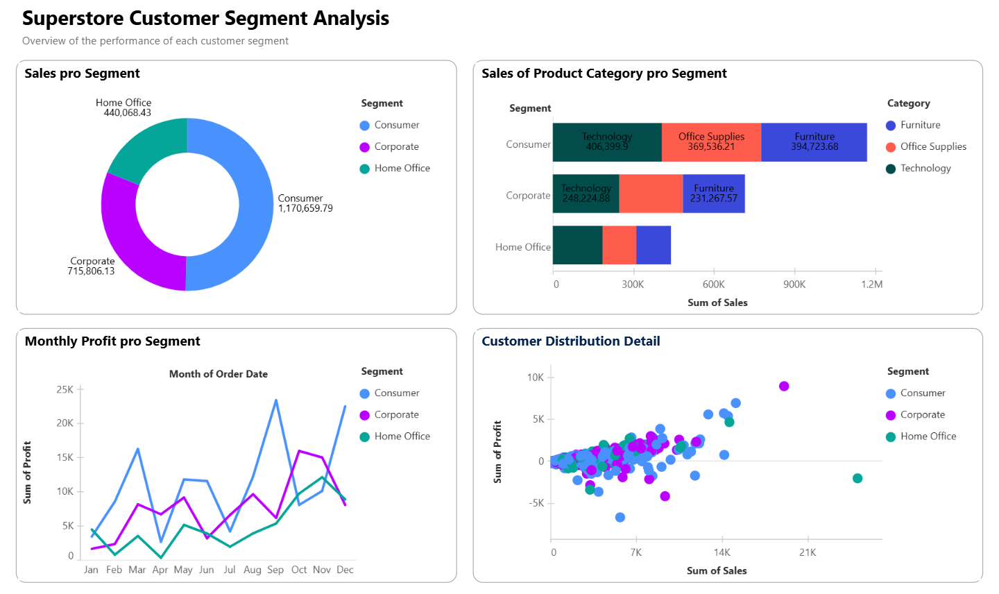
There are only 4 simple charts, a donut chart, a stacked bar chart, a time series line chart and a scatterplot, and no filters or parameter actions yet. I specifically chose to build different chart types because I wanted to see and test various features.
Donut Chart
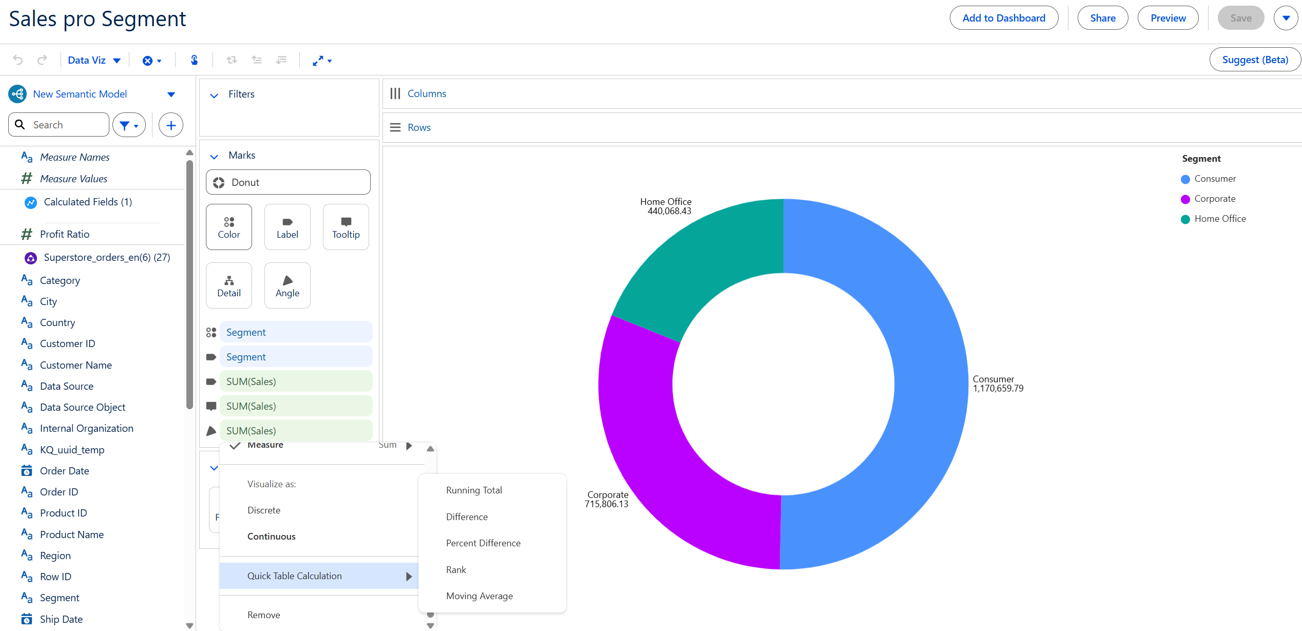
It was pretty easy to create a donut chart in comparison to Tableau Desktop. All you have to do is choose the Donut visualization in the Marks card and drag your dimension value on Color and measure value on Angle. Additionally, you can take the same fields again and drag them on Label to see them as text. What I found unoptimal here is that you cannot use Ctrl + Click on the fields in the Mark card to be able to drag them and you have to manually find them in the sea of fields again and drag them in.
In this case, I wanted to see the percentage of total of Sales of each Segment, but as you can see in the image, there is no option for Percentage of Total in the Quick Table Calculation, which I also found unoptimal in comparison to Tableau Desktop. Lastly, I figured out that the tooltip is not set automatically after dragging fields in and also cannot be directly edited. One thing you can edit is the name of the field you've dragged on Tooltip by clicking on the ▼ on the right of the field and choose Edit Label.
Stacked Bar Chart
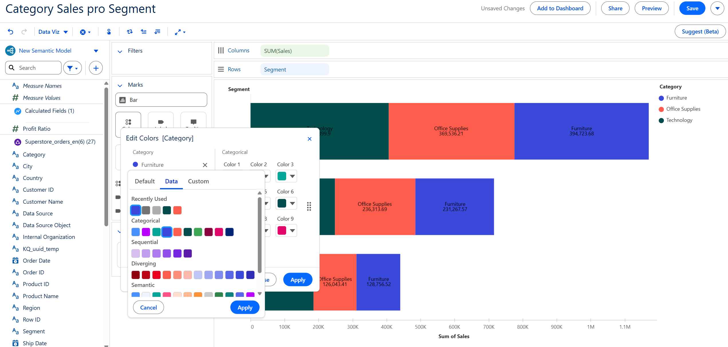
Bar chart is simple to build. And to have the bars additionally divided into parts such as in this case, each Segment being divided into Category, you only have to drag the dimension on Color. What I specially liked here is the color options provided in the Color mark. In the image above, you can see there are 3 tabs for choosing color: Default, Data and Custom. The Data tab has several color definitions that you can choose from and I found it very structured and easy to use.
Line Chart
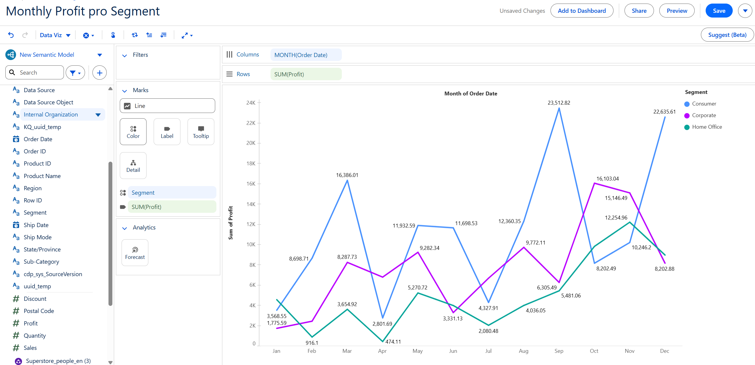
Line chart is also very simple. What I wanted to see here is the maximum and the minimum value of each line, and in this case, of each Segment. But what I found out after dragging the measure on Label was that you cannot flexibly edit the field labeling in comparison to Tableau Desktop. Here you only have one option that either all values are on screen or none at all. You also cannot format the texts on canvas.
Scatterplot
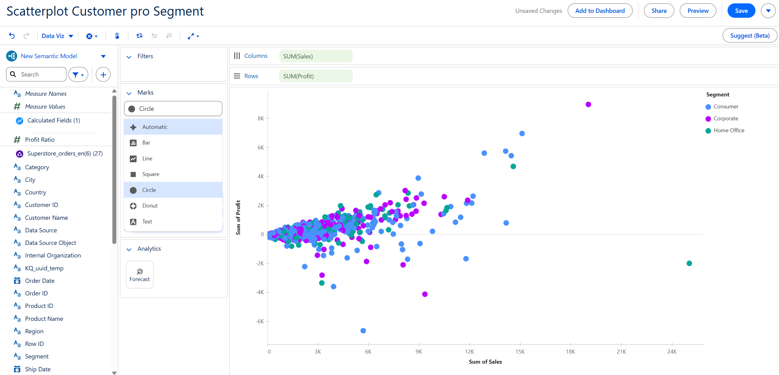
The same about field labeling can also be said here. You cannot choose to label e. g. the name of the customer with the highest sale or profit amount. Either all values or none. Additionally, you cannot format the axises or canvas in generall, which I found out while trying to rename the axises and to enabling the gridlines.
Building the Dashboard
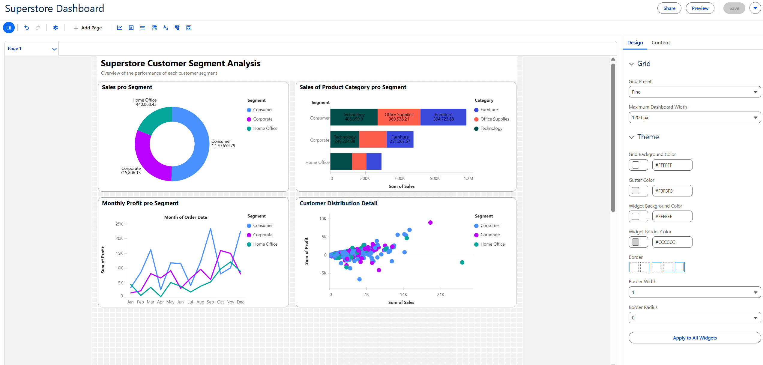
The image above shows the interface where you can build dashboards. From the tools pane at the top, from left to right, you can add visualizations, metrics, lists, toggles, text fields, buttons and containers into the current page. You also can have multiple pages. On the right side of the interface, you can edit the page's design like grid setting, page width but not height, page theme, borders and the option I like the most is Border Radius.
While building this dashboard, I found the grid layout very useful and it helped me to easily place and align elements. However, I found it very buggy whenever I tried to resize or move elements around. Other thing worth to mention is that you cannot disable some of the color legends and have only one of them or move them else where on the canvas. As you can see in the image above, I have 3 color legends with the same colors and I just want to have one as reference but I cannot do it.
Chat with Agent
In this case, I didn't chat much with the AI Agent built in Tableau Next. I asked it a few questions about some information connected to my dashboard and it often gave me very detailed answers but some other times, I had to rephrase many times for it to give me the answer I want. Agent can be really helpful and efficient if you know exactly what you want to ask and can give it a well written prompt. Otherwise, the chat with it can consume a lot of your time and you still won't get the desired result.
Conclusion
In summary I found Tableau Next is a promising product. Although there are still many limitions on features but I think it's efficient enough for building simple dashboards. However, it's important to note that it's new and still being developed so when it comes to a deep-dive analysis, Tableau Desktop remains essential.