A Gantt chart in Tableau has three elements:
- A dimension, giving the different items on display
- A measure (usually date/time), giving the start point for each item
- An optional size measure, giving how long the item lasts
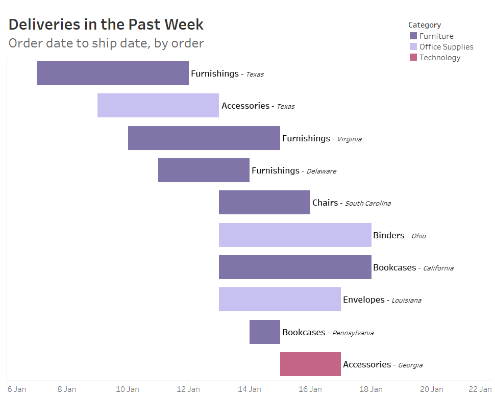
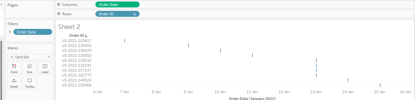
In this example, I'm looking at the order/shipping times over the past week. I'm using the Superstore sample dataset and have filtered the data to the final week. I want each bar of my Gantt to represent an order, so I begin by dragging my Order ID dimension to the rows. The start point for each of my orders (representing the left each of each bar) is the Ship Date measure (exact date), so I drag that to columns. From the Marks pane, I set my chart type to Gantt.
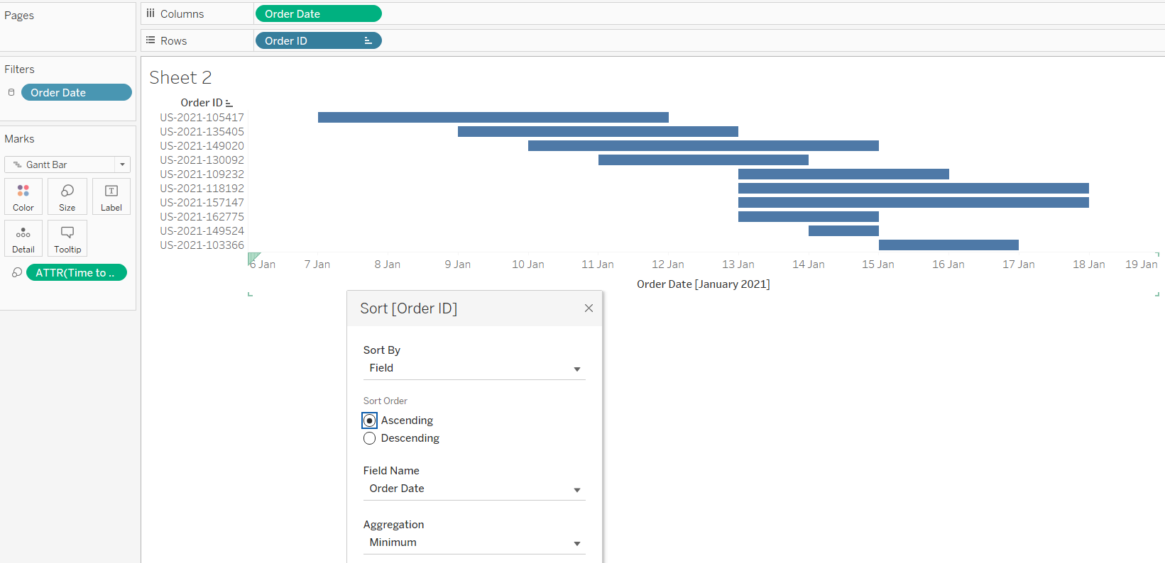
To extend the Gantt bars out - in this case up to the shipping date, I need a measure of the time between order and shipping. For this I create a calculated field 'Time to Ship' with the calculation [Ship Date] - [Order Date]. Depending on your data, you may already have a suitable duration field, and won't need a calculation. This is added to Size, and extends each bar rightward by the specified amount. The bars are then sorted by Order Date so later orders appear further down.
And that's all that's needed to create a Gantt chart. This can then be formatted, and additional details added, to create a more informative and easy-to-read chart like the one below.