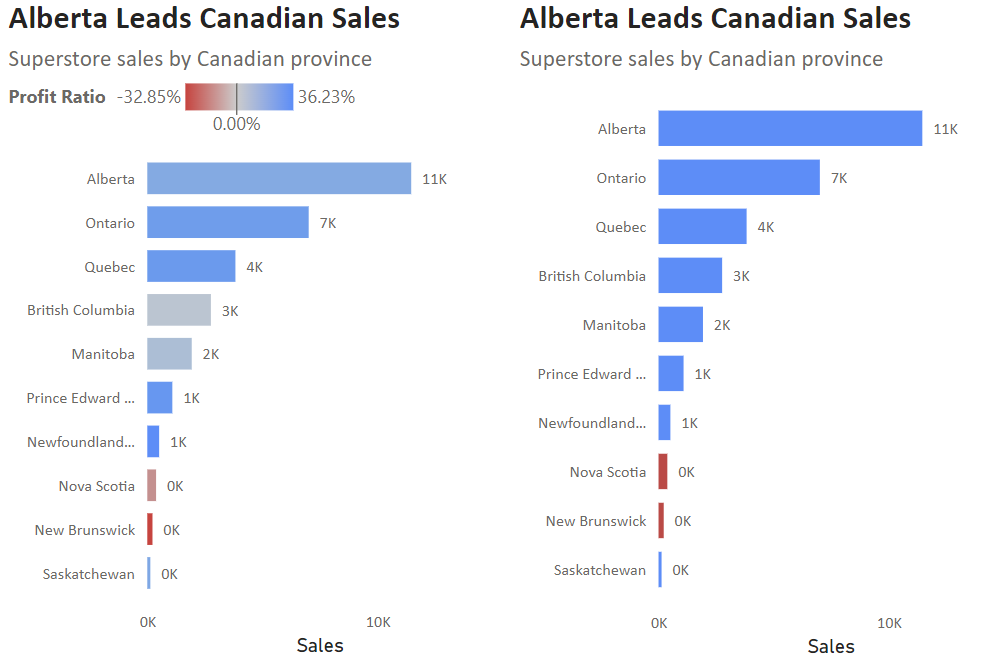
We can add information to a graph or map in Power BI with conditional colour formatting. This blog illustrates two different ways to do this, with the different outputs shown below.
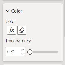
To begin, we need to select the graph and locate the colour formatting pane. This will be found in Visualizations > Format Visual, although the location within Format Visual depends on the graph. For a bar chart it is found within Bars > Color. Conditional formatting can be accessed using the fx button, shown below.
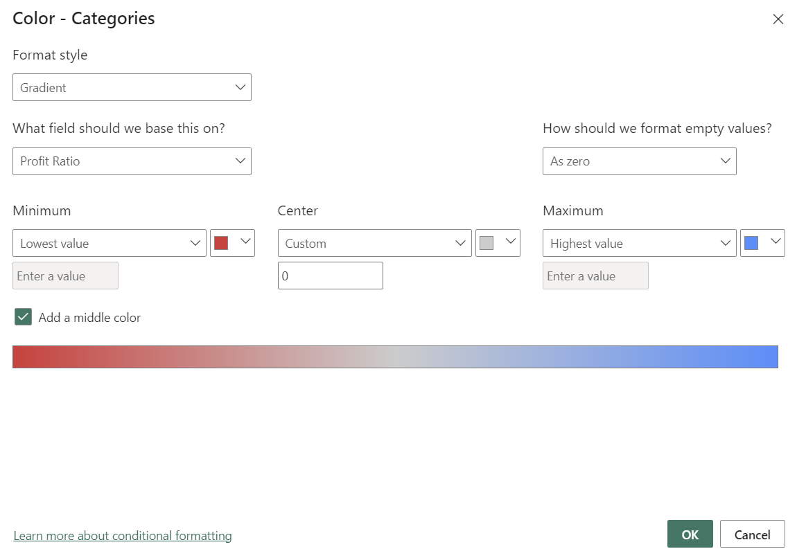
Colouring can be gradient or categorical. If we want a gradient colour spectrum, we select the Gradient format style, then choose the field we want the colour to be based on - in this case, Profit Ratio. The colour gradient by default extends from the lowest to the highest value in the field, although the range can also be selected manually. An optional middle value and associated middle colour can also be added, which is most useful for centring a zero-value in the gradient.
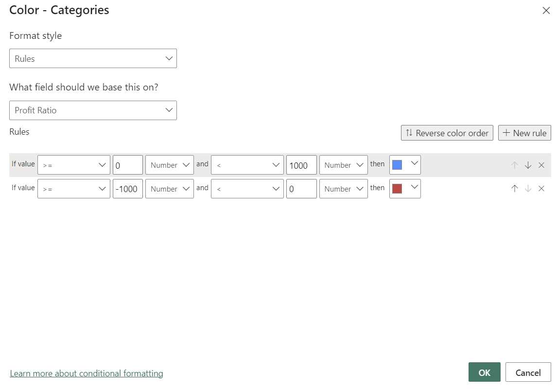
Categorical colour bins can also be added by selecting the Rule format style. Individual colours can be assigned to specific value ranges for the chosen field. In the right-hand bar chart at the beginning of this blog, positive and negative profit ratios are highlighted with conditional colour rules, shown below.