


This week I decided to create a Power BI dashboard focusing on RDWF's call center data. My main goal was to develop visualizations that would offer valuable insights into call center operations while also providing a detailed view of customer interactions.
One of the main challenges was determining which metrics were most important to include in the dashboard. Call centers data can contain a variety of fields, from call volume from waiting time to customer satisfaction scores and agent performance metrics. Selecting the most relevant metrics required careful consideration in my case.
Once I imported the data into Power Bi and defined the metrics, I focused on designing a dashboard with a clean and user-friendly layout. For the Executive Dashboard, I wrote some DAX calcs to highlight the highest number of records within a view and to calculate the rank for the city and state level. I then added some charts, graphs, and KPIs that provided a comprehensive view of call center performance, highlighting trends and areas for improvement. I also added buttons and generated the action, so that the user can switch between state and city view (please see below)

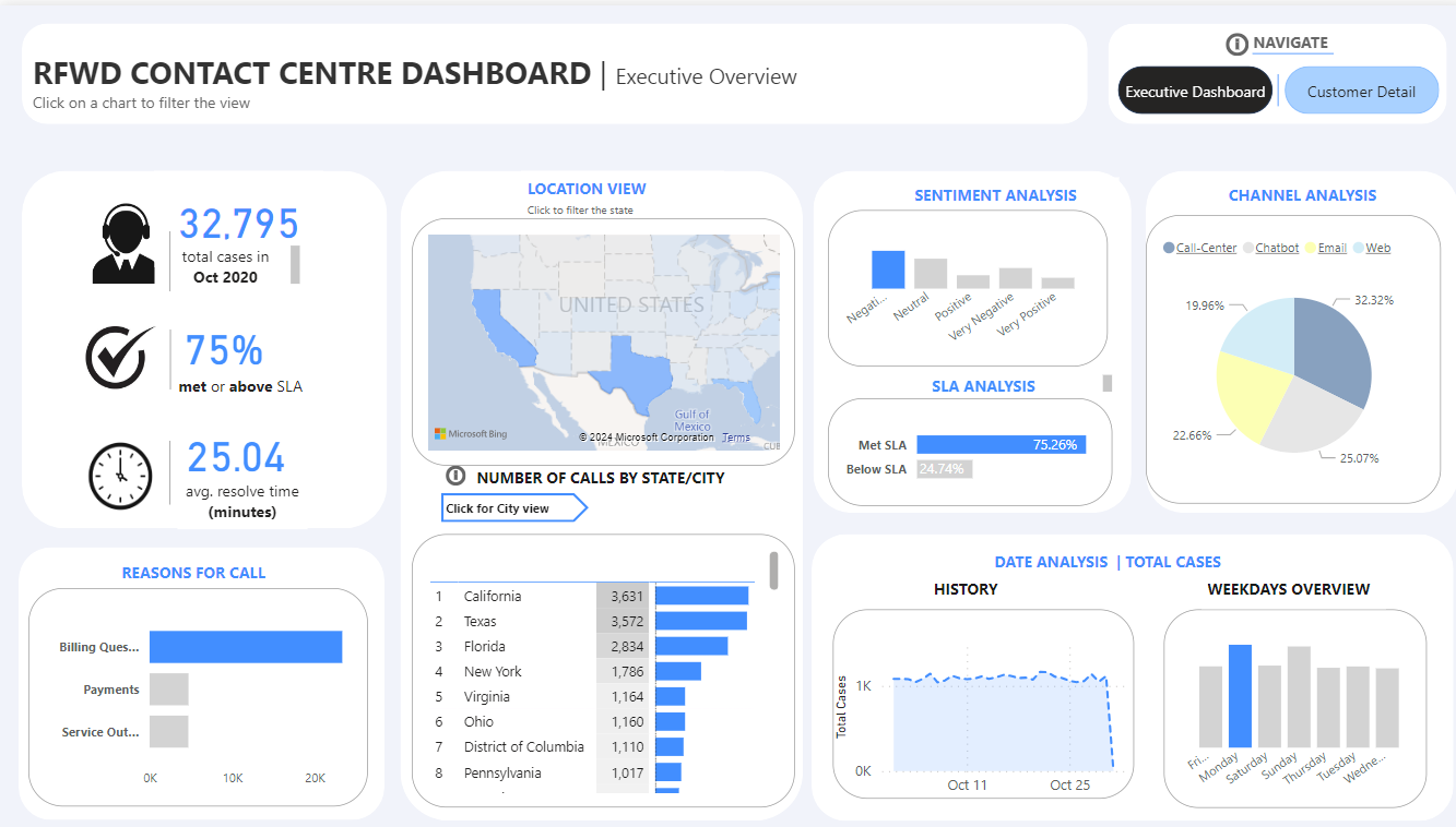
Key Features:
- managers can access the dashboard to check the current situation for each state/city and make decisions based on the data
- the dashboard has a clean and intuitive design, with easily understandable visualizations.
- the graphs have a dynamic color based on the maximum number of records so that the user can easily see the areas with the highest records within each category.
- contains interactive features such as filtering, sorting, and rank capabilities and allows users to explore data from different perspectives and levels of detail.
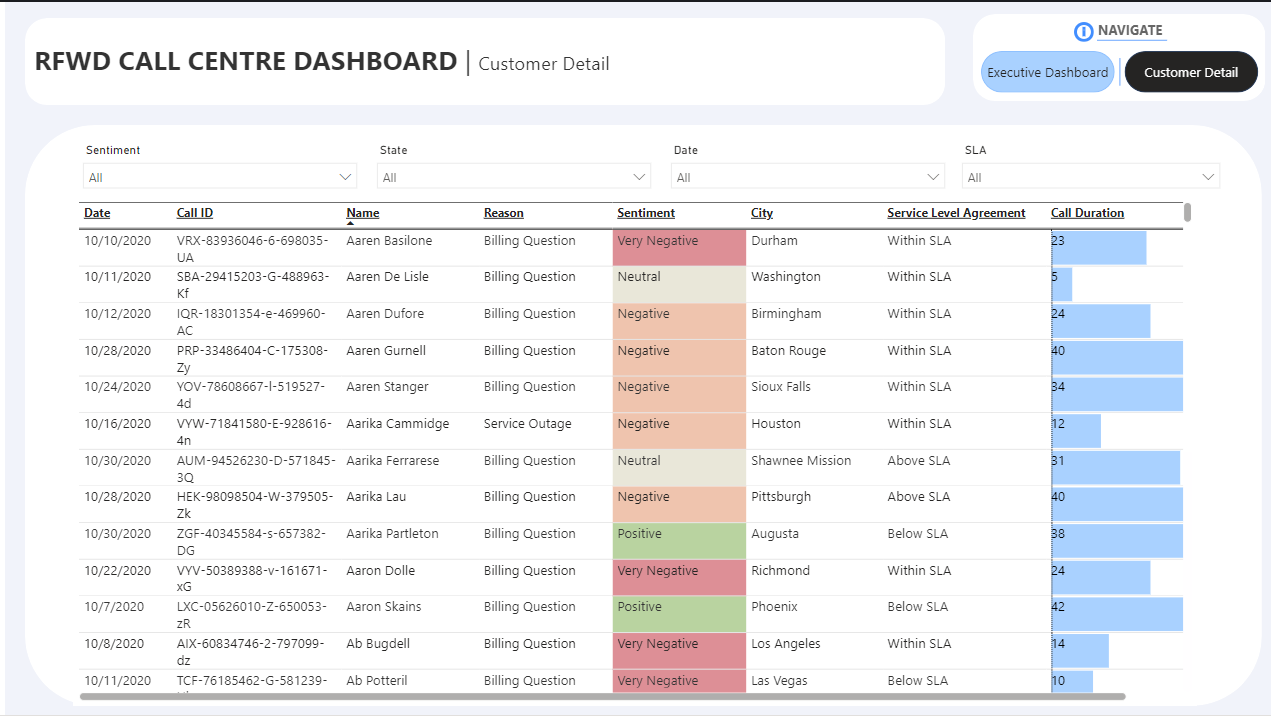
In addition to the call center dashboard, I developed the Customer detail dashboard to explore individual customer interactions further. This offered insights into customer preferences, behavior, and sentiment, allowing RDWF to personalize interactions and improve overall customer experience.
Key Features:
- offers the user the possibility to filter the view based on date, state, SLA and sentiment.
- the dashboard contains an effective use of color that highlights the sentiment of the customer ( ex. negative, very negative, positive, neutral) This can help the manager to distinguish the data faster and make the most appropriate decisions.
The limitations
- the date field contained only the records from Oct 2020, so I was unable to provide current year/month/day vs prior year/month/day analysis.
The Data is from RDWF | Call Center
Please find the published dashboard here:
https://www.novypro.com/project/contact-center-dashboard