


Our task for today was to look at Museum data and to focus on the process for finding insights in the data.
The data from today is from this article by Mapping Museums and can be found here.
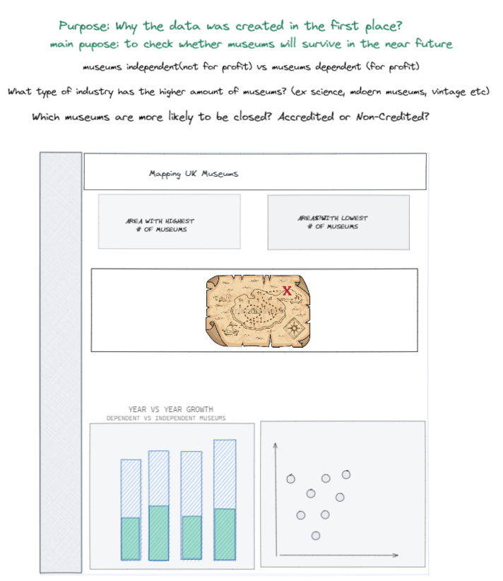
I first started by creating my user story along with some questions that I would like to have the answers.
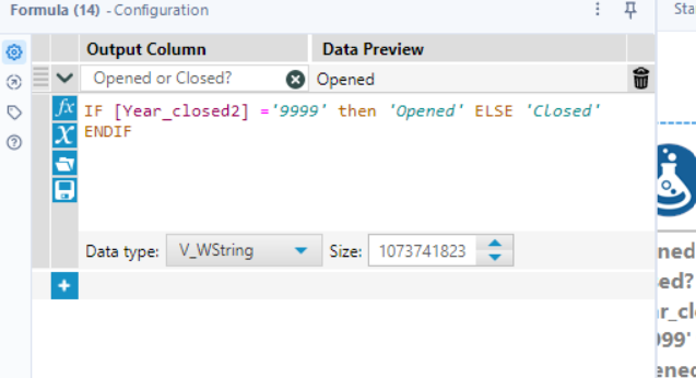
The dataset was not a headache so the only thing I had to do was to split the years and remove "_" from some columns. Also, I used the Formula tool to calculate the closed and opened museums (because there were a lot of years ending in 9999)
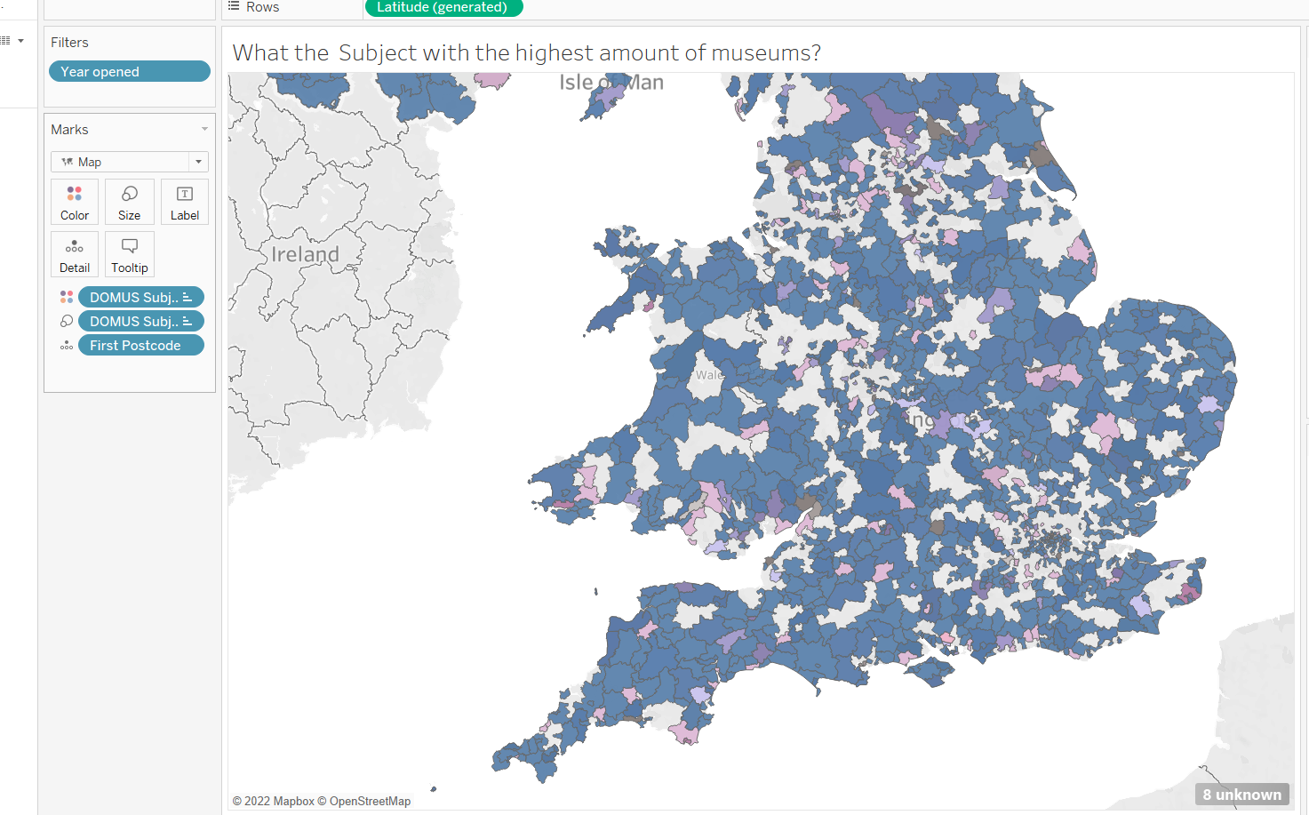
After preparing the data and creating the user story I went to Tableau and to started to create some charts. The issue that I had was with the Map itself. For some reasons, the region and cities couldn't be read in the map and the only thing that could be read was the Postcode. This is how the map looked with the first postcode (HORRIBLE, right?) 😣
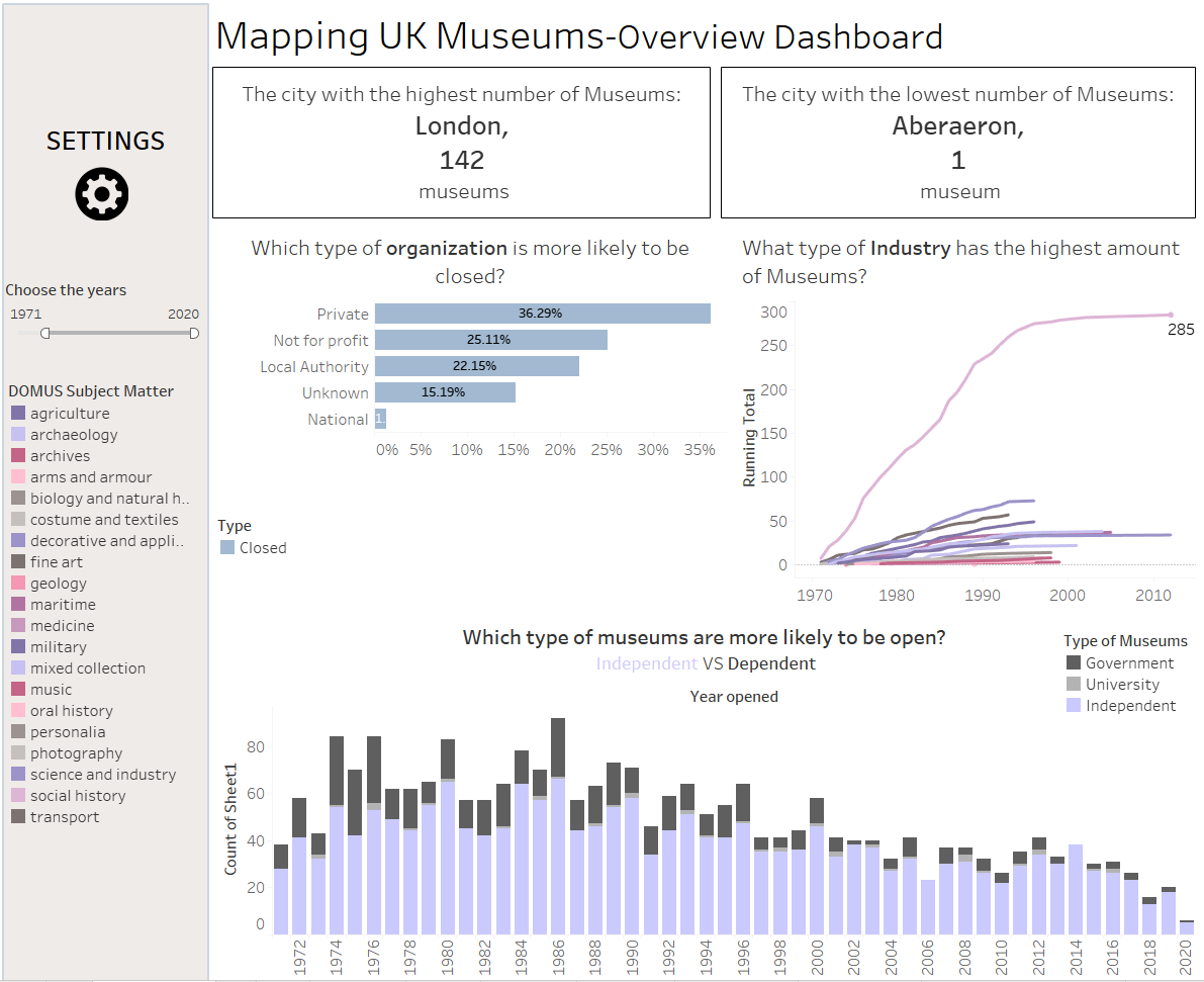
After spending more than one hour with the map (asking for help, changing the data type etc.) I realized that I need to change the chart (so I created a chart in a hurry to replace them map from the dashboard)
This is how my final dashboard looked like with the available time:
If I would have more time, I would probably put more effort into researching this subject and also potentially joining another dataset. I think that a dataset with "the number of visitors for each museum" would be interested to compare. 💡
See you next time!