


For one of my personal projects, I will be building a business dashboard specifically for an events company - read more about my plan here.
As much as I want to focus on the usability (i.e. ensuring there are valuable insights) which often means sticking to simple charts so it can be easily understood, I also want to use this as an opportunity to challenge myself to create an unconventional chart in Tableau.
As per my user story in my initial blog, a feature of the dashboard which will be insightful is to identify whether there are any seasonal trends in bookings, to help us better prepare for any seasonal surges in demand. It would have been easy to go with a basic line or bar chart to show this, but upon browsing through tableau public, I thought a radial column chart would be a pretty cool alternative.
This blog post will walk you through how to create a radial column chart in Tableau.
Foundations of Geometry
Before getting into the step-by-step process, let's start off with some foundations of geometry to better understand the logic behind the process of building the chart.
The standard (quadratic) equation of a circle is as follows:
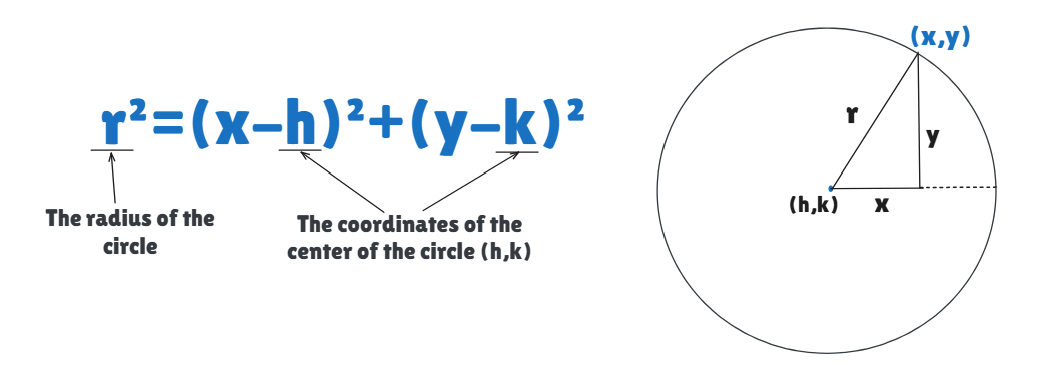
This is because of SOH CAH TOA - this mnemonic tells us the relationship between angles and the sides of a right-angled triangle.
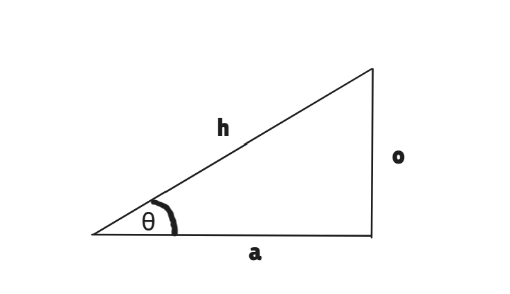
SOH CAH TOA tells us that Sinθ = o/h. Similarly, Cosθ = a/h.
Applying this principle to the sketch of the circle above, means that:
Sinθ = y/r - multiplying both sides by r means
rSinθ = y
Similarly, Cosθ = x/r - multiplying both sides by r means
rCosθ = x
Applying Geometry to the Scenario
In order to build the radial column chart, we need the points of the date to form the circumference a circle, which will create the inner circle in the chart - this is the starting point of each bar. The length of each line is determined by the value e.g. Sum(Sales), or in my instance, Sum(total bookings). When this is added on to the starting point for each date, this will then create points for the outer circle.
Applying the geometry logic to this, each of the starting points that form the inner circle of the chart, will have their own (x,y) coordinates, as per the below image.
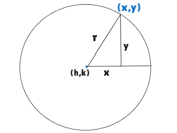
Since we've established that for each (x,y) coordinate the value for x and y is determined by x = rCosθ and y = rSinθ, this means that for each point of the outer circle, the (x,y) coordinates are defined by
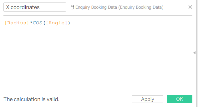
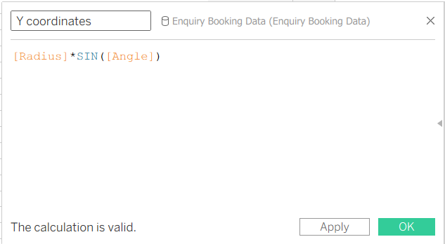
x = r(+'sum of total bookings')Cosθ
y = r(+'sum of total bookings')Sinθ
Building the Radial Column Chart in Tableau
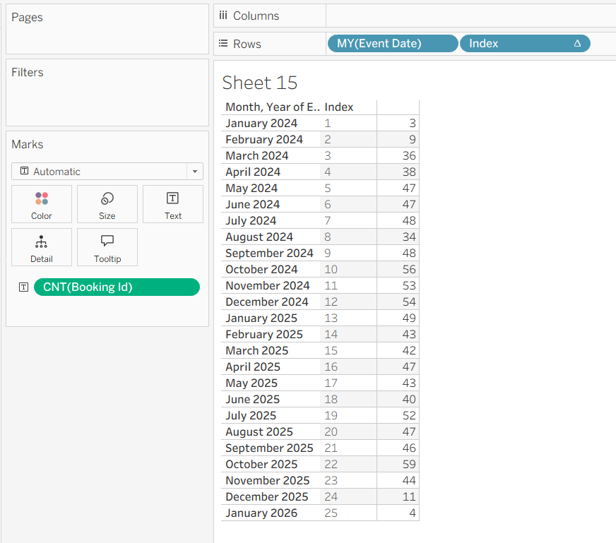
It's good practice to create a basic table as you create calculated fields for the points on the chart etc, so you can sense check the results.
Step 1
Starting off by putting your date field as a discrete pill on rows, in my case this is the Event Date field, and the measure to the view (in my instance count of booking ID). Next you will need to create an Index calculation as a discrete field and add this onto rows, as per the below image.
Step 2
As mentioned above, since we need to create points for the inner circle and outer circle, this requires us to duplicate the dataset, which we can do by unioning the dataset onto itself in the Data Source page of Tableau. We will come back to this in Step 4.
Step 3
Next we need to create a calculated field for the Angle Increment. The purpose of this calculated field is to split the 360° angle of the inner circle equally amongst each of the date/month buckets in the table from step 1 - in my instance this is 25. To make this dynamic, we can use a fixed LOD in the expression for the calculated field.
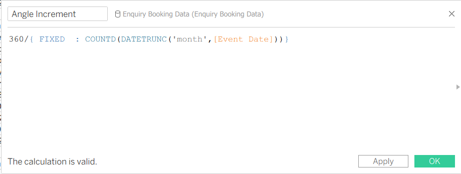
Since this essentially divides 360 by the number of months in the date field (25), we can work out the individual angle for each point (i.e. each month) on the circle by ensuring the angle increment for each point is a cumulative/running sum. To do this, we can create another calculated field for Angle.
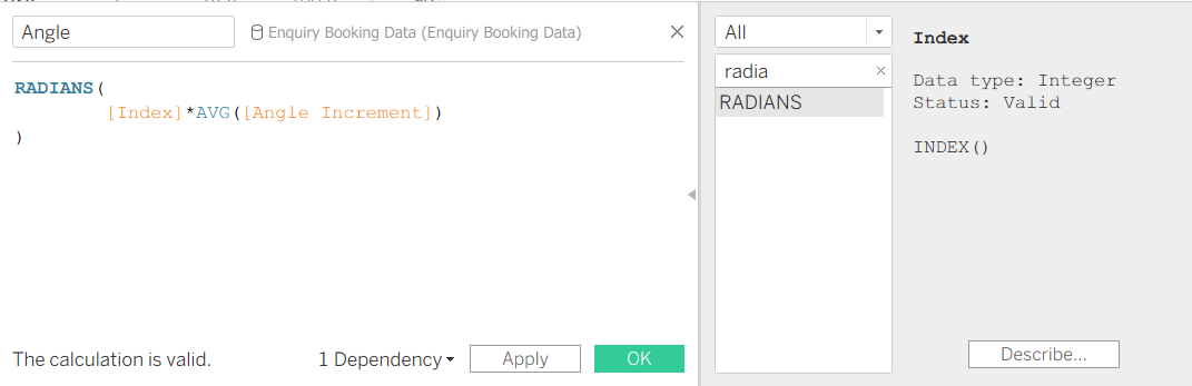
As per the image above, we simply multiply the index calculated field from Step 1 by the average angle increment. We then wrap this expression in the RADIANS function, as this is the function that allows tableau to identify the values as angles.
Step 4
Now that we have created the calculated field for the angle, referring back to the Geometry Foundations above, we know the x and y coordinates to be defined by
x = rCosθ and y = rSinθ. This means we just need the r value (radius) to be able to derive the x and y coordinates for each point.
This is where the unioning the dataset in step 2 comes in! When you union datasets in tableau, this automatically generates a new field called Table Name. The radius is defined by the following formula:
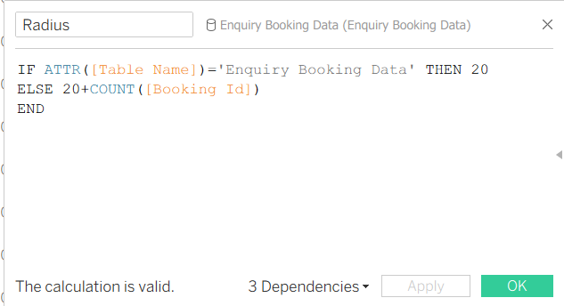
'20' in the above calculation is the value of the radius of the inner circle of the chart we want to create. You can choose any value here, that makes sense with the values in the measure used in your chart, or alternatively you could create a parameter for this to allow for user interactivity.
Now we have the Radius, we can create the x and y coordinates for each point using x = rCosθ and y = rSinθ.
Step 5
Now we can begin building!
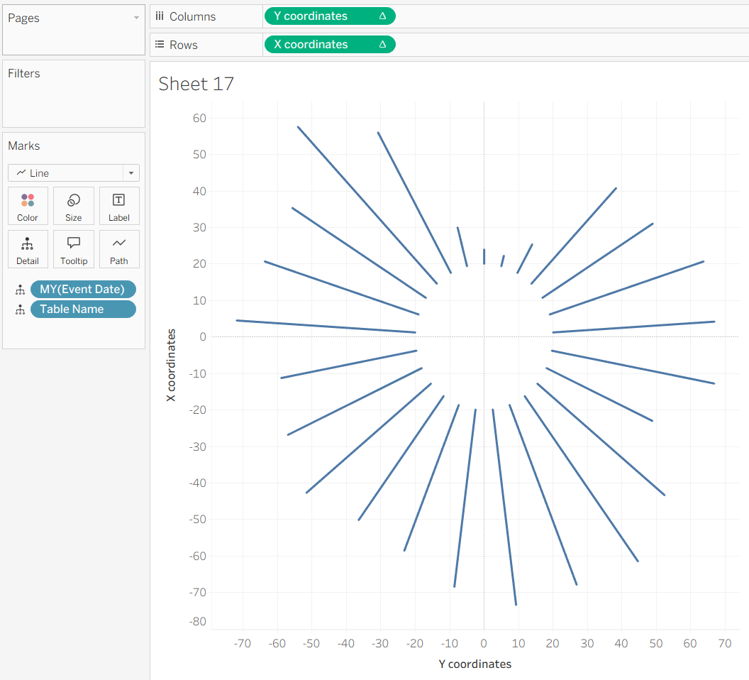
Create a new sheet in your workbook and drag the Y coordinates field to columns, X coordinates field to rows, Table Name to detail, and the discrete Date field to detail. This should give you a perfect diagonal line, as per the below image.
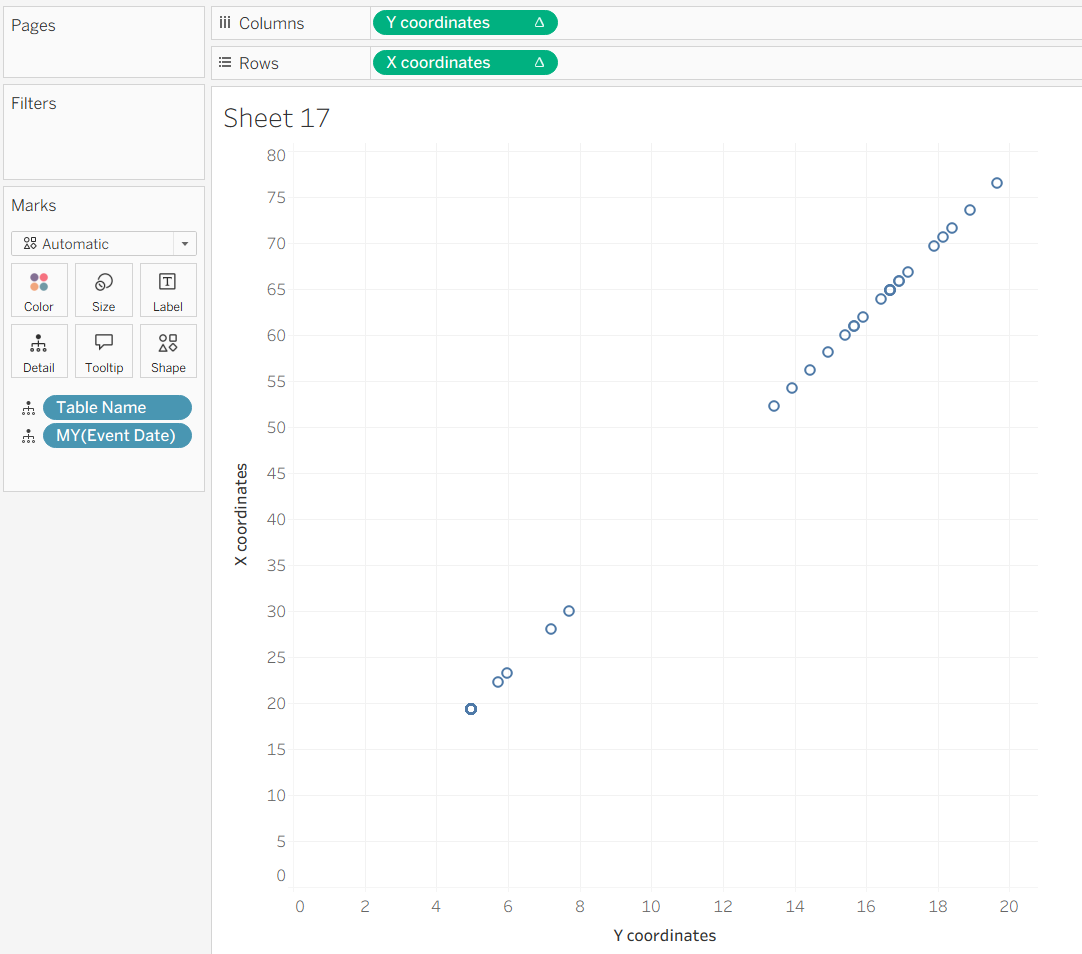
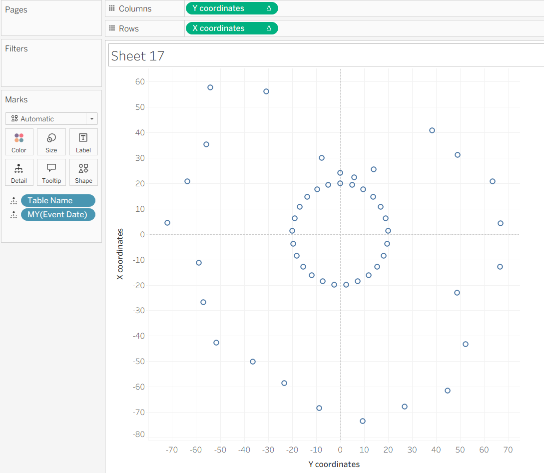
We can see that the X coordinates and Y coordinates are table calcs (indicated by the ∆ symbol), so to get this from a diagonal line to show the inner circle and outer circle points, we must right click each field in the rows and columns shelf, select Compute Using and select the Date field in the visualisation.
This should then change the points to look something like the below image, where we can see the points of the inner circle and outer circle.
To get this chart to show lines, change the Marks card from Automatic to Line and drag the MY(Date field) pill above the Table Name pill in the Marks Card, as per the below image.
Formatting
You can make the lines thicker by increasing the size on the Size marks card, and also have markers at the start and end of each line by selecting the Colour marks card and choosing Markers.
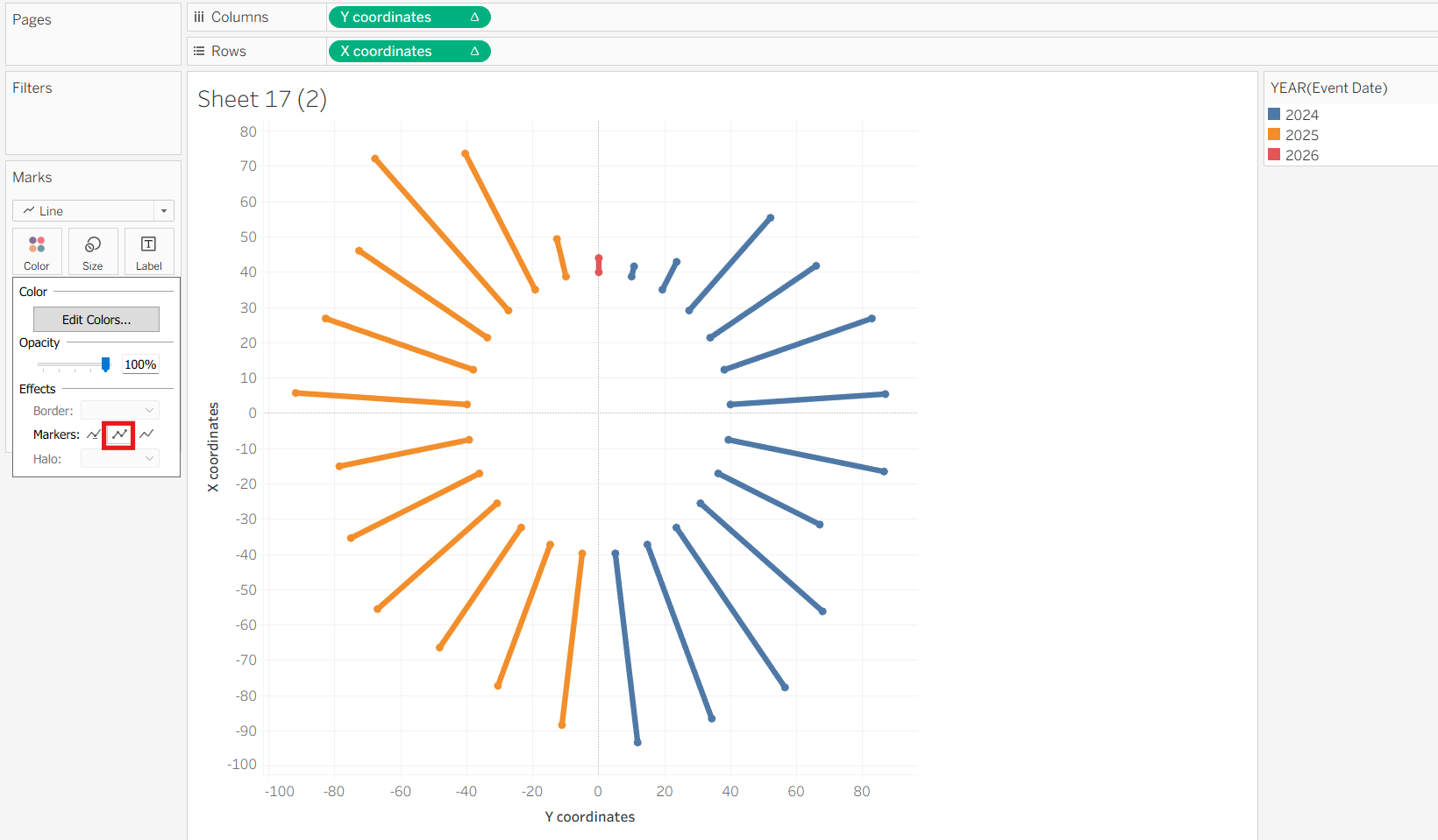
You can also colour the bars by YEAR of the date field or any other field of choice to add more detail to the view, and add labels as you see fit.
Tips for Interactivity
As mentioned above, you can make this chart interactive with the use of parameters. You can use parameters to allow the user to pick a value for the radius of the inner circle and the angle of the chart (e.g. instead of a full 360 degrees circle, having this as a 180 degrees semi-circle etc). These parameters can then be included the respective calculated fields to allow for interactivity. You can refer to this Youtube video for a step-by-step guide on how to this.
I hope this blog post was comprehensive enough, and keep an eye out for my final dashboard!