Day two of dashboard week and today we were focusing on the importance of accessibility in dashboard design and what this looks like.
The Brief
Today's brief was as follows:
Scenario - Chloe from the Mayor’s Office is interested in promoting inclusive tourism, but she’s open about her dyslexia and dyscalculia. She finds most city planning dashboards overwhelming or unusable, particularly those filled with icons, percentages, and colours that blur together.
Data: The London Accessibility Dataset — Attractions sheet (access features, booking policies, etc.)
Output: Upload to Tableau Public. Your version of the dashboard should:
- Minimise cognitive overload (no heavy grid layouts or dense legends)- Use plain English and icons with alt text
- Offer voice-over summaries or toggles for simplified views
- Show rankings visually rather than numerically when possible
User Story and Sketches
After looking at the data and assessing the brief, I came up with a user story to base my dashboard on. The user story I settled on was:
As someone with a cognitive disability
I want to decide which London attractions to visit
I can decide which attractions to visit
By assessing which attractions are inclusive for people I may be travelling with
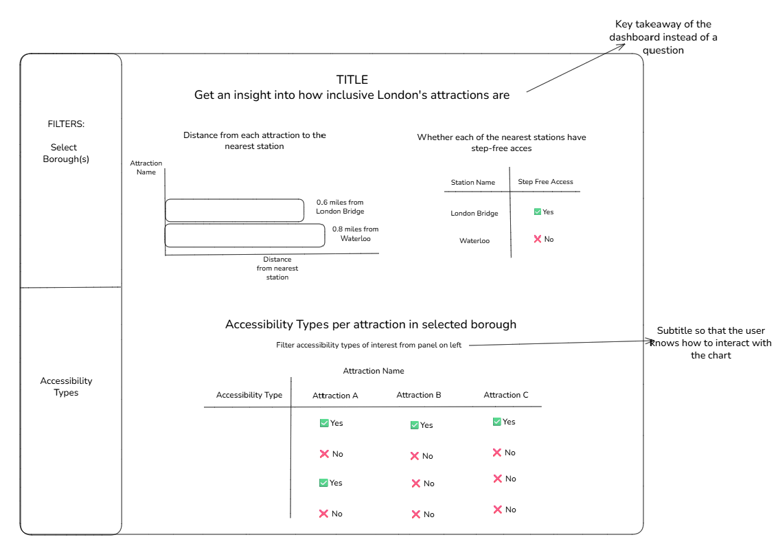
I created the below sketch in excalidraw centered on this user story.

Features of the dashboard sketch:
- I wanted the 'distance from each attraction the nearest station' chart to be ordered by lowest to highest, so the user can easily and quickly identify which attraction has the closest distance to a station - I also wanted the station names in the accompanying table showing 'whether each of the nearest stations have step-free access' to be ordered in the same way so that the user can easily make a correlation between the two charts, and see whether the station closest to their attraction of interest has step-free access --> this also meets the output requirement of showing rankings visually rather than numerically
- I wanted the bars in the 'distance from each attraction the nearest station' chart to be labelled with the value of the distance and the name of the nearest station to cater this to the needs of the user, who may struggle with being able to identify the value of each bar by reading it from the axes
- I wanted to include a filter for 'Borough' and 'Accessibility Type' to allow the user to limit the number of marks in the view of the charts, so as to not overwhelm them
- I wanted to use an off-white colour for the background of my dashboard to make it dyslexia-friendly - the contrast of stark white backgrounds with black text can be too harsh for dyslexic viewers of a dashboard
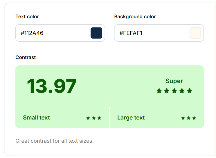
- I checked the coolors website to find a text colour that would be suitable for the off-white background I chose, and settled on the below colour palette:

My Final Output
I did have to do some minor data preparation in tableau prep to restructure/reshape the data to be able to achieve the visualisations I had sketched out.
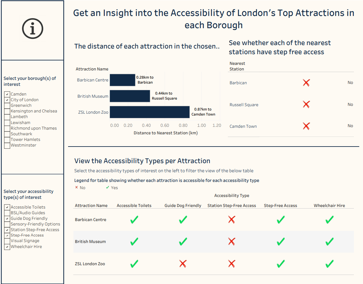
My final dashboard can be seen in the below image, you can also view it here on Tableau Public.

