


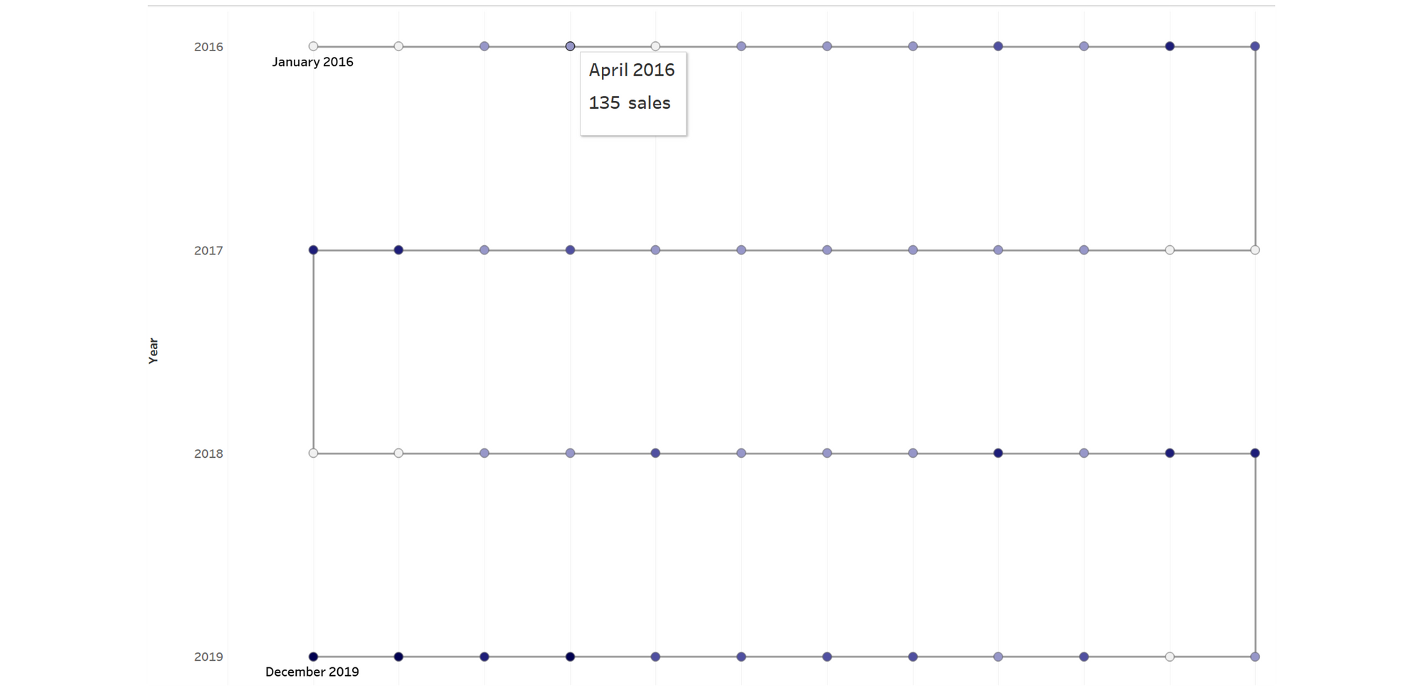
This week I tried to incorporate a 'snake' shaped graph into my #MakeOverMonday attempt.
See results on my Tableau Public : https://public.tableau.com/views/MakeOverMondayNCAAHeightofWomensBasketballTeams/Dashboard1?:language=en-GB&:display_count=n&:origin=viz_share_link
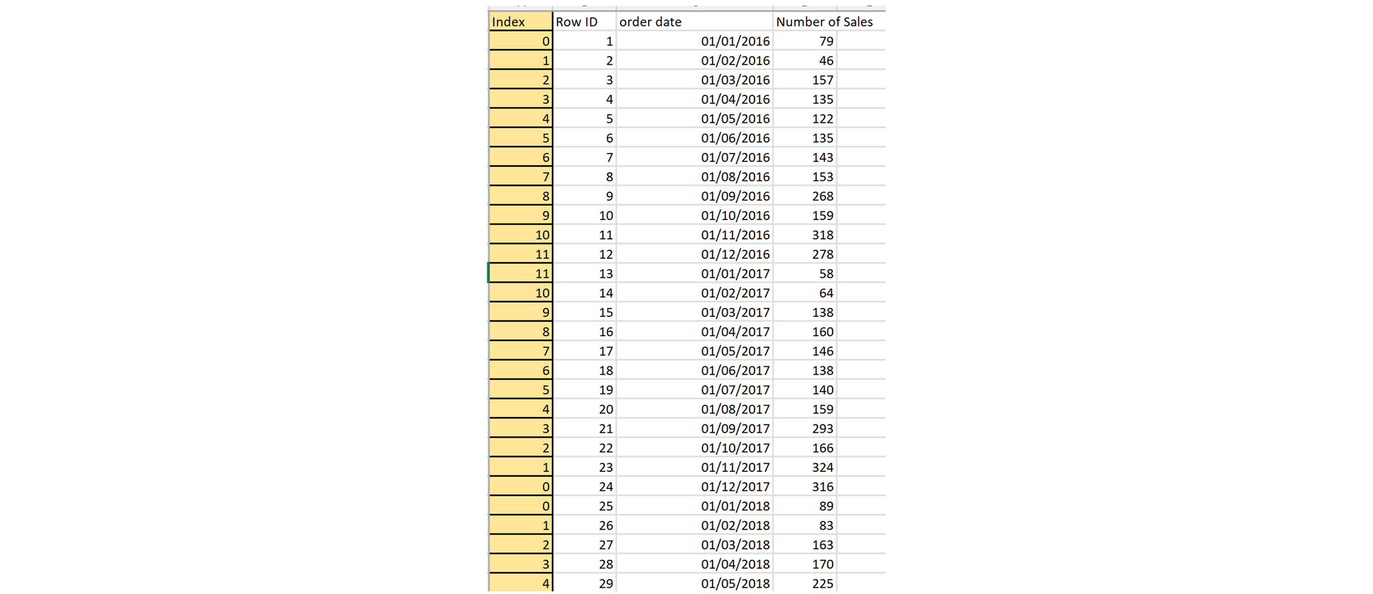
I thought I would share how to make this type of graph and create a timeline of sales using the Superstore dataset.
Firstly, I used Tableau Prep to clean the data and remove irrelevant fields:

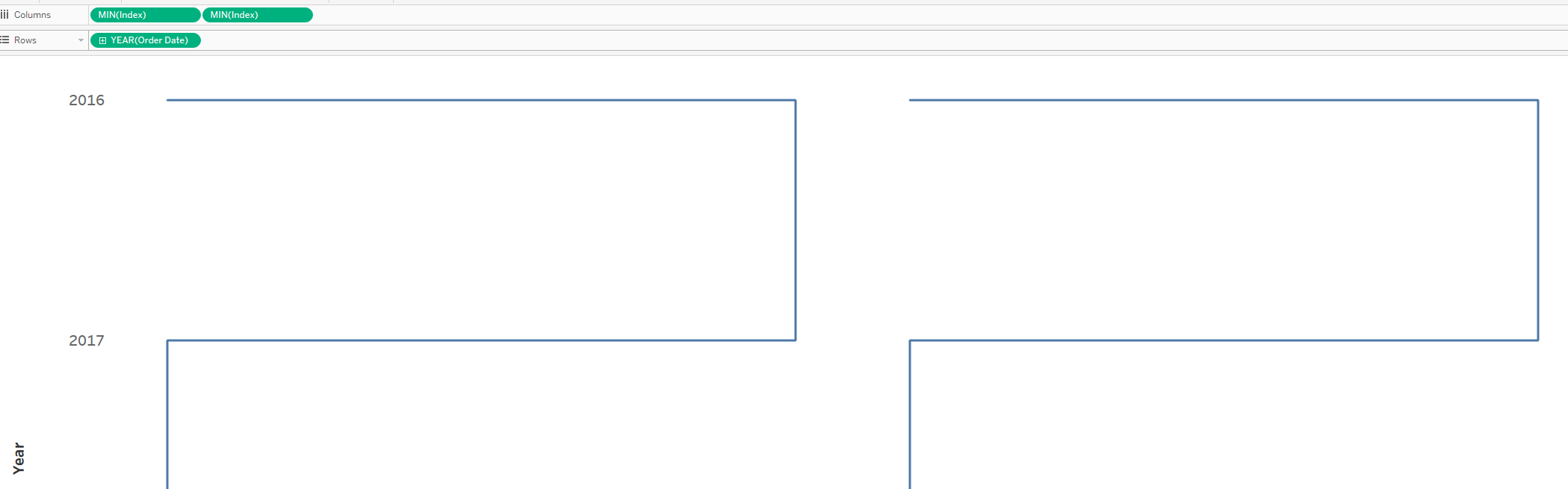
To make the snake shape, you need to create an index which will indicate where on the line you want each date to go. I am interested in the months of the year, so I wanted 12 points per year. To create the join at the end of each row, you need to make sure that the index number lines up with the consecutive date:
Now we insert this into Tableau and get to work.
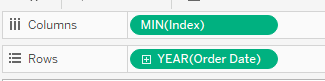
You want to drag in your index to the rows and order date to the columns:
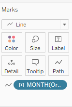
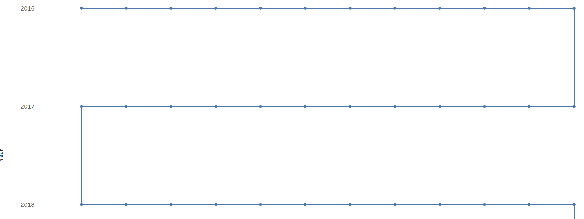
Change the graph type to 'Line' and drag the order date to the marks pane and change it to 'MONTH':
Now you should have the basis for the timeline:
To create the data points, create a second axis with the index.
Change the second graph type to your desired look. I chose circles:

Merge the axes and synchronise:
Add in the data that you would like to show and format as desired, creating a MIN/MAX label for the start and end dates.
If you want a different shape to your graph, play with the index numbers on your data source and see how it changes.