Todays the final day of dashboard week which means its the end of training! I have learnt so much in these last four months and it is going to feel strange not spending all day everyday in a room with the same 7 people.
Our task for today was to use the World Happiness Report to create a well designed dashboard.
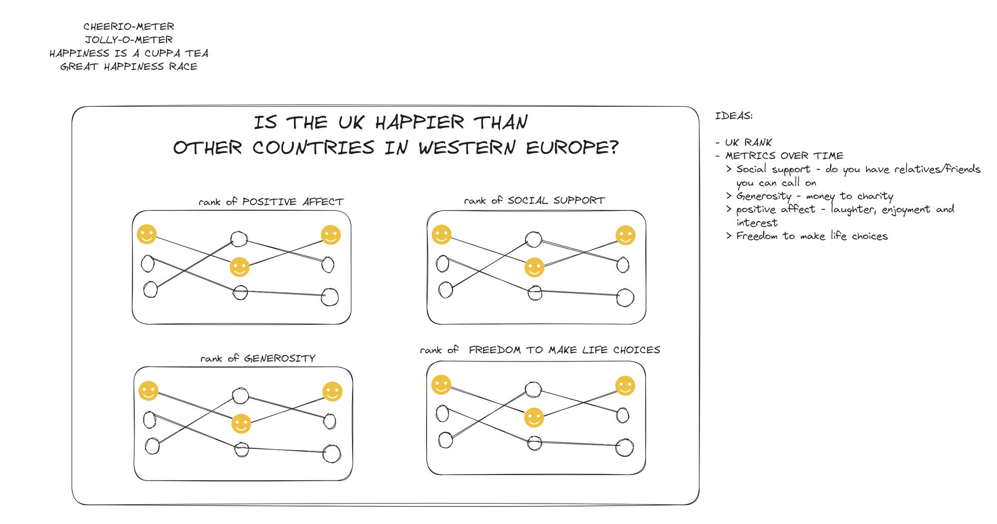
PLAN
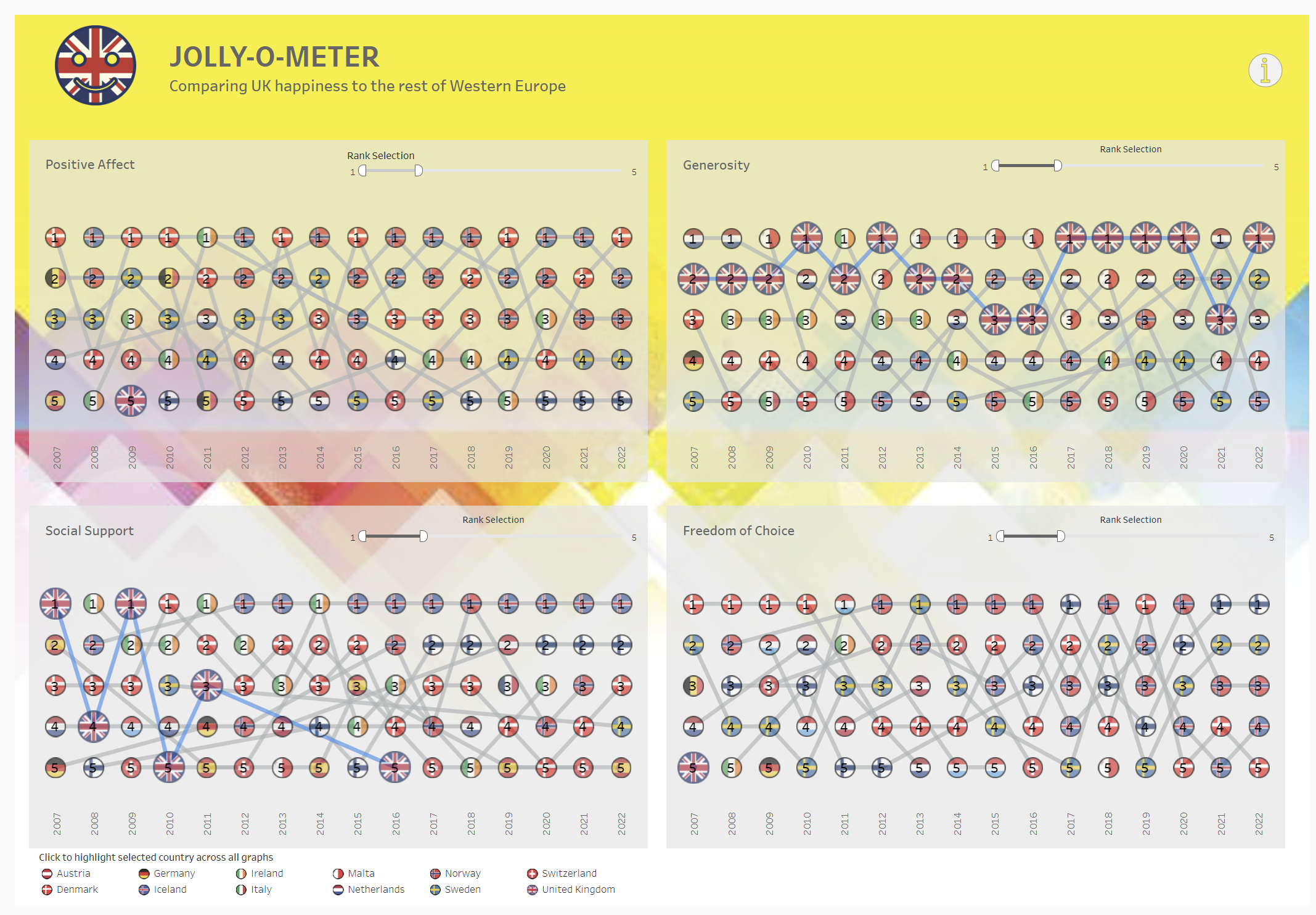
We only had until 12 today, so I wanted to narrow my scope to just show how the UK compares to other Western European countries based on four metrics: positive affect, generosity, social support and freedom of choice.
PROCESS
I experimented with the bump charts to see what the best design was that showed the rankings clearly.
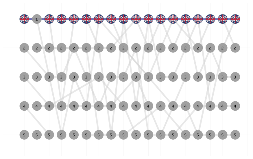
My first attempt, apart from the creepy smiles, was also limiting the user to seeing just the UK. I thought it would be mice to see what the other countries are and highlight the UK in another way.
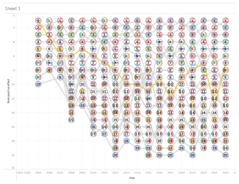
This was my second attempt. I thought it could be clearer which line was the UK line. Also too many ranks were showing so I wanted to limit that.
DASHBOARD
Follow the link below to see the final result! 👇