


When building charts some of the things we do not think about are accessibility requirements. The only one thing that is usually considered are the colour blindness tests.
Therefore, when creating my dashboard I was considering these choices:
- Labelling line directly. Usually in high-contrast colour.
- Using-colour blind accessible palette
- Labelling marks in multiple ways. Use colours and shapes.
- Making text size larger
- Making mark size larger
- Avoiding visual overloading (less marks/colours/categories)
- Use captions to describe charts (helps with screen readers)
- Show most recent values
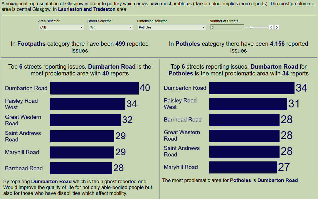
Example part of my dashboard that was created.
Some notable things is to use the "colour contrast" in coolers.co it helps a lot to make the dashboards more contrast.
Thank you for reading :)