


Cellular growth is controlled by the Notch gene. When the gene is activated it triggers a cascade of protein interactions in different parts of a cell. Mutations of any protein in the network can lead to abnormal growth and manifest diseases like cancer. Therefore, it is important to understand the entire system. Let me show you how to visualize it in Tableau:
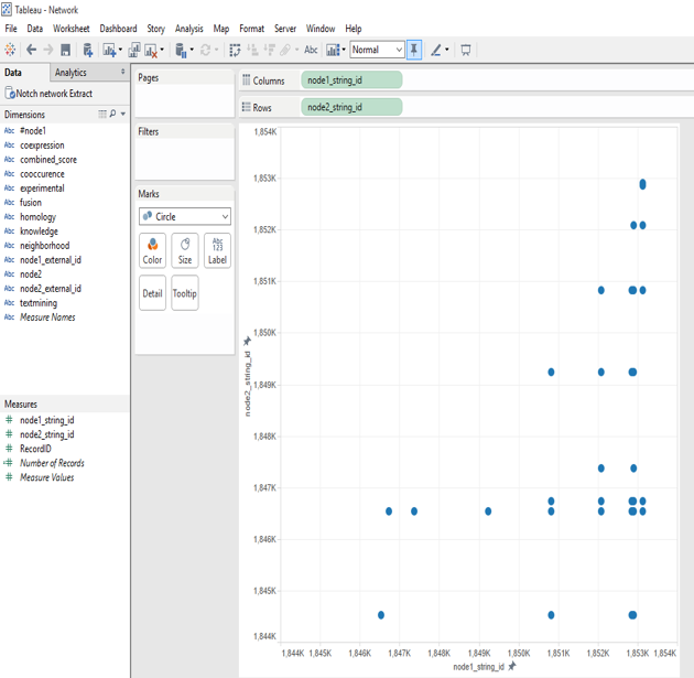
1. Drag measures for x and y node coordinates onto column and row shelves.
2. Create dual axis scatterplot by duplicating the y node coordinates.
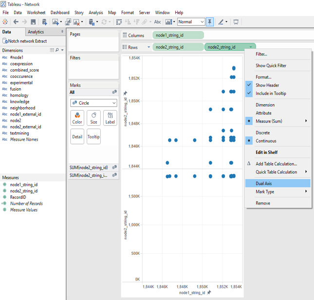
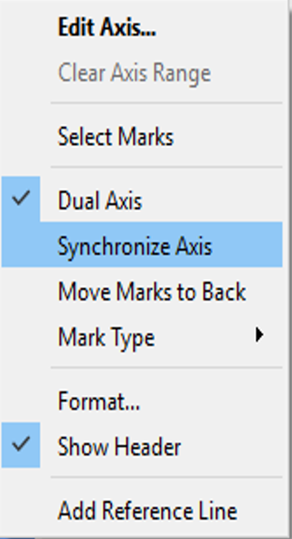
3.Choose “synchronize axis” from the edit axis drop-down menu.
4. Add Record ID onto Color in the Marks card for one the y node coordinates.
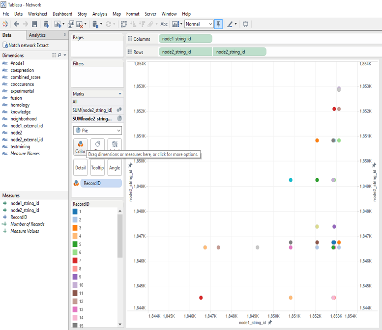
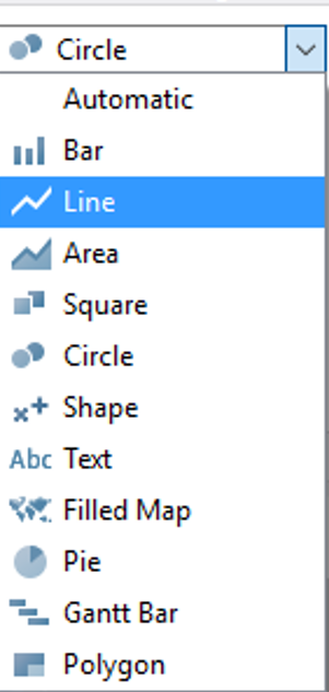
5. Change mark type to Line for the other y node coordinate.
6. Add Record ID onto path.
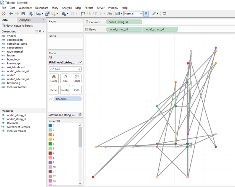
7. Finally, label nodes, edit size, color and don’t forget to edit your tooltips.
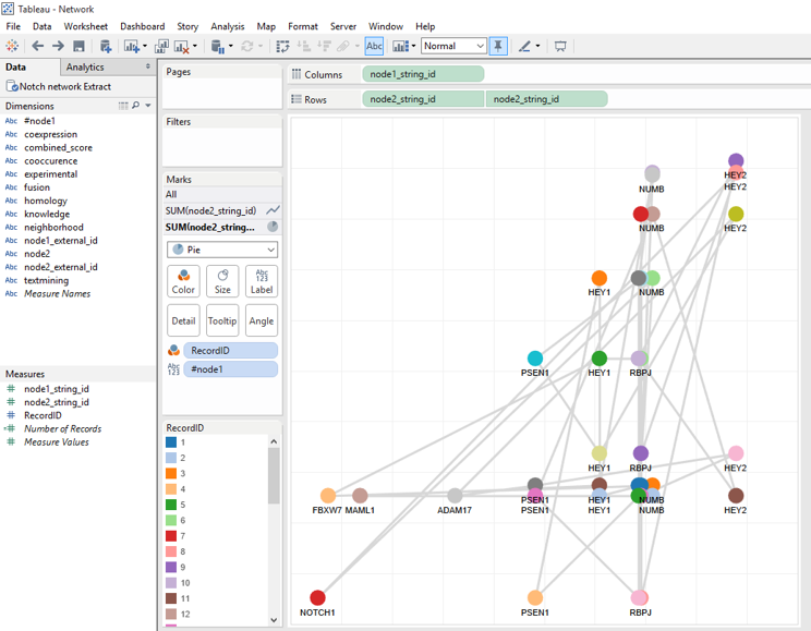
There you are, I have built a network graph for a complex gene network. Have you got any interesting network data? Please share it with us!