Adding visuals into a tooltip can be a good way to show users further information to the graphs without adding too many charts to the initial visual. Other use cases for visuals in tooltips can include showing breakdowns of the data behind the visual.
To start with you must have two charts built. The first is the one you want to have the tooltip, the second is the one you want to be the tooltip. You must make sure that the chart you want as the tooltip is on its own page.
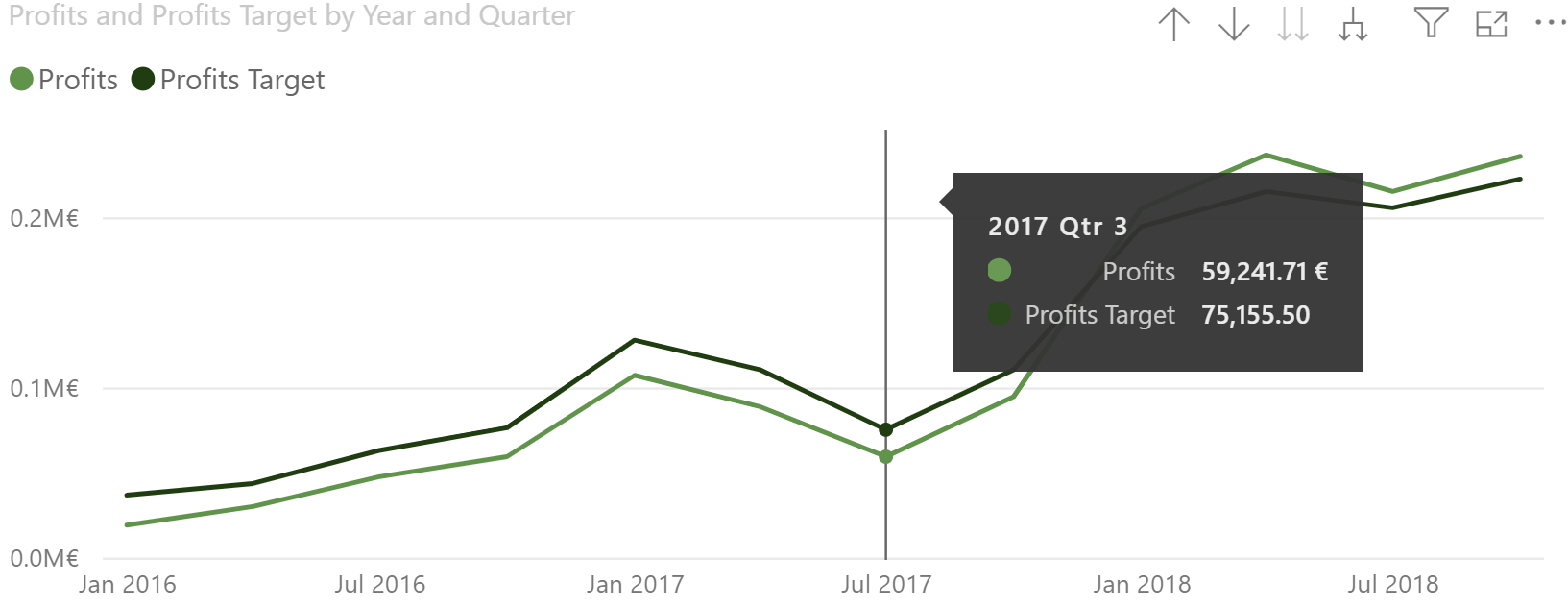
The tooltip on your first graph will look something like the one below. These are the default tooltips shown by Power BI.

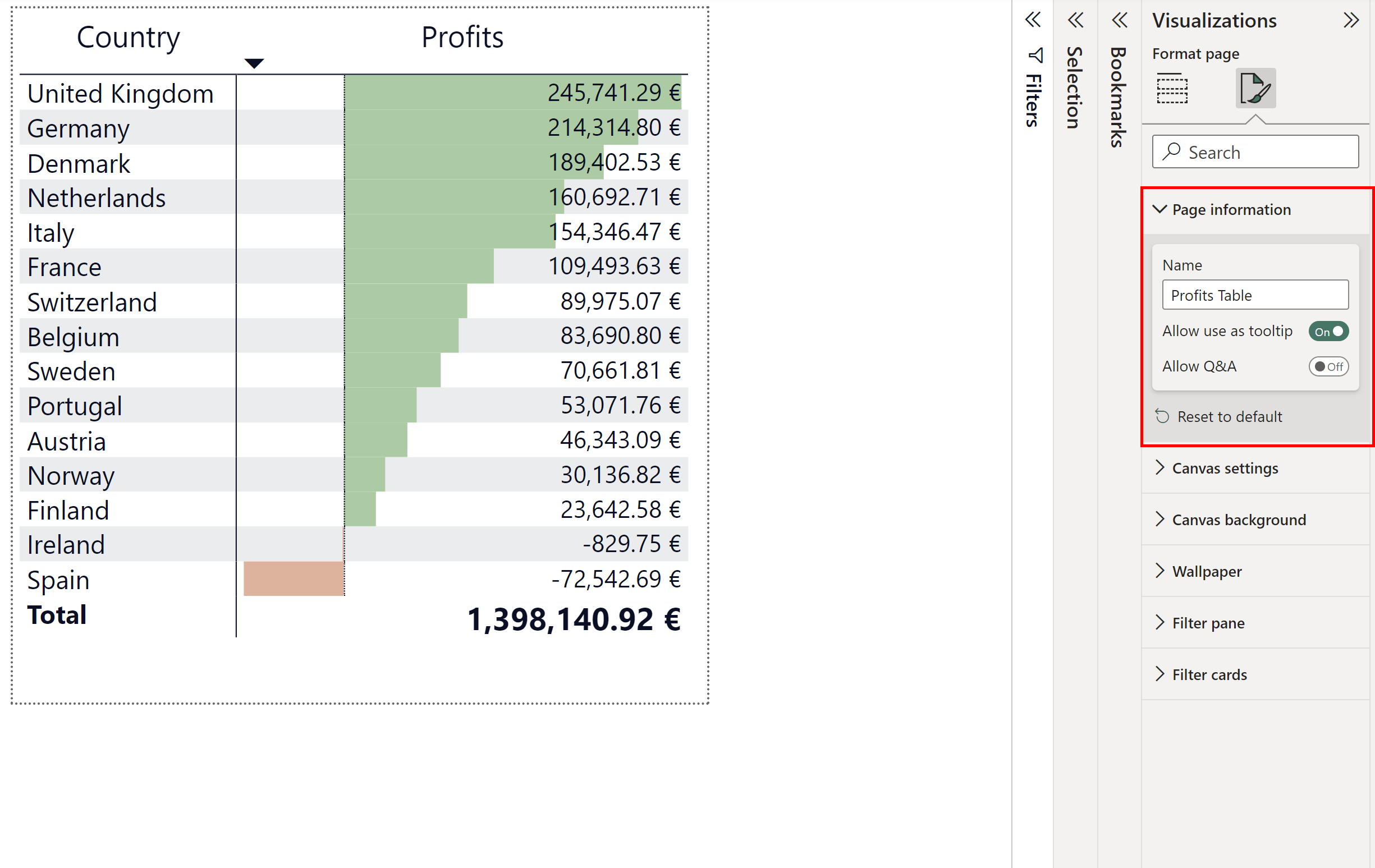
Now go to the chart that you want to show as the tooltip. Go to Format Page > Page Information > toggle "Allow use as tooltip" to on.

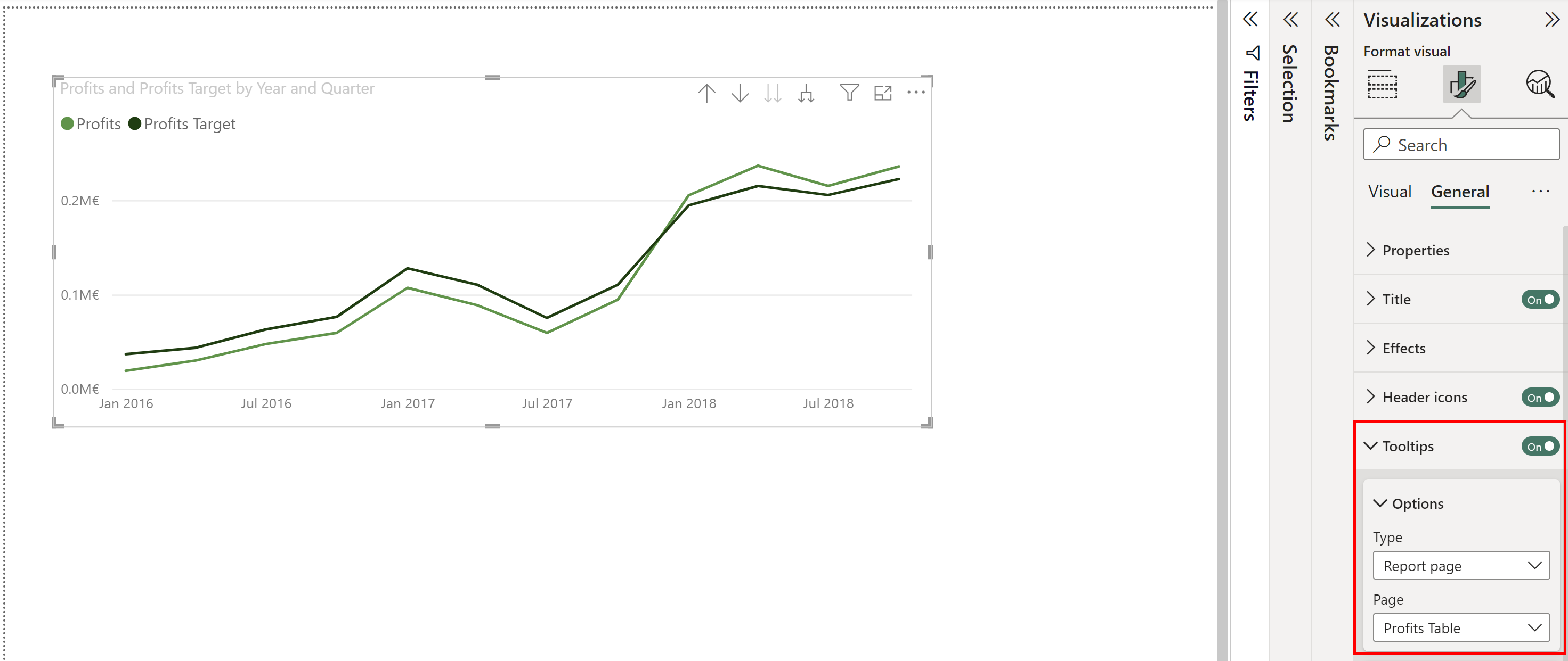
Now navigate back to the visual with the tooltip. Select the visual > Format Visual > General > Tooltip > Type = Report Page > Page = the page with the tooltip visual on.

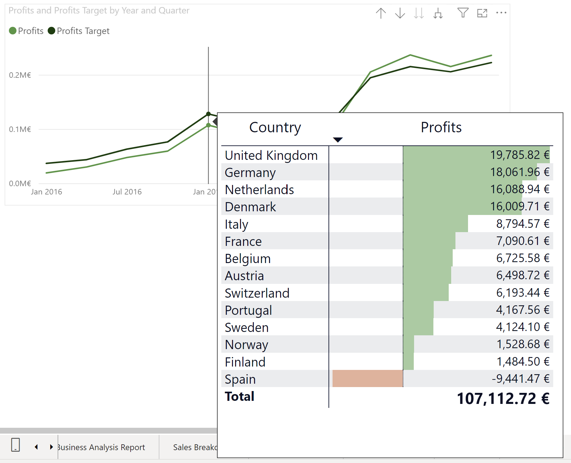
Just like that you will have a visual inside of your tooltip.

(Note: The size of the tooltip is dependent on the size of the page that the tooltip visual is on.)
