


To end the final day of dashboard week, and consequently training, we were tasked with creating a dashboard from the Data + Movies challenge set by Tableau.
The project was meant to be 2 days, but I had to squeeze the project down into 1 day as I was taking holiday on the Friday. This means by the end of the day I had to complete my:
- Plan
- Scope
- Sketch
- Dashboard
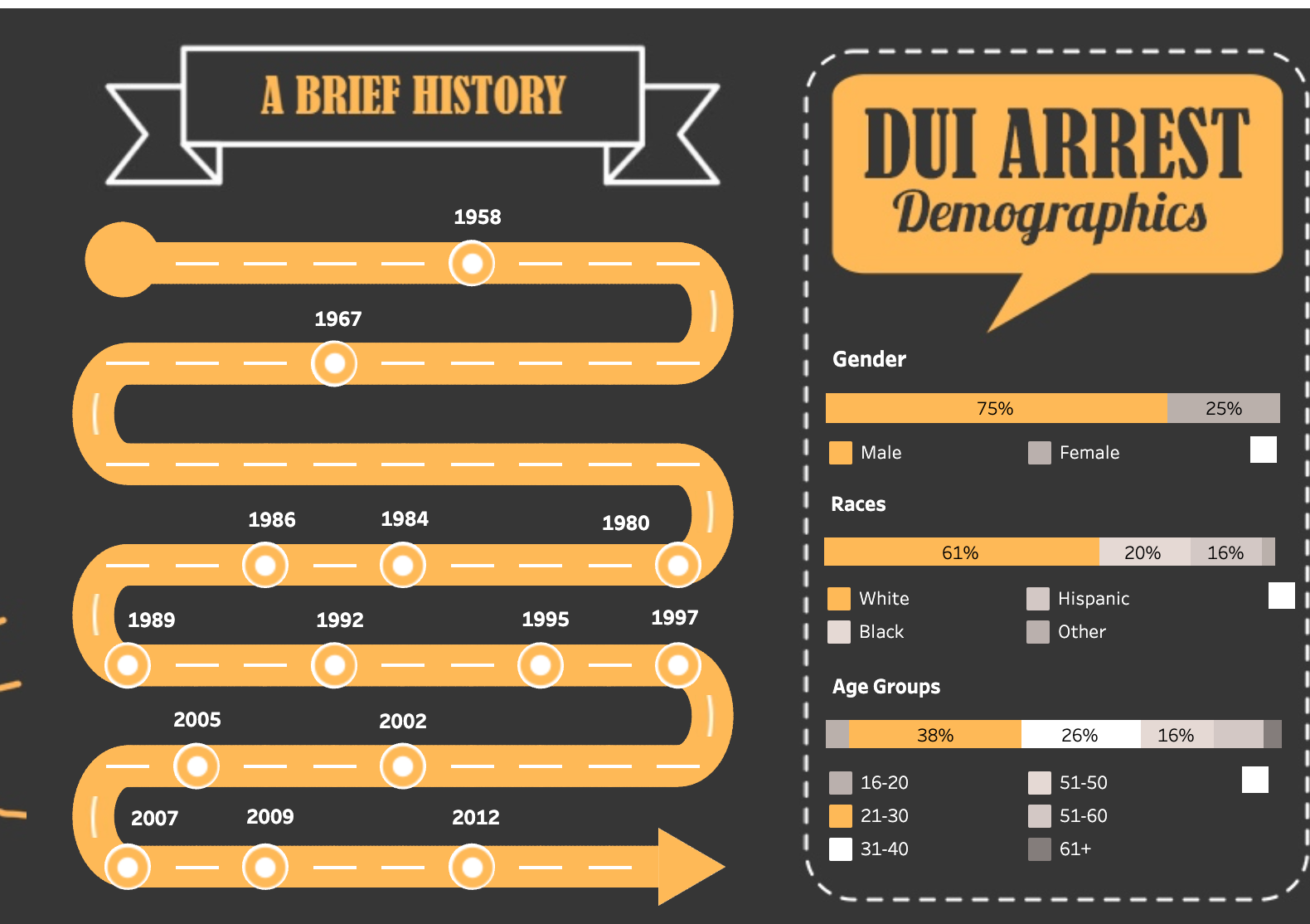
Due to time constraints, I had to make quick decisions. After reviewing the data, I decided to focus on the career of one actor, Leonardo DiCaprio. Taking inspiration from other dashboards from Tableau Public, I decided to tell a story with a timeline, below are some screenshots of inspiration:
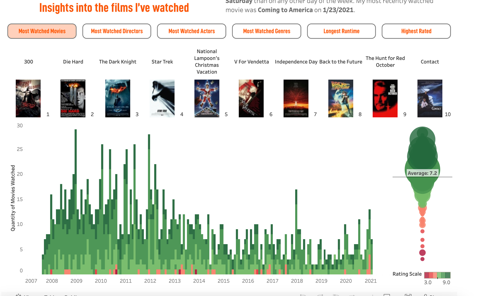
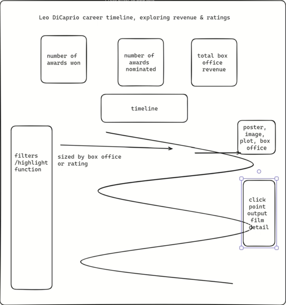
After viewing these dashboards, I got an idea to combine the two. Use the curvy timeline with points on the line representing different film releases, using available metrics in the dataset or supplementary data to get some insights to tell a story about how DiCaprio's film releases impacted his career. The second dashboard above, with the movie posters I thought could be used to create good graphics when clicking on a mark on the chart, in addition to more information regarding the selected film. As a consequence, I mocked up a basic sketch on Excalidraw to give the basic layout of the dashboard:
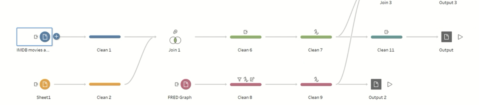
Prior to building the dashboard, I needed to get the Box Office revenue data, which was available online. After putting it into an Excel workbook, I used Tableau Prep to clean some of the data as some of the film names weren't an exact match, and joined on to the original dataset, which I filtered out on Tableau to just look at DiCaprio's films:
After loading the new dataset into Tableau, I proceeded to build the dashboard according to the sketch. I wanted formatting and visuals to be a top priority of this dashboard, so after using a Youtube tutorial to build the curvy timeline chart above, I downloaded all of the movie film posters from the internet, which then I assigned to shapes so when the data was filtered to a specific mark, it would cause the corresponding film to show up in a different area of the dashboard.
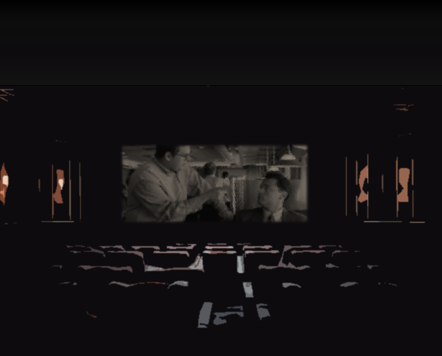
After building the bulk of the dashboard and getting to a point where I was happy with the layout and functionality, I created an edited a background using a stock picture of a cinema and an extract from The Wolf of Wall Street. I managed to do this on PowerPoint, by matching the slide size to the size of my dashboard. I then edited the images to become darker so there would be some contrast on the dashboard, and important information would all be visible:
Finally, after some last final formatting I finalised the dashboard and posted it to Tableau Public:
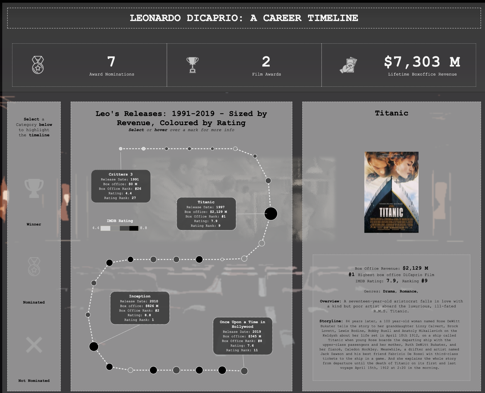
Although I was happy with the final product, when uploading to Public, the highlight pane to the left colours changed which when selecting a category, does not match up with the colours I picked on Tableau Desktop! Unsure of the reason, but seems to be something to do with me using sets as filter buttons. I was unable to amend this in time due to time constraints, however I will seek to find a solution in the future.