


As part of DS44's dashboard week, we delved into the crucial topic of Accessibility. The task involved presenting a dashboard based on our learnings, specifically focusing on making it accessible to users who navigate exclusively with a keyboard. I was tasked with re-creating a business dashboard under these constraints.
Challenges with the Original Dashboard
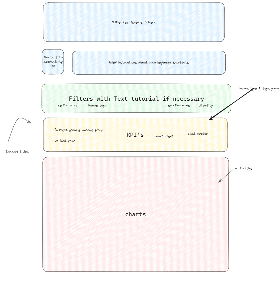
While I can't share screenshots of the original dashboard, I'll describe some key issues I faced. A keyboard-only user interacts with dashboard elements by pressing the tab key. Ideally, tabbing through the dashboard should follow a logical order, such as moving linearly through filters before moving to other elements. However, I observed that the tabbing sequence was inconsistent. The focus order in Tableau defaults to left-right, top-bottom, which disrupted the linear navigation through the filters.
Another significant issue was the lack of value labels on bar charts. Typically, users hover over bars to see tooltips with values. However, for a keyboard-only user, hovering isn't an option, so values need to be directly visible on the bars.
Redesigning for Keyboard Accessibility
To address these issues, I redesigned the dashboard with the following key changes:
- Linear Filter Navigation:
- I placed all filters at the top of the dashboard. This allowed users to tab through the filters sequentially without skipping to other dashboard elements.
- Distinctive Color Coding:
- In order to make this dashboard as accessible as possible to the widest group of users, I wanted to make use of the 'color-blind' scheme available on Tableau and make the colors used in different charts as distinctive as possible. This included KPI's, in which I used blue to indicate up and orange to indicate down, with an arrow pointing in the respective direction.
- Enhanced Data Visibility:
- I added labels to the latest values on line charts, ensuring users can see the most recent trend data without needing to hover.
- I also included grid lines on line charts in order to give the user the best gauge possible of what different areas on line charts were representing numerically.
- Finally, I added labels onto bar charts indicating each bars total value, in addition to a KPI that looked at figures vs last year so more information can be gained at a glance.
Dashboard Sketch
Key Takeaways
This project was an invaluable learning experience, highlighting the importance of accessibility in data visualization. By addressing the needs of keyboard-only users, I can make our dashboards more inclusive and user-friendly for a broader audience. Understanding and implementing these accessibility principles not only enhances usability but also ensures that our visualizations can reach and benefit more people.
Overall, this exercise underscored the critical role of accessibility in creating impactful and inclusive data visualizations.