


Accessibility is an umbrella term which changes can change its meaning depending on the people it involves. Accommodating for different conditions when building vizzes is therefore a difficult task unless you know exactly what conditions you're trying to address.
That said, there a couple things you can always keep in mind when think about accessibility and inclusivity of visual best practice. Ensuring that you incorporate those in your daily work can help increase the amount of people you can reach as well as ensure the message you're sending across is understand better.
On that note, here a couple of tips as to how you can help increase accessibility of y0ur vizzes by choosing the right font:
- Font Choice
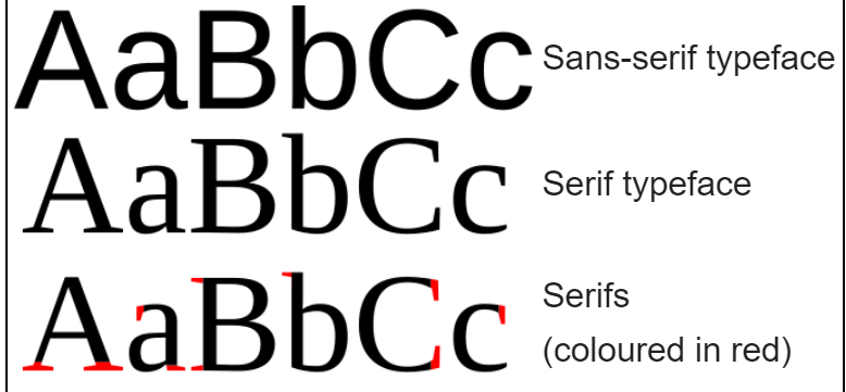
Ensuring your font is readable helps everyone, regardless as to whether they are neurotypical or not. On that note, always try to choose a clean Sans Serif font. Using fonts without 'extended strokes' minimises the risk of certain similarly looking letters becoming confusing and increases the overall readability. An easy go to example would be Arial.
- Font Size
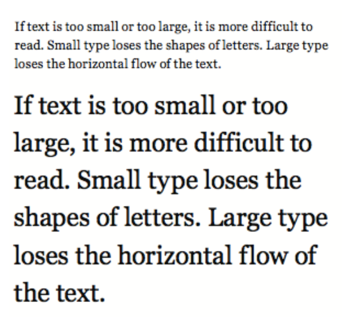
As a good practice, we should always aim to ensure that no text is being written using a font smaller than 12. Small fonts are hard to read for everyone! If your audience includes people with visual impairments or ADHD, they might find reading small print extra difficult. On that note, make sure to not make your font too big either - this obviously might also become an issue!
- Contrast
Choosing a font colour needs to always be done in conjunction with the background. Ensuring the adequate amount of contrast is absolutely crucial to increase the readability for certain types of visual impairments, among other conditions. To ensure the right contrast, I recommend using Deque Color Palette Contrast Checker. A great resource to keep in your bookmarks!