


Power BI gives users the ability to interact with reports rather than simply view them. Interactivity makes it easier to explore data, uncover insights, and control what information is shown on screen. In this blog I will walk through three common ways to add interactivity to a report: basic chart interactions, buttons, and slicers.
Basic chart interactions
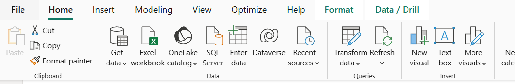
When you click on any visual, the formatting options appear in the ribbon at the top. In the Format tab you will see an option called Edit interactions.
Selecting this will place three icons on every chart in the report view. These icons represent Highlight, Filter, and None.
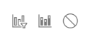
The first icon is Highlight and it shows the selected values while keeping the rest of the data visible.
The middle icon is Filter and it removes the unselected values completely from the other visuals.
The last icon is None and it means the selection will not affect that visual at all.
Buttons
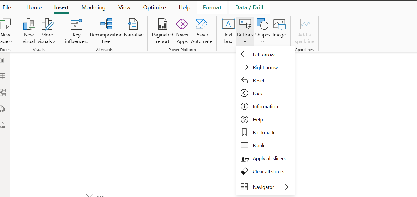
Buttons are another way to add interactivity. To insert one, go to the Insert tab at the top and look for Buttons in the Elements section. Choose the button style you want. A formatting pane will open on the right.
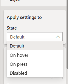
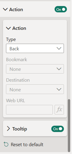
Under State you can choose how the user interacts with the button, such as clicking or hovering.
Further down in the pane you will find the Action section. This is where you set what the button will do, for example navigating to the previous page, next page, or returning to the beginning of the report etc.
Slicers
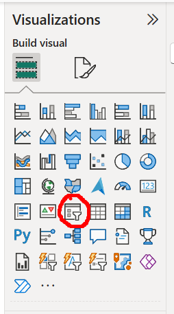
Slicers are one of the simplest and most useful interactive tools in Power BI. A slicer lets the user filter visuals by selecting categories, dates, numbers, or other values. To add one, go to the Visualisations pane and choose the Slicer visual.
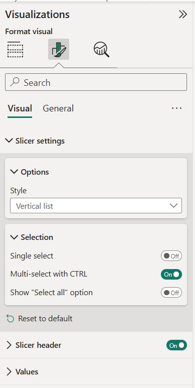
Select the field you want to filter by and the slicer will immediately apply to visuals on the page. Slicers can also be formatted to allow single selections, multiple selections, or a search box depending on how you want users to explore the data.
Interactivity makes Power BI reports easier to explore and more engaging for users. With simple tools like chart interactions, buttons, and slicers, you can give viewers more control over what they see and how they navigate the report.