One Makeovermonday topics related to the successes of the Marvel Movies. In order to evaluate the success of a film, various metrics come into play, as these are crucial for answering the question. These criteria range from Audience Score, Critical Success to Percent of Budget Recovered.
The original illustration shows an interactive scatterplot that you can explore for yourself.
Information is Beautiful
Since I had already worked on dumbbell charts and on creating parameters in Tableau in order to master them, I tried to apply my self-acquired skills here as well.
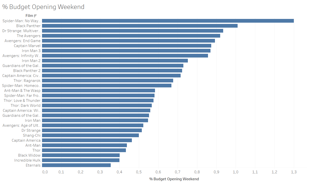
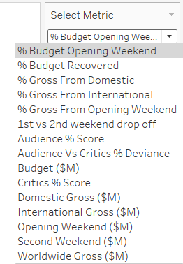
Since, as already mentioned, the file contains many metrics and it is not essential to create a separate chart for each metric, a parameter can be used to allow the selection of a single metric. A descending bar chart then shows the top films based on the metric.
A dumbbell plot can be used to visualize two different values in time, or to show the difference between two different values.
The file already contains a metric for audience vs critics % deviance. But to create a dumbbell chart, I created a calculated field and subtracted the audience score from the critics score as an absolute number. This enables the desired view on Tableau. Finally, there is a view that shows which films have the greatest variance between these two values.
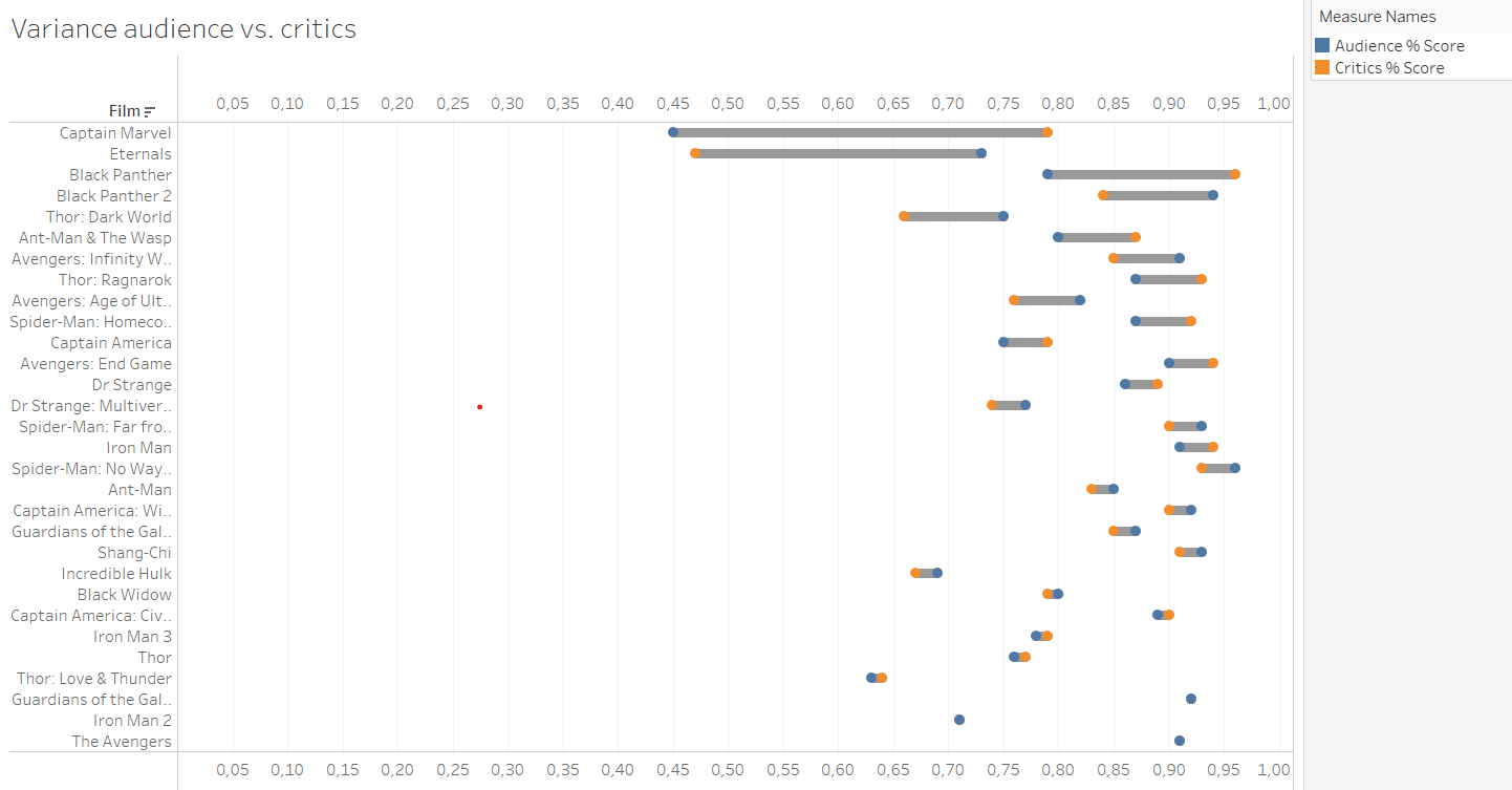
This is what I managed to do in the allotted time.
A week later, we had the time to "makeover" the Makeover Monday with this topic. Since I couldn't build a dashboard earlier due to the limited time, I was finally able to create it now.
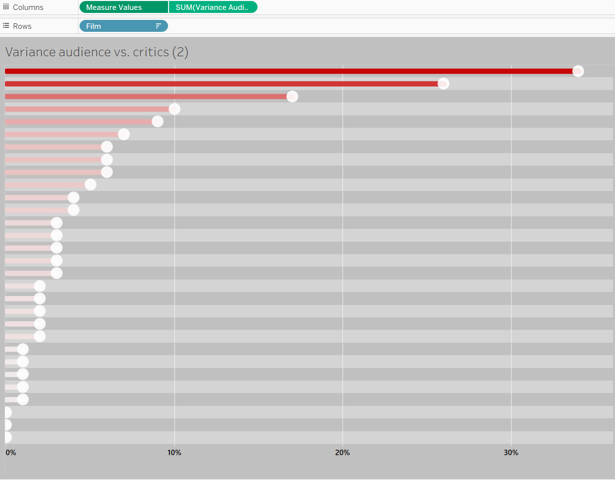
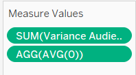
What I wanted to add to my Dumbbell Chart was another chart that shows only the deviations as a line, which are also sorted in descending order. In a Dumbbell Chart, since the lines "float," it's usually difficult to compare the values, and the sorting is not visible at first glance. I was able to solve this by approaching it in a similar way. A fictional field needs to be created. I simply typed AVG(0) into the Column. This way, the zero values create the vertical line on the Y-axis.
As seen in the image above, I changed a lot in formatting. Usually, there was little time left for formatting during the MOMs, so I was never really satisfied with the visual of my dashboards. I prefer to use the time to build more charts rather than focus on formatting. However, this time I made it a goal to dedicate time to its visual.
For the colors, I orientated myself on the Marvel logo. Additionally, I tried to use padding and borders more effectively, and as a result, the dashboard looks more organized and neat.
I would have chosen a longer layout again, as it's the simplest solution when you have a chart with many values, but once again, I wanted to challenge myself. It was important to me that the lines in the upper charts don't overlap. This time, I placed the legends and the parameter as floating, so there would be enough space horizontally. As long as the content allows, I think it's not essential to show the entire view in bar charts but to allow scrolling instead.
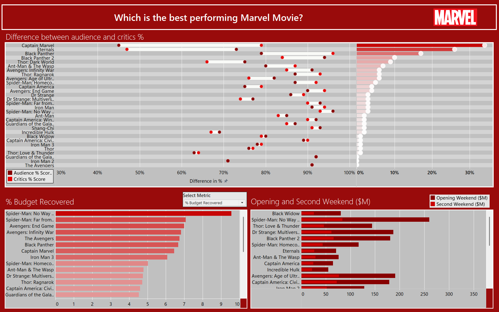
In my opinion, the dashboard could be improved more, both in terms of appearance and content. For instance, I would have preferred to include more interactivity. But I also think that there isn't much that needs to be done, since my dashboard intends to show an overview about some success factors and not to tell a story, primarily. I'm happy I included a parameter, as an interactive element.
https://public.tableau.com/app/profile/ahsen.polat/viz/MOM_Marvel_v2/Dashboard1
